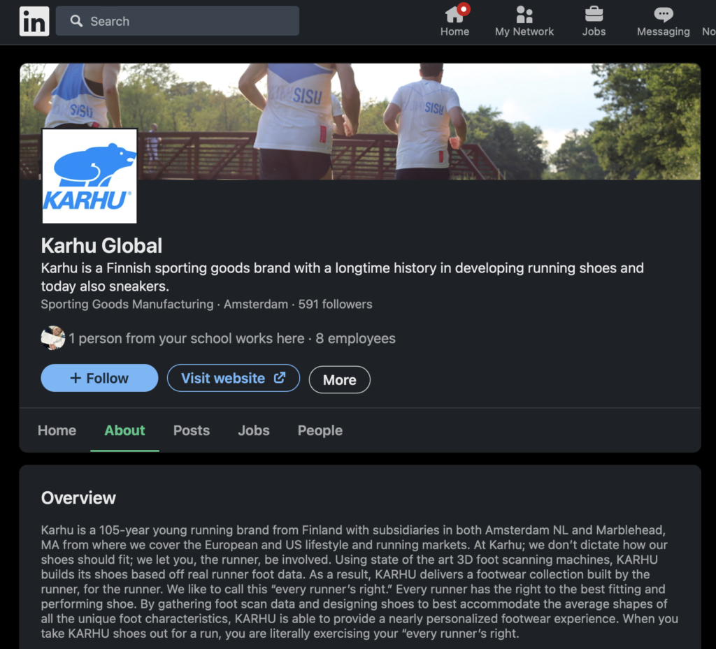
Introduction to the brand
Karhu is a Finnish sports shoe brand. Some shoes are more street style sneakers, good for walking and hiking and some more towards running and racing. They also sell everyday apparel like hoodies, socks, shorts and headwear etc. The brand carries an oldschool, earthy, nordic sports feeling. The thing that makes them stand out is that their collections are always inpired by a certain color theme, from nature or buildings from the city. Karhu does collaborations with different creators, brands and sports events.
Karhu has an interesting history. It was founded in 1916 as a general sports brand, making javelins and skis out of locally sourced birch. Eventually the brand developed into making mainly running shoes. Karhu was very popular from the 1920 to the 80s.
They had a lot of innovations in their shoe technology and they have proven that running with their shoes helps you run faster. Karhus values are that they want to stay very authentic and make great products. They might not be the best-known brand, but they believe that they are probably one of the most authentic. Their goal is not to be a billion-dollar brand, their goal is to be the most sought-after and most admired brand because we’re authentic, we’re exclusive, and we build incredible products.
Fun fact!
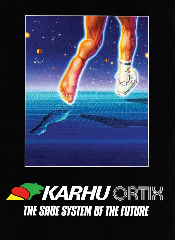
The three stripes were originally Karhus but they sold them to Adidas in 1920 for about 1600 euros and a couple of bottles of whiskey. ;D
Expressions
Physical brand expressions
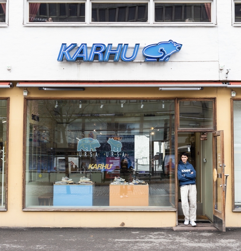
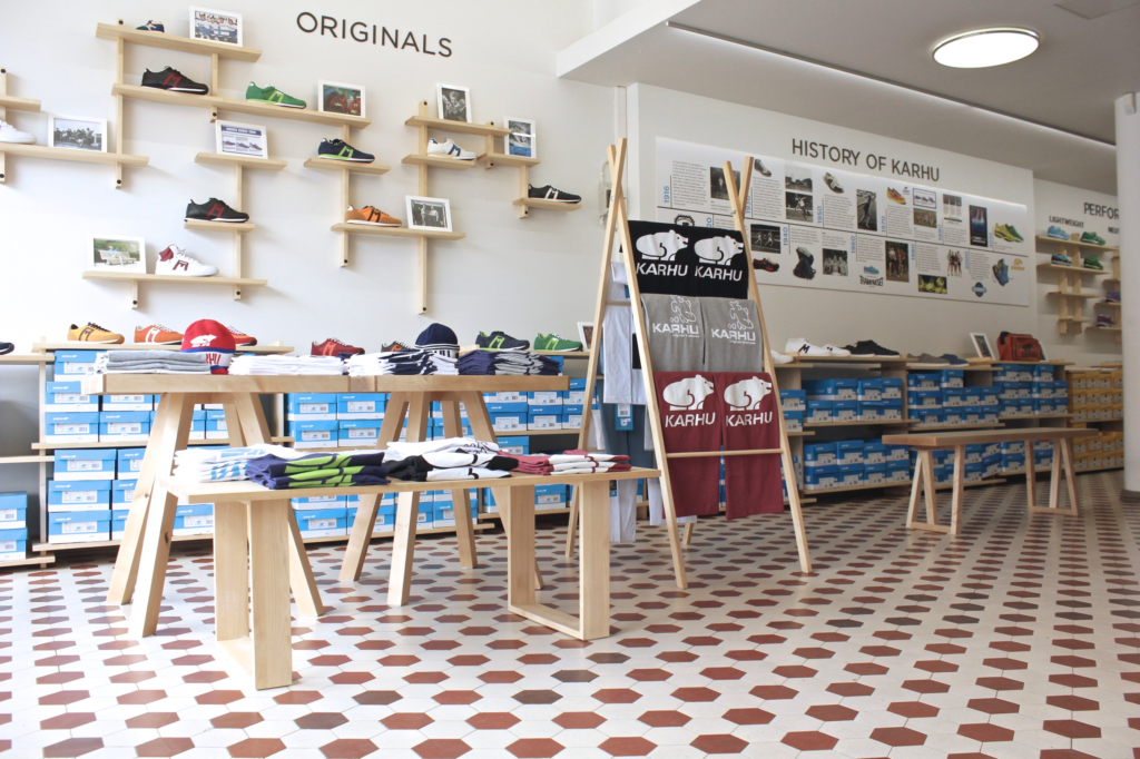
Karhu has a store in the center of Helsinki and they sell their shoes at sports stores and online. The store goes well with their brand. It has lightwood furniture and it has a casual, modern and airy feel.
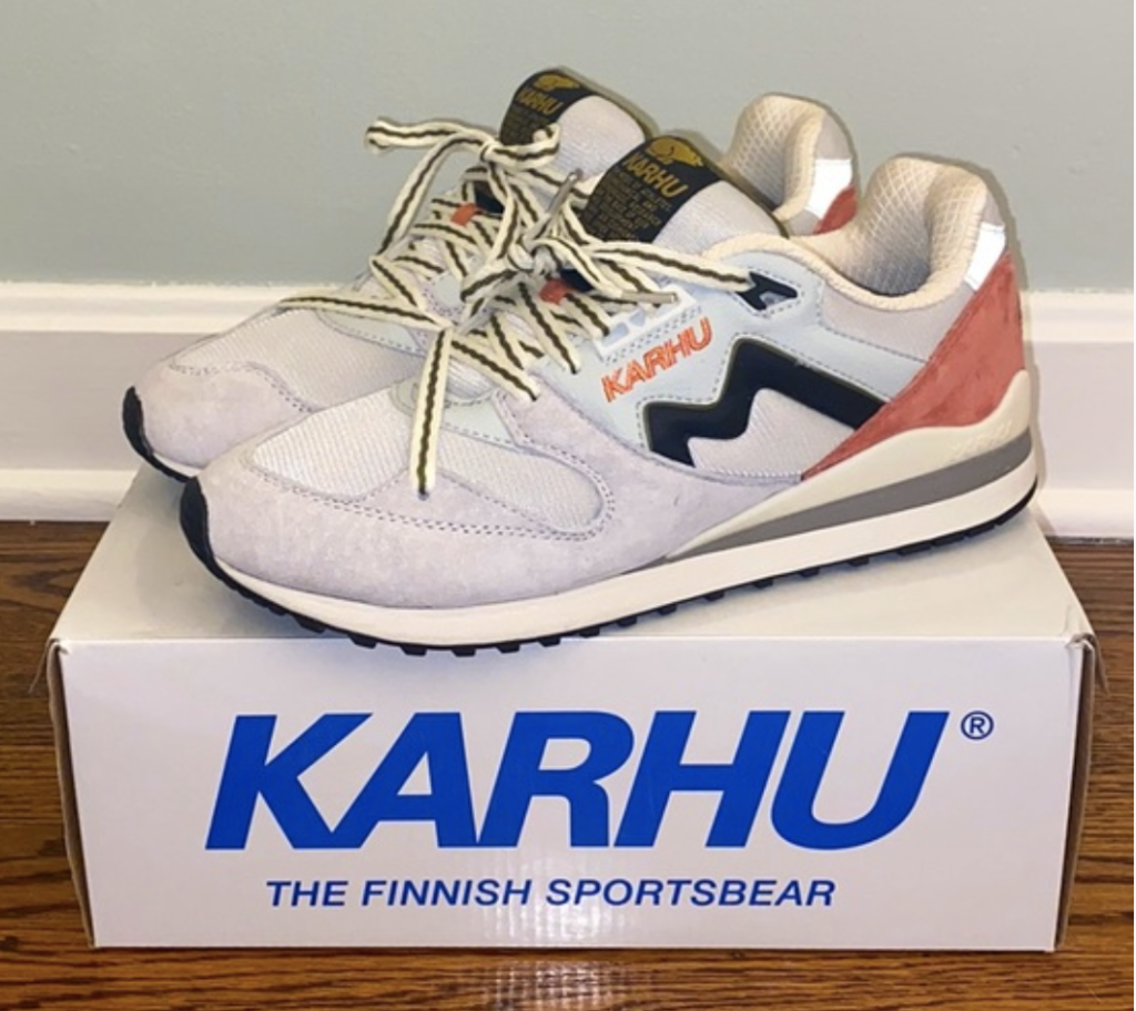
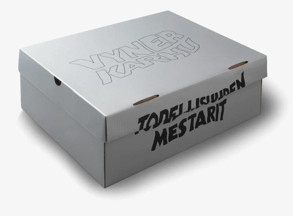
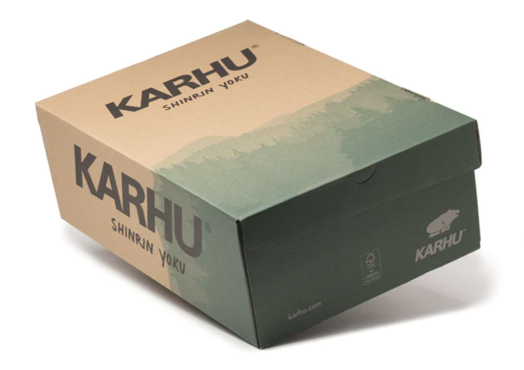
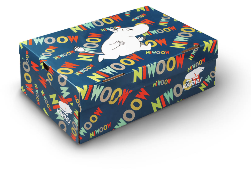
The basic packaging for shoes is a white box with blue font, but depending on the collection the packaging is made to fit that.
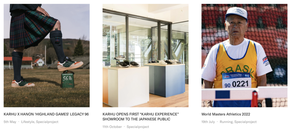
Karhu is involved in events related to sports and fashion.
Digital brand expressions
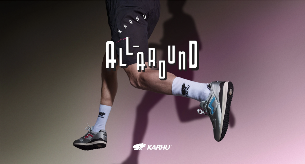
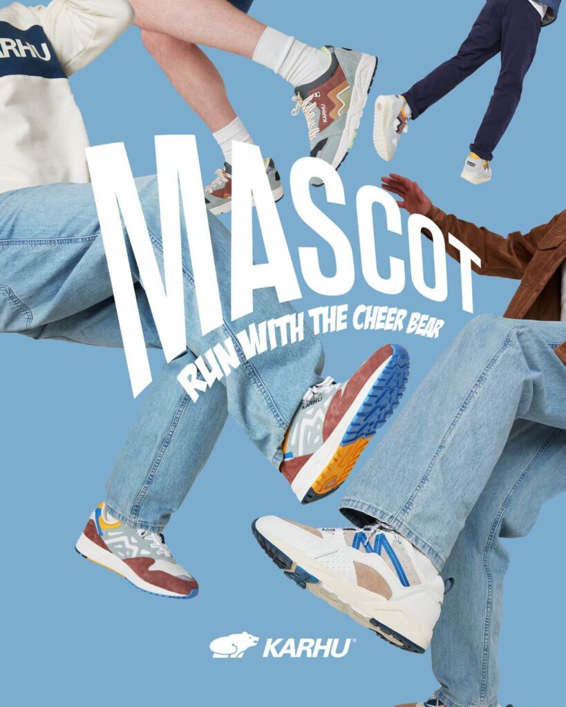
Karhus advertisements and promo pictures really play with colours and creating a feeling or a mood for the collection/shoe. The only advertisements I have found from Karhu are online.
Karhus website is clear and easy to navigate. It has a clear shopping section for their apparel and shoes. It also has blog posts about what is going on with the brand and about the collaborations that Karhu does with other creators, brands or events. It also has a brief history section of their brand.
Landing page
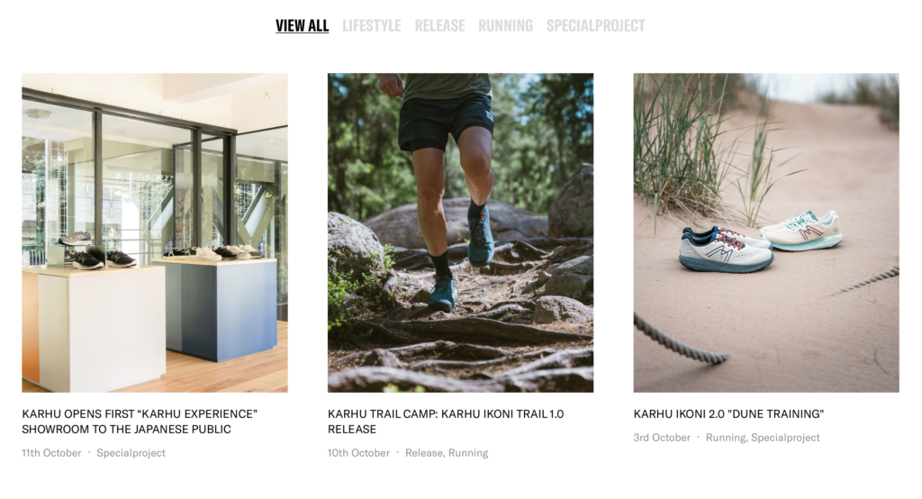
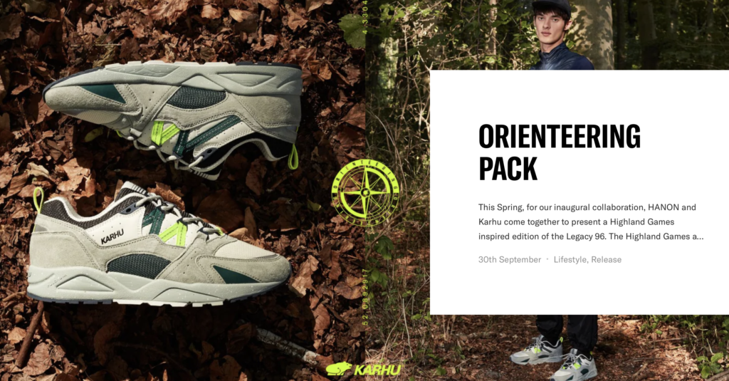
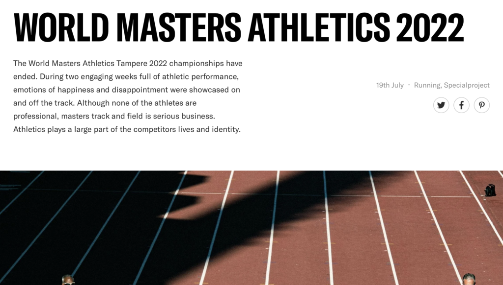
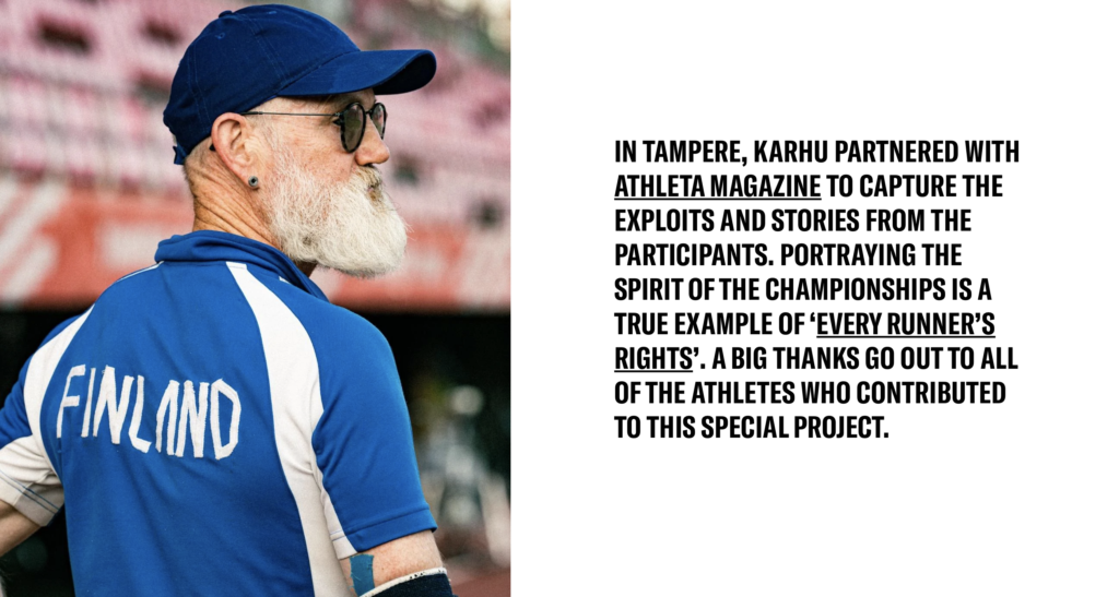
Posts about their collaborations
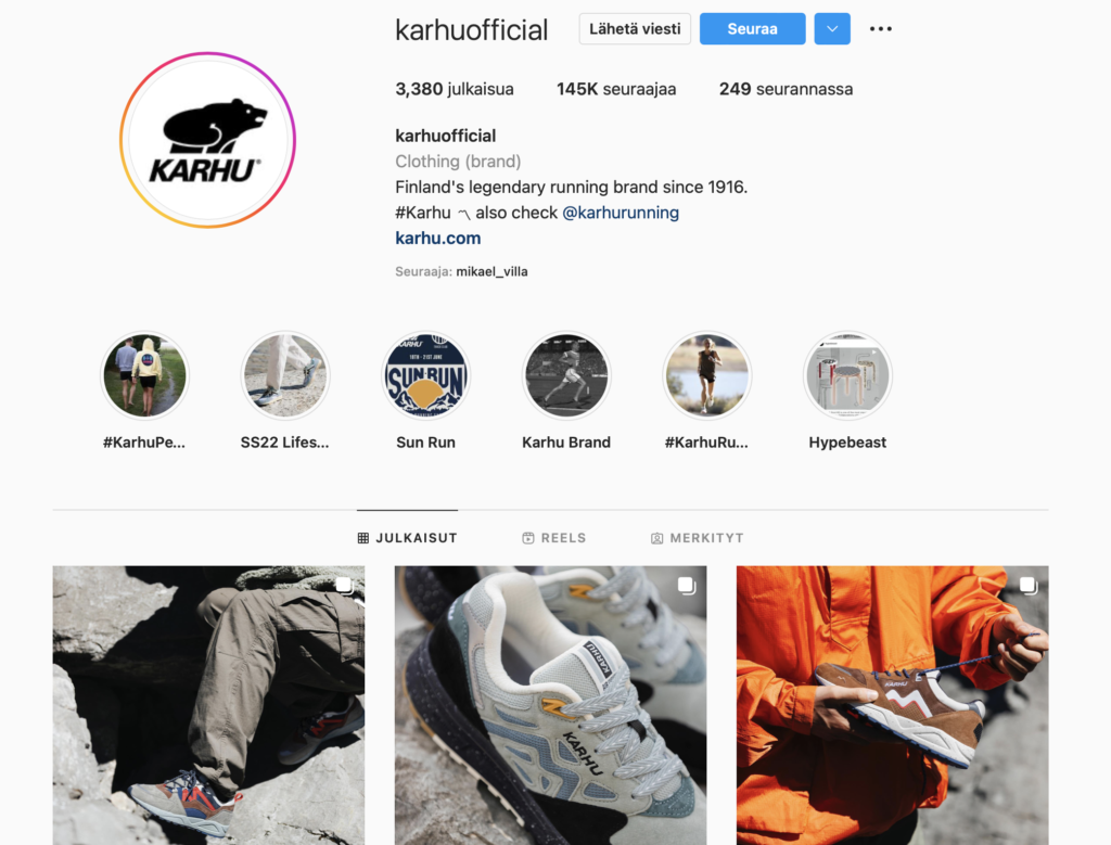
Instagram On the the instagram feed you can see all the different collections and campaigns Karhu has released. The information correlates straight to the website and is very clear.
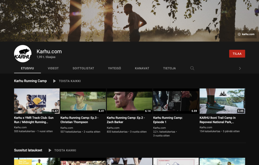
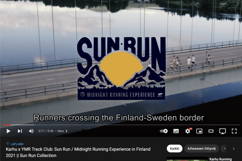
Youtube They have their own YouTube channel with promo videos, podcasts, interviews, videos from the events Karhu is in etc.
Brand elements
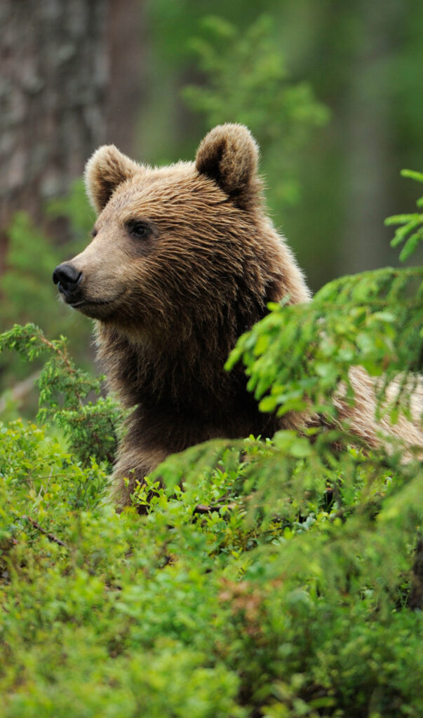
Name: Karhu means bear in Finnish. The name has a strong associations in Finnish mythology, since bears were feared and holy animals for Finnish people. Bear is a sign of life and death, reincarnation, endurance or the unique Finnish word for that “sisu” and independence. Bear is also a sign of the forest and mother earth.
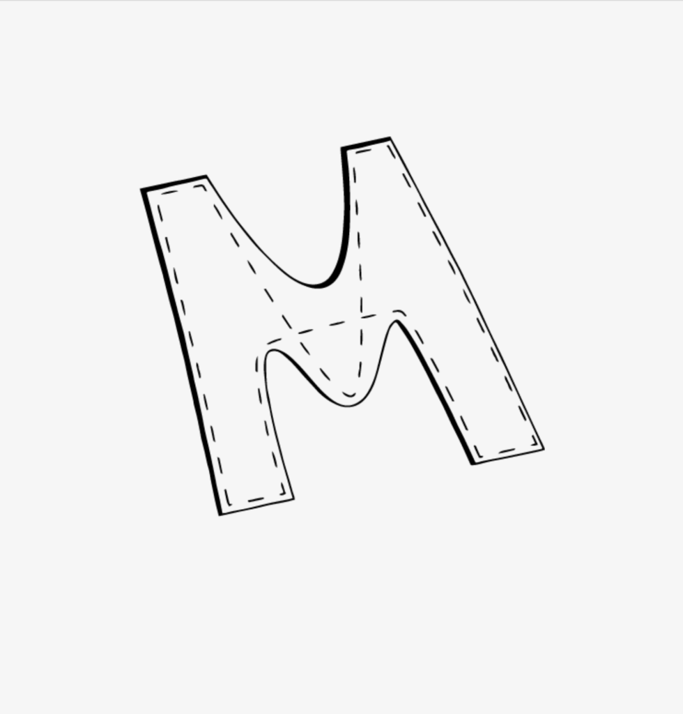
Logo: The logo is a black and white flat illustration of a bear wit clear, smooth lines. Another logo is the letter M that is seen on the sides of their shoes. The M stands for “Mestari” which means Master or Champion in Finnish, tying the M back to the brands roots as a sports brand and the olympics where Karhu first gained its popularity.
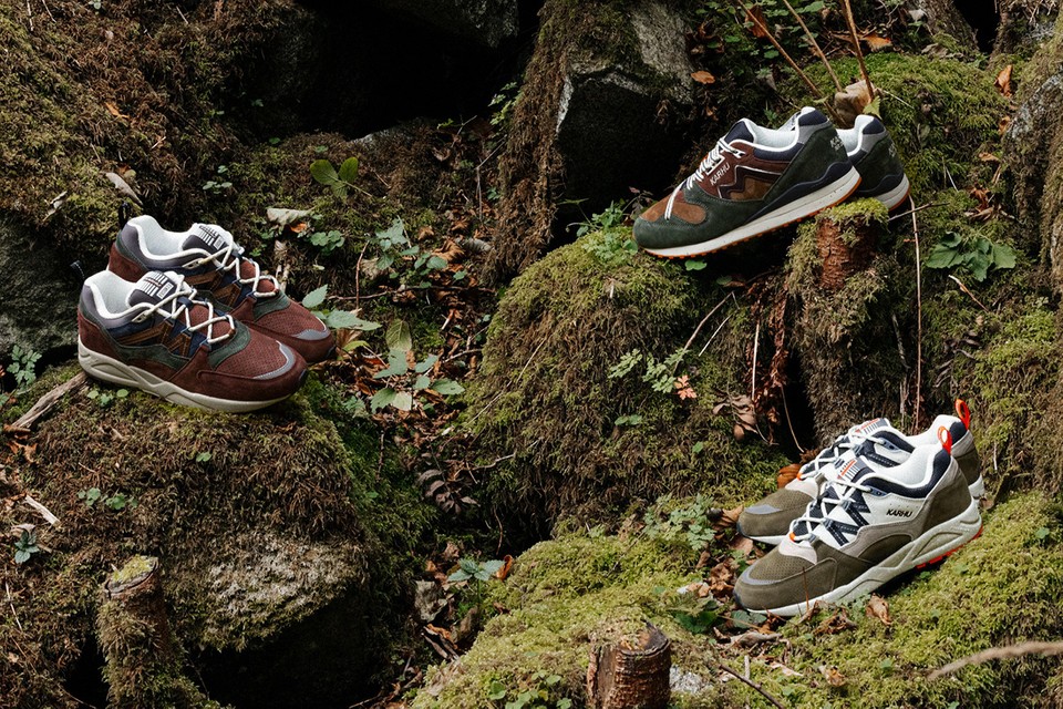
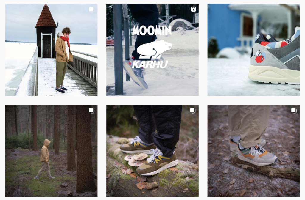
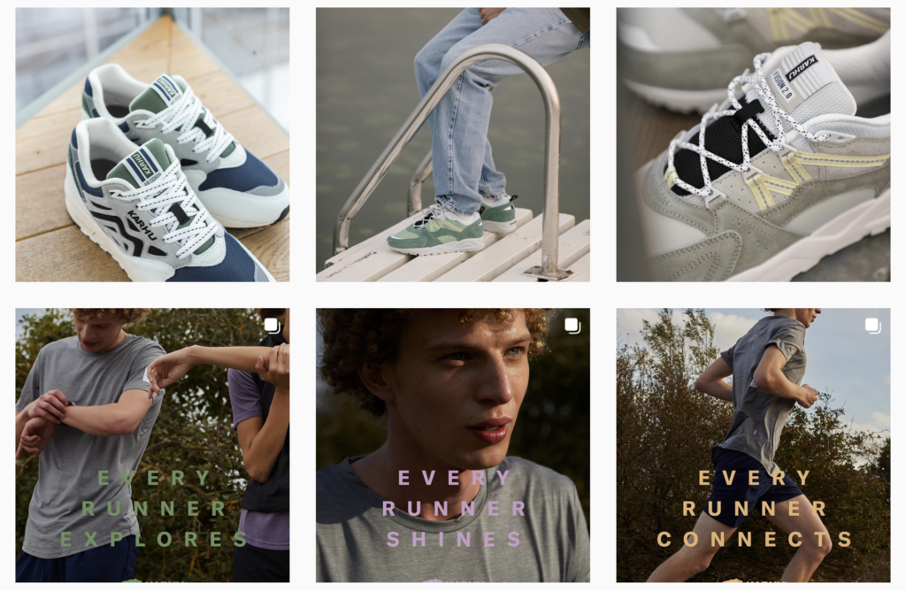
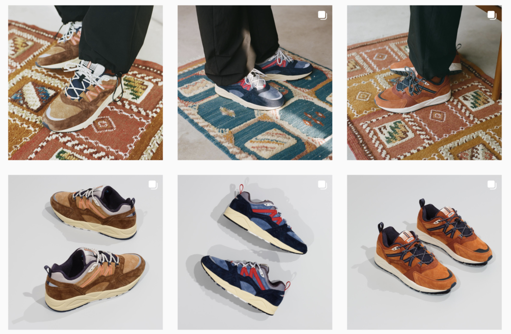
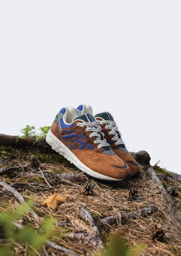
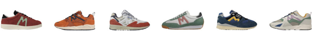
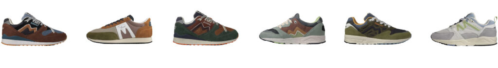
Colours: Karhus own website and other expressions are pretty b&w and neutral and they let their sneakers and other products shine for themselves with all their colours. Their sneakers have fun and unique colour combinations. They have all types or colours with variant shades but usually the colours are more on the muted side. When they release a new collection it has a distinct colour theme that fits well with the collections story. The colours depend on the collection and collaboration.
Images: Karhus images are clean, clear, bright professional looking photography. The colours are always well thought out, the sneakers, landscapes, surroundings and outfits always match together well either in a monochromatic or complementary way.
Typography: The typography is clean, clear and grotesque lettering. There are 3 fonts they primarily use and sometimes they have dashes of script lettering depending on the collaborations Karhu does with other creators, brands and sports. The collaborations feeling and style determine the extra lettering giving the collaboration more personality.
Tone of voice: Professional and relaxed.
Mental Brand Identity
Vision: Most authentic brand
Mission: To always stay authentic and make great products
Values: Authenticity, exclusiveness, quality, nature, comfort, efficiency
Personality: Clean, sporty
Promise: To always evolve and innovate their shoes to be better than before
Essence: Nordic sports brand
Competitors and Alternatives
Karhus natural competitors are other sports brands like Nike, Adidas, Puma, The North Face and Halti for example.
Links:
https://www.fleetfeet.com/blog/behind-karhu
https://midtownsigns.com/blog/five-ways-a-mural-can-boost-your-business
https://www.nshoremag.com/community-news/karhu/
First draft of the magazine article
The first and last one standing
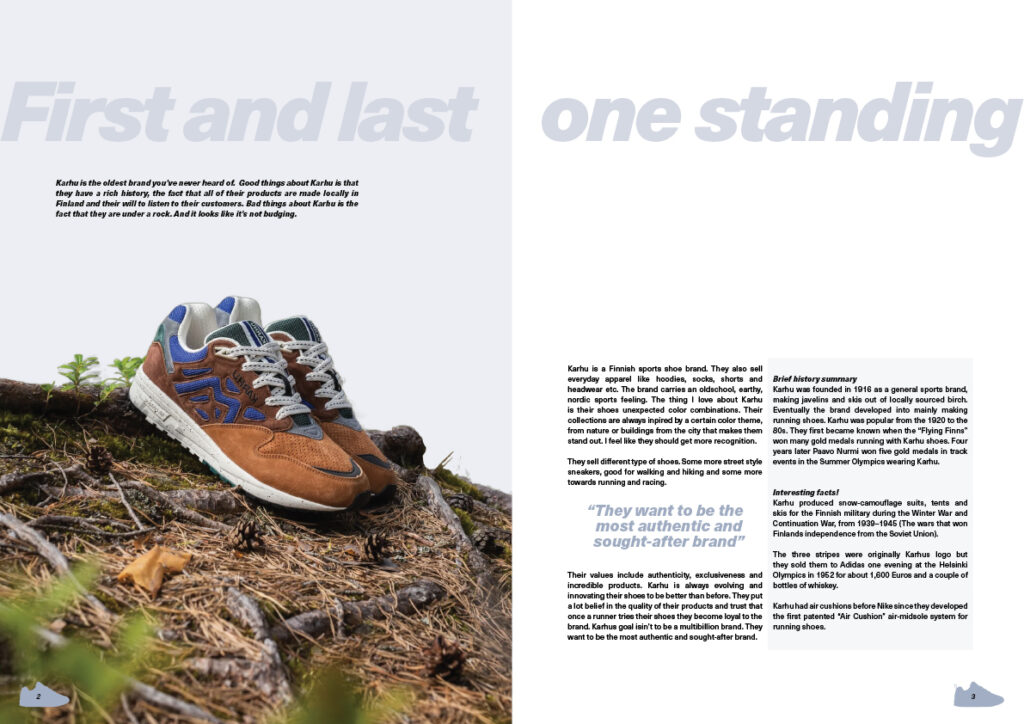
Karhu is a Finnish sports shoe brand. They also sell everyday apparel like hoodies, socks, shorts and headwear etc. The brand carries an oldschool, earthy, nordic sports feeling. The thing I love about Karhu is their shoes unexpected color combinations. Their collections are always inpired by a certain color theme, from nature or buildings from the city that makes them stand out. I feel like they should get more recognition.
They sell different type of shoes. Some more street style sneakers, good for walking and hiking and some more towards running and racing.
Their values include authenticity, exclusiveness and incredible products. Karhu is always evolving and innovating their shoes to be better than before. They put a lot belief in the quality of their products and trust that once a runner tries their shoes they become loyal to the brand. Karhus goal isin’t to be a multibillion brand. They want to be the most authentic and sought-after brand.
Brief history summary
Karhu was founded in 1916 as a general sports brand, making javelins and skis out of locally sourced birch. Eventually the brand developed into mainly making running shoes. Karhu was popular from the 1920 to the 80s. They first became known when the “Flying Finns” won many gold medals running with Karhu shoes. Four years later Paavo Nurmi won five gold medals in track events in the Summer Olympics wearing Karhu.
Interesting facts!
Karhu produced snow-camouflage suits, tents and skis for the Finnish military during the Winter War and Continuation War, from 1939–1945 (The wars that won Finlands independence from the Soviet Union).
The three stripes were originally Karhus logo but they sold them to Adidas one evening at the Helsinki Olympics in 1952 for about 1,600 Euros and a couple of bottles of whiskey.
Karhu had air cushions before Nike since they developed the first patented “Air Cushion” air-midsole system for running shoes.
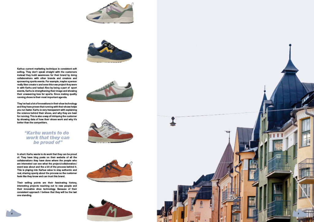
Karhus current marketing technique is consistent soft selling. They don’t speak straight with the customers instead they build awareness for their brand by doing collaborations with other brands and creators and sponsoring sports events. For example, maybe a person really likes creator x and sees this new project they were in with Karhu and tadaa! Also by being a part of sport events, Karhu is strengthening their image and showing their unwavering love for sports. Since making quality running shoes is their most important agenda.
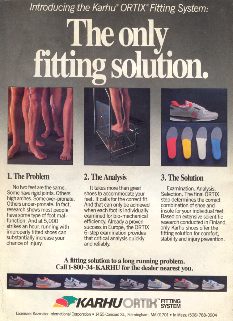
They’ve had a lot of innovations in their shoe technology and they have proven that running with their shoes helps you run faster. Karhu is very transparent with explaining the science behind their shoes, and why they are best for running. This is also a way of intriguing the customer by showing data of how their shoes work and why it’s better than the competitors.
In short: Karhu wants to do work that they can be proud of. They have blog posts on their website of all the collaborations they have done where the people who are interested can see what the project/collaboration/event was about and the a bit of the process behind it. This is playing into Karhus value to stay authentic and real, sharing openly about the process so the customer feels like they know and can trust this brand.
Their selling points are their fascinating history, interesting projects reaching out to new people and their innovative shoe technology. Because of their consistent approach I believe that they will be the last one standing.
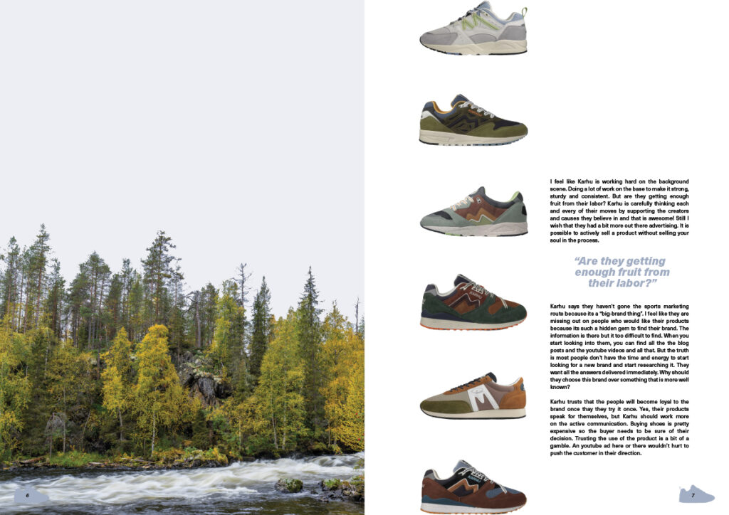
I feel like Karhu is working hard on the background scene. Doing a lot of work on the base to make it strong, sturdy and consistent. But are they getting enough fruit from their labor? Karhu is carefully thinking each and every of their moves by supporting the creators and causes they believe in and that is awesome! Still I wish that they had a bit more out there advertising. It is possible to actively sell a product without selling your soul in the process.
Karhu says they haven’t gone the sports marketing route because its a “big-brand thing”. I feel like they are missing out on people who would like their products because its such a hidden gem to find their brand. The information is there but it too difficult to find. When you start looking into them, you can find all the the blog posts and the youtube videos and all that. But the truth is most people don’t have the time and energy to start looking for a new brand and start researching it. They want all the answers delivered immediately. Why should they choose this brand over something that is more well known?
Karhu trusts that the people will become loyal to the brand once thay they try it once. Yes, their products speak for themselves, but Karhu should work more on the active communication. Buying shoes is pretty expensive so the buyer needs to be sure of their decision. Trusting the use of the product is a bit of a gamble. An youtube ad here or there wouldn’t hurt to push the customer in their direction.
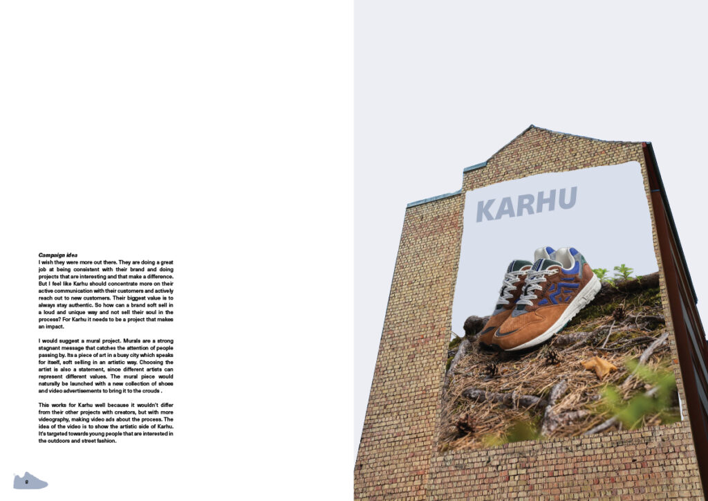
Campaign idea
I wish they were more out there. They are doing a great job at being consistent with their brand and doing projects that are interesting and that make a difference. But I feel like Karhu should concentrate more on their active communication with their customers and actively reach out to new customers. Their biggest value is to always stay authentic. So how can a brand soft sell in a loud and unique way and not sell their soul in the process? For Karhu it needs to be a project that makes an impact.
I would suggest a mural project. Murals are a strong stagnant message that catches the attention of people passing by. It’s a piece of art in a busy city which speaks for itself, soft selling in an artistic way. Choosing the artist is also a statement, since different artists can represent different values. The mural piece would naturally be launched with a new collection of shoes and video advertisements to bring it to the crouds .
This works for Karhu well because it wouldn’t differ from their other projects with creators, but with more videography, making video ads about the process. The idea of the video is to show the artistic side of Karhu. It’s targeted towards young people that are interested in the outdoors and street fashion.
Magazine spreads
Feedback from Jorgen
The story opens with a powerful header and a funny -cheeky- ‘tone of voice’ introduction. The interesting facts are now in the current story, but try to place them in separate frames or as quotes. It makes more sense to make a clear difference in the main story and the secondary facts and figures.
If you talk about the marketing techniques, for example the collaborations and shoe technology, show clear examples of that. We prefer to see images of that instead of the full-page photo of the Finnish houses. That’s a nice image for sure, but it has no (clear) substantive value. How does Karhu differ from the other major well-known brands? That is not clear now. You say: Because of their consistent approach I believe that they will be the last one standing’. Don’t the other brands do that? Try to clarify that a bit more.
You make a clear point about ‘being not visible enough’. That’s a nice personal statement and you’re absolutely right. The campaign proposal in which a mural is developed is very interesting. The visual you propose is a bit disappointing. It does not (yet) have the artistic value that you intend. And where is the copy where you can say something about the ‘hidden gems’ for example. A mural is usually painted, right? Why are we looking at a (boring) photo of a dull brick wall? This can be much more creative. During the assessment, make sure that the article is printed on both sides and not glued together… This undermines the quality of your work.
Final executions for the magazine
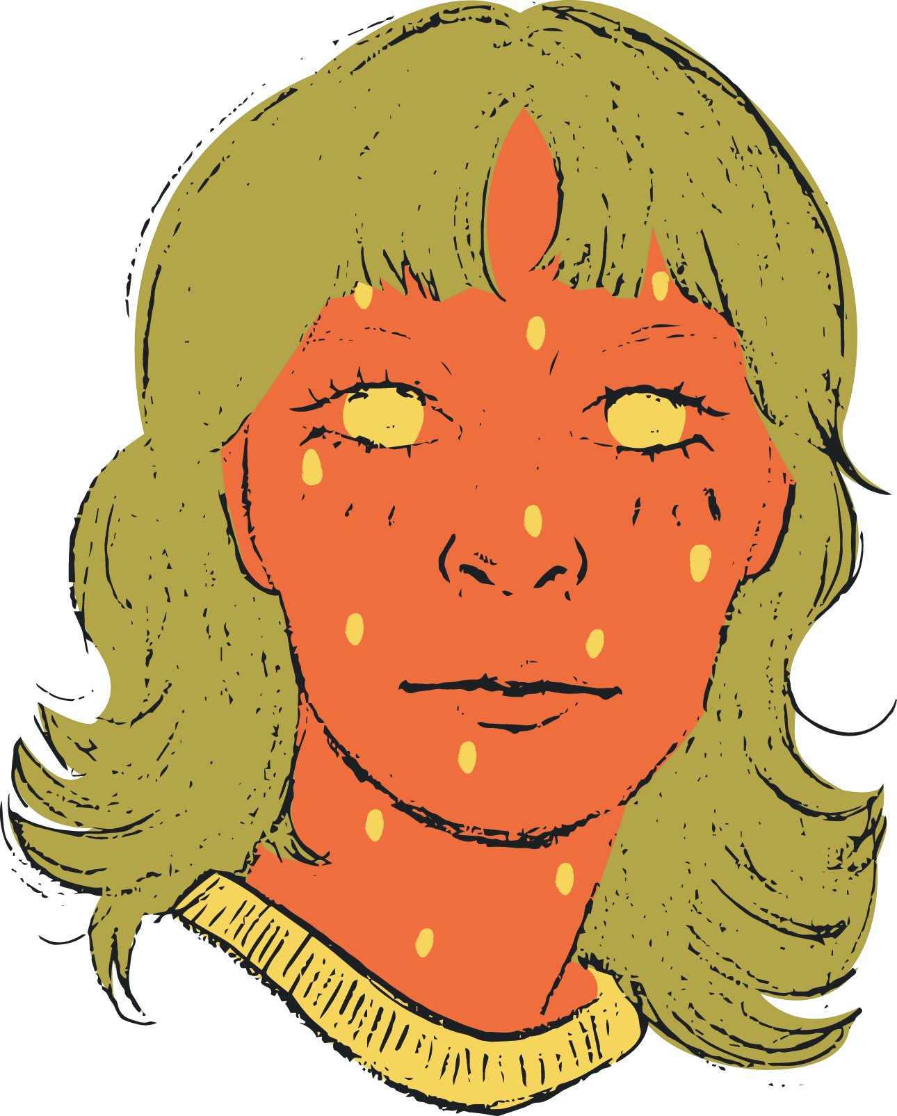
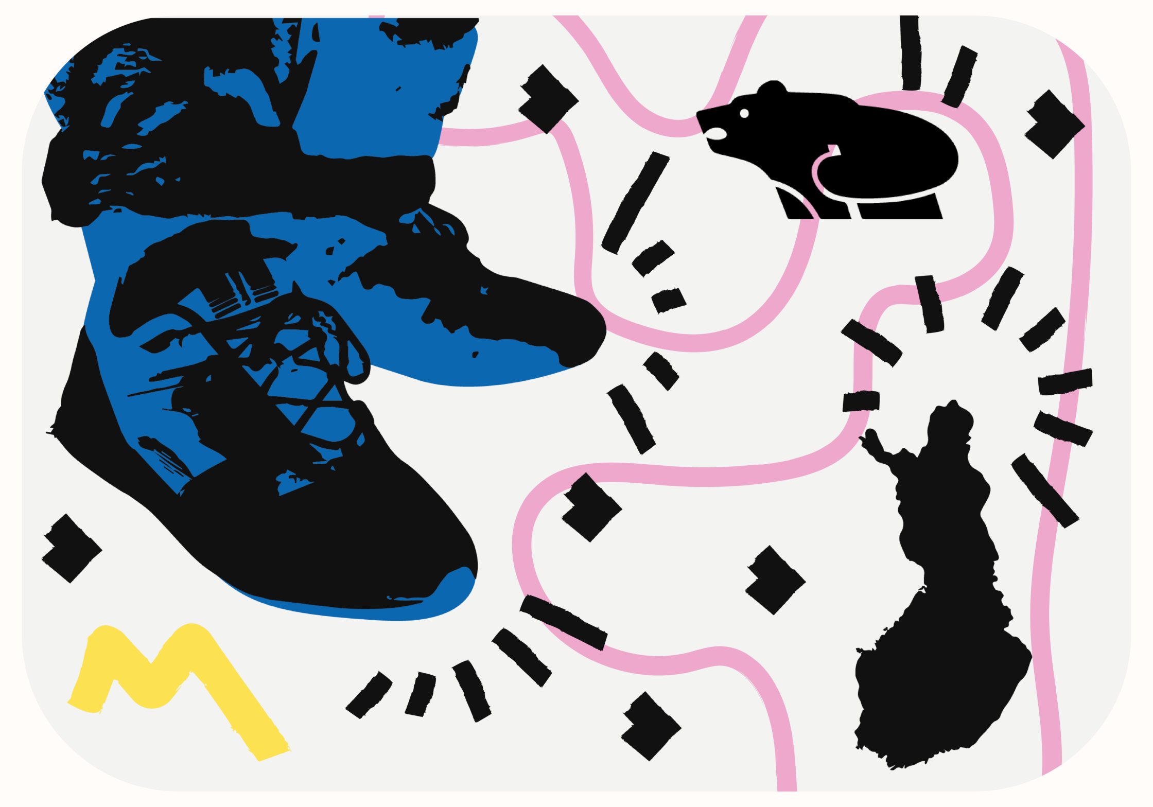
I rewrote my article, trying to make it more clear and to show more clear examples of the things was talking about. I also linked the photos/illustrations better to my text so the reader would get more information. I don’t know why my last spread was so grey so for the updated spread I made it more colourful and play into a more street style. What better place to experiment than on school projects! My proposition for Karhu is to make a mural with Keith Haring so I wanted to make that theme stronger by incorporating a flat bold and colourful graffiti style to all the photos making them vectors. I also used the same type of strokes Keith Haring uses in his art throughout the spreads to keep them all cohesive. I thought the style fit my article, brand and mural proposition well.