For assignment 2 (Random Starting point Case) you will work mainly individually. The starting point for this assignment is your own creative inspiration. This will lead you to develop strong personal images that will stand out in your portfolio. You will deliver three campaign images with a well thought out substantiation.
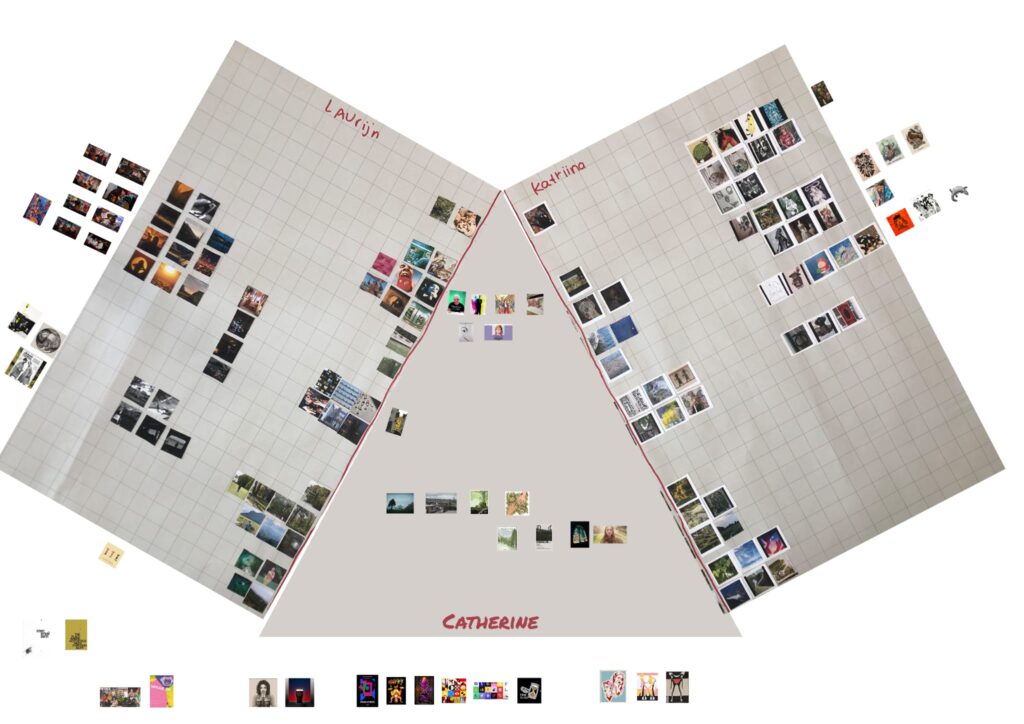
TEAM MOODBOARD
50 pictures of inspiration
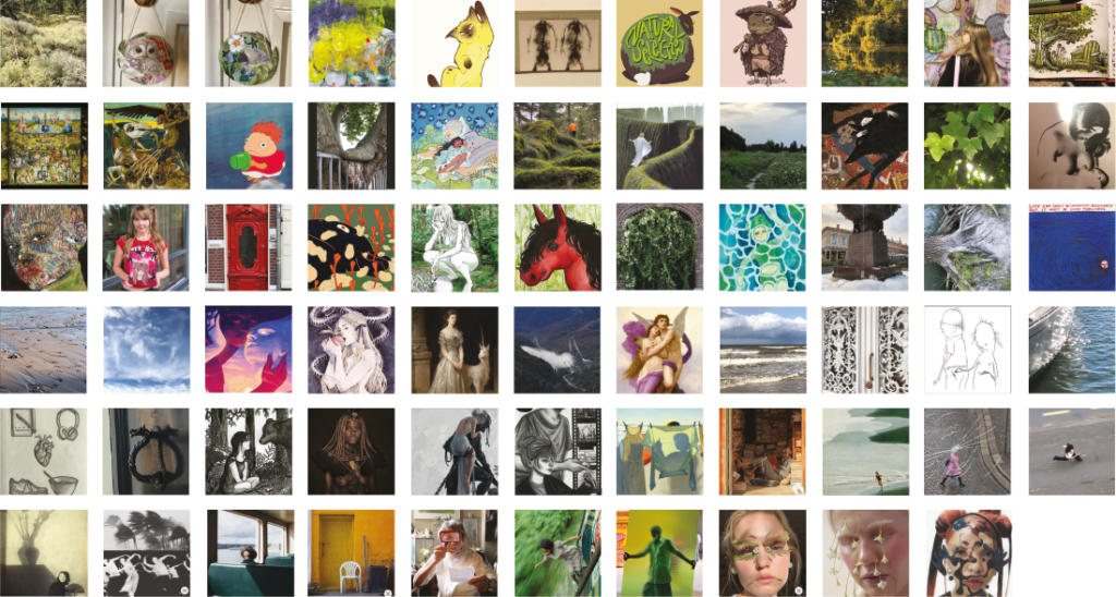
In case 2, I partnered with Laurijn and Catherine. First I compiled 50 pictures that inspire me. As I started searching for the images, I just thought back on the images that have really stuck with me. I chose the images that make me feel like “I really wanna draw that”. In class we cut them out and matched the images with our partners that matched each others aesthetics. We had some differences and and similarities.
How our work overlapped
- Interested in interesting compositions
- Patterns in our environment
- Nature, forest, water important to us
- A dreamy, melancholic, out of this world feeling
Where does it differ?
- Laurijn likes artistic photography and candid photos of people. The person is not necessarily the main focus but it is part of the composition.
- Vast spaces playing with composition and light
- A big, more distant idea of the world
- Abstract slice of life
- Catherine likes bold colourful images and sticker like pop ups.
I’m inspired by details in my surroundings, I like to create stories in my head of little things I see and personifying them. I get inspired by the present and the past, so I love to go to museums and get inspired by older artwork (paintings, video installations, sculptures). I had more illustrations, fantasy elements and patterns that you find in your surroundings in my 50 pictures moodboard.
I really liked Laurijn photos, especially the candid photos. It really spoke to me and I realised that is something I forgot from my pictures. Something that I was missing was also the big spaces playing with composition and light.
My interview on Laurijn
Analyse Laurijns work
- Laurijn has a lot of abstract work. She is interested big, vast ideas, 3D artwork and futurism. Composition and atmosphere are important.
What are her creative ambitions
- She wants people to feel something when they look at her work. She wants her pieces to be a conversation starter that will make people stop in their tracks and feel the atmosphere of her artwork. She likes a melancholic, surreal but still a somehow comfortable feeling. Like a feeling of home you can’t describe.
What artwork gives her energy
- Being in a place you can’t go, having a strong feeling of connection to the place. A melancholic and homey atmosphere, a slice of life of something abstract that doesn’t quite make sense. She is inspired by the artist Paul Milinski.
Her dream jobs after graduation
- Laurijn wants to be an art director, being in charge of the big picture, steering the design in the right way. She wants to be apart of big projects for example a fashion events and such.
Laurijns interview on me
Analyse Katriinas work
- Katriina showed me some of her recent work and she likes to use cute and fun personalities in her stories. Her illustrations usually have a scratchbook style which almost feels a bit sentimental. She also likes to use humor in her work
What are her creative ambitions
- She wants to create a place that doesnt exist, a story that you wouldn’t see normally. Also seeing the beauty in little things
What artwork gives her energy
- The real life world inspires her in finding fun stories to tell and create a new perspective
Her dream jobs after graduation
- She would like to work on print design so you can see your creative work come to live. Or designing bookcovers would be something she would enjoy.
My interview on Catherine
Analyse Catherines work
- Catherine has a vast spectrum of work she has created. She likes to do motion graphics and animations. As of late she wants to start drawing more. She is interested in folklore and creating a moody feeling in her artwork. She is not shy to try different mediums.
What are her creative ambitions
- Catherine wants to make a change in the world. She wants to do work that correlates with her values for example making mental health help more accessible for everyone and helping those in need. She wishes for a more accessible world that is kinder to everyone.
What artwork gives her energy
- She gets inspired when she is working on big projects. For example projects with music and arts.
Her dream jobs after graduation
- Her dream job would be creating a documentary bringing important subjects to light. She wants to create her own designs and be a part of big projects like creating the designs for a music festival.
Catherines interview on me
Analyse Katriinas work
- Katriina’s work has a lot of mood within the composition & really draws you into the world within the image. Katriina is skilled in empathising with character/ subject which I feel helps develop pieces, worlds & character development and how you interpret them.
What are her creative ambitions
- Katriina wants to work as a team in a design studio where they work together to see their designs come to life & create beauty in everyday life.
What artwork gives her energy
- Katriina is inspired by details of objects and forms withing nature and everyday life. These details allow Katriina to create story’s and personality’s out of these unique shapes & objects which inspire all of her work.
Her dream jobs after graduation
- Katriina wishes to work withing the design industry, specialising in illustrations for book covers and packaging. I feel she would be a great fit for this as from analysing Katriina’s work character design seems like a brilliant fit for her as she is able to create really impressive & interesting characters & worlds simply from her imagination.
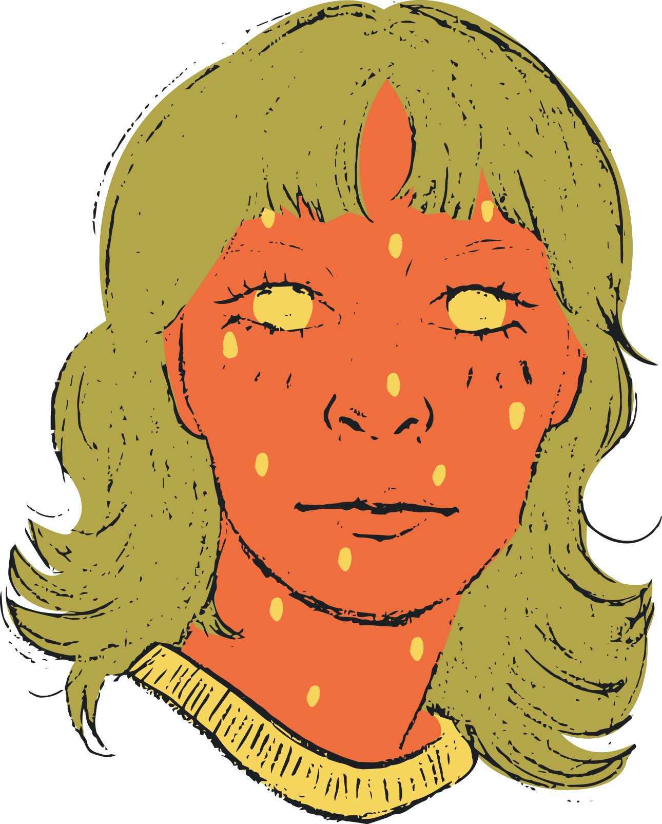
50 funny sentences and 5 sketches
On this exercise I worked with June. We started with one word and added more to the paper of things that we were reminded of. After that we picked out random words and made interesting sentences from them. It was quite a fun and creative way of coming up with concepts. When I’m feeling stuck on what I should do for a concept I want to try this again. You can really come up with alternative out of the box ideas this way. Below you can see the 5 sketches and the sentences they were formed from. I chose these sentences because they were either funny to me, made me happy or made me feel comforted.
Clicking this link you will fill find all the sentences we cooked up:
https://docs.google.com/document/d/19A9qfeDUqTYwaK557h8bimHXyftcFyhqbJX503SYiRk/edit
Feedback
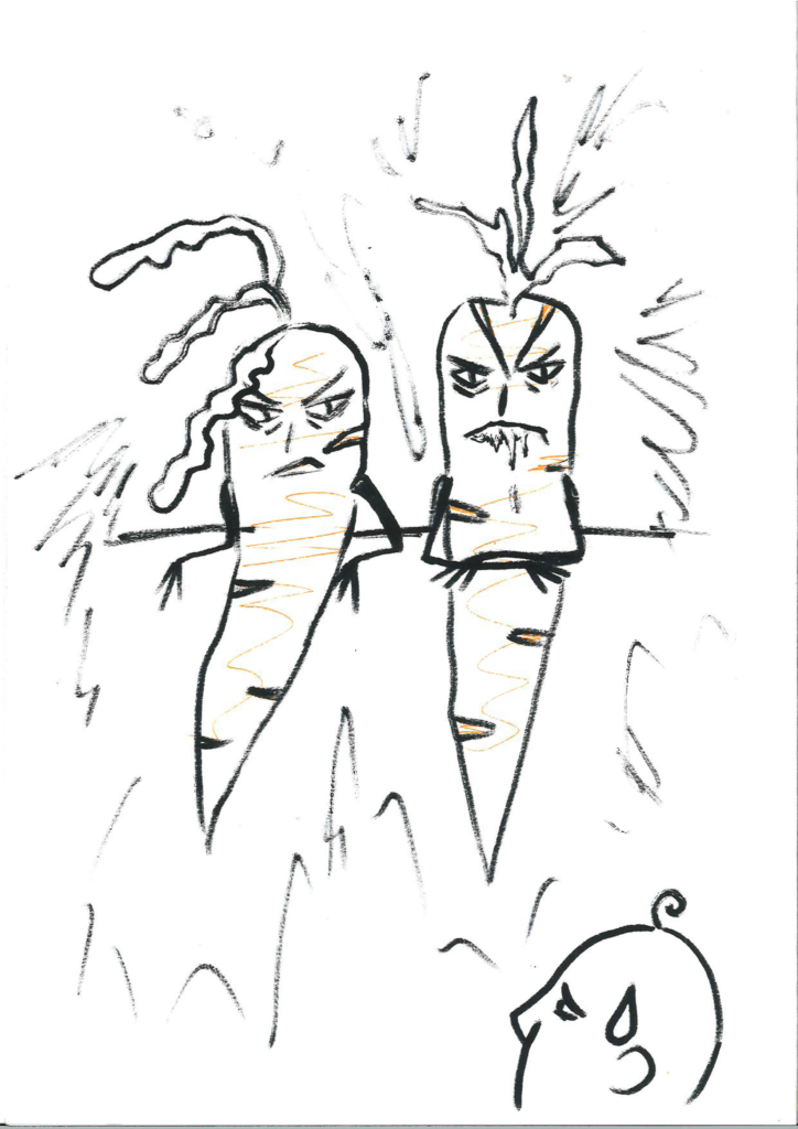
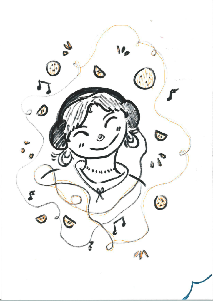
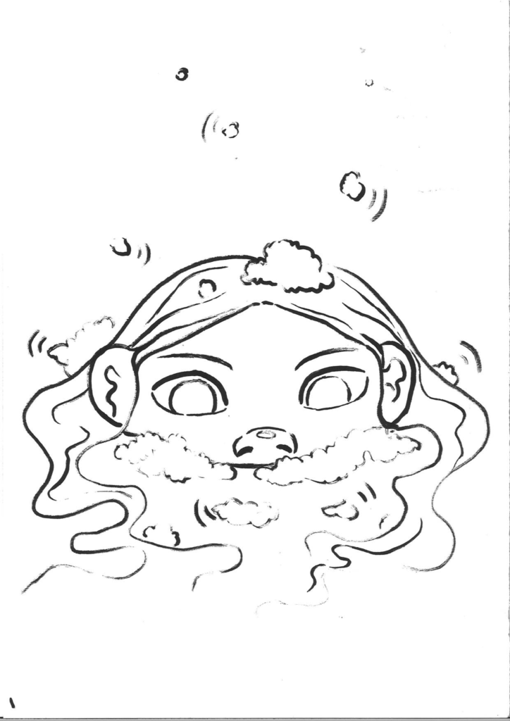
My personal favorite was the sentence and picture of “More people should quitly listen to foam in water. Then the dangerous carrots and then the constellation picture. But I wasn’t confident that you could make a lot variations from the foam picture. Rob also said that he liked the the head emerging from some liquid and that this in between state creates suspense.
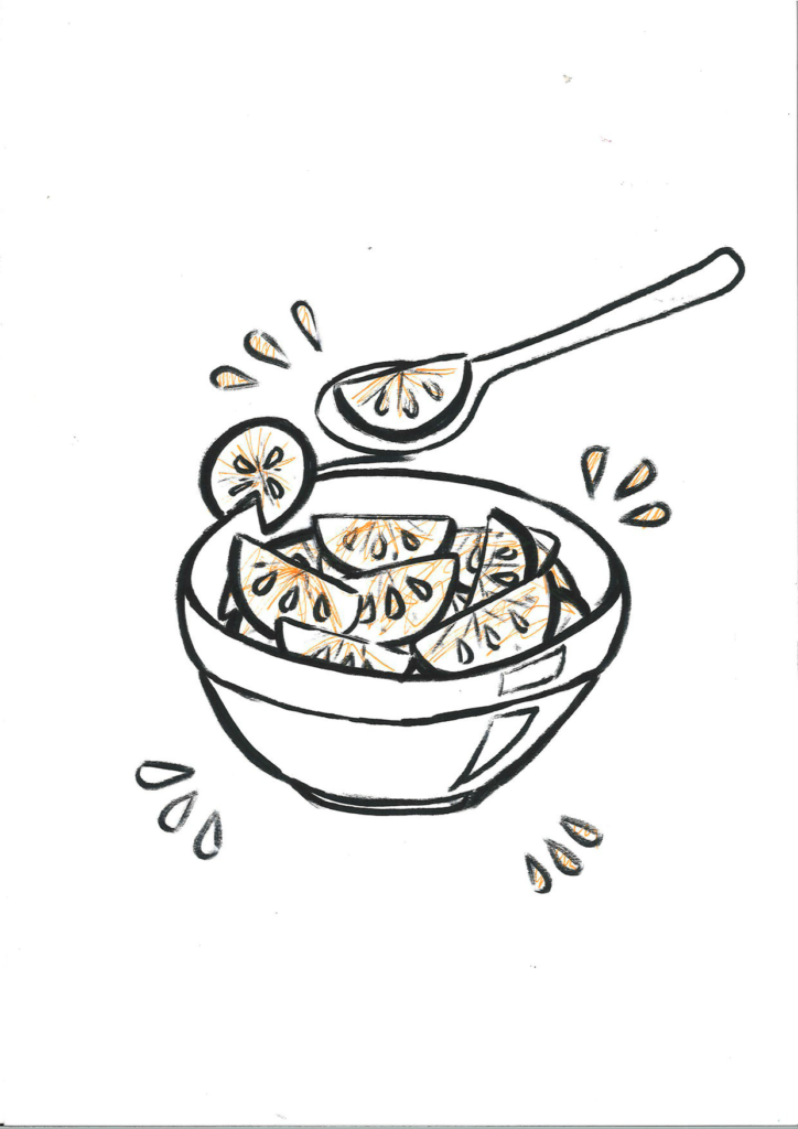
The mandarins in a bowl got feedback that it could work well because of its simplicity. I could take it a step further by combining something mundane like a bowl and putting something crazy in it to create a surreal picture.
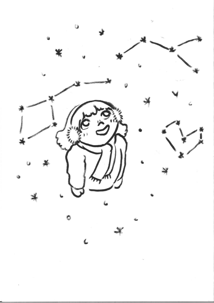
People liked the constellation sketch. I got a suggestion that I could do it with watercolour and that I could try to flip it around and put the constellations on the ground instead of in the sky. Or there could be something else on the ground or perhaps something else in the sky. After this feedback I chose to work further on the constellations because i felt like it had a lot of elements that I could work with. It had the most potential for story telling and making a lot of variations with.
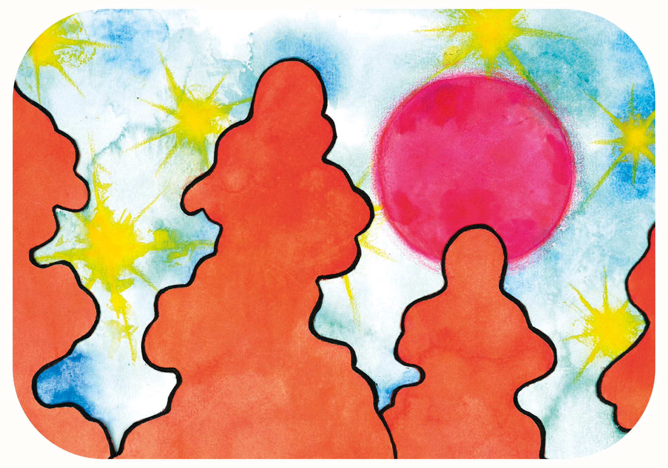
9 updated sketches of constellations
For next time I made 3 series of the Constellation sketch I chose.
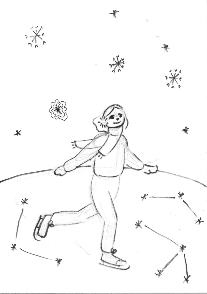
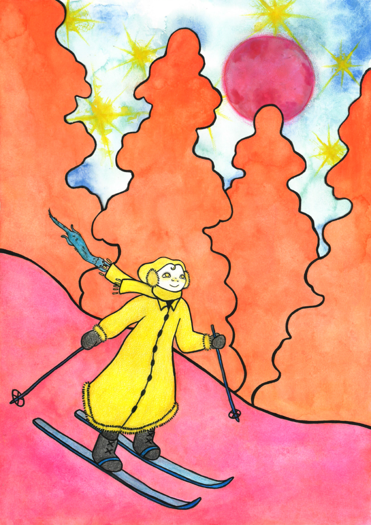
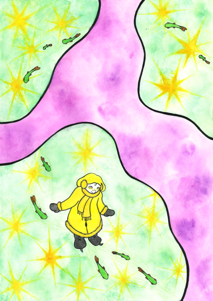
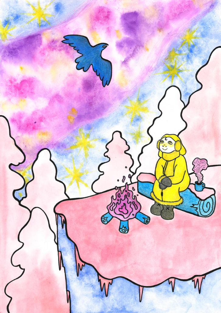
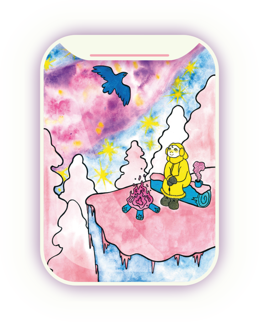
I made a series of Snow, Space and Ice. I just spun the different elements around to create different variations. I really liked the winter theme because all of them have a quiet, peaceful and grateful feeling to them. A lone traveler who isn’t feeling lonely.
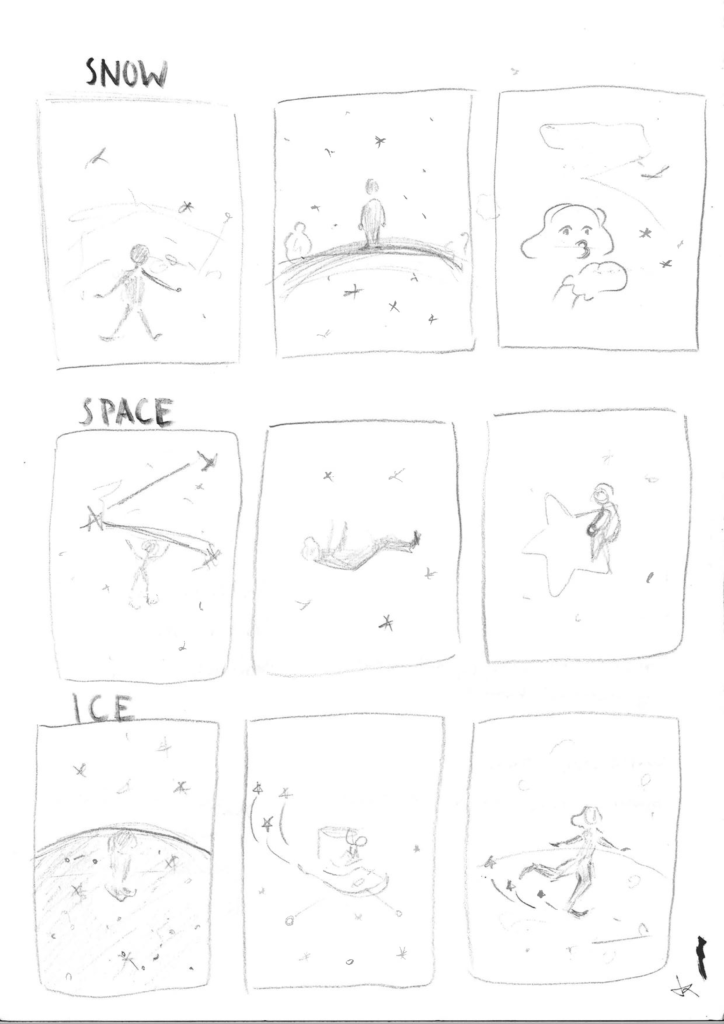
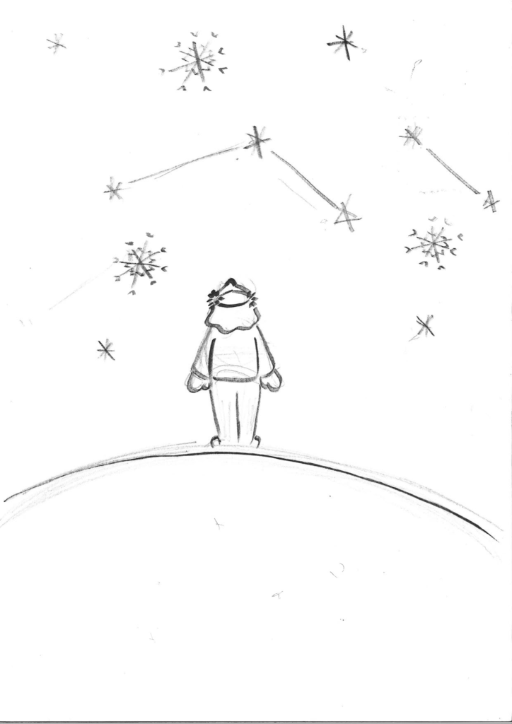
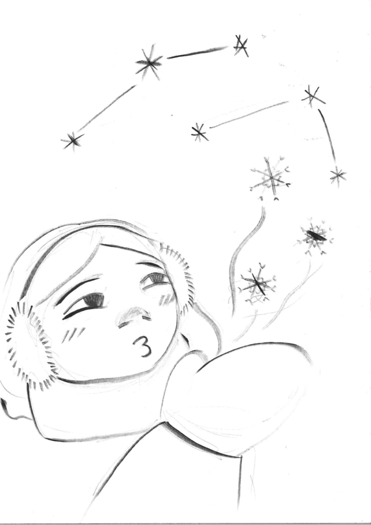
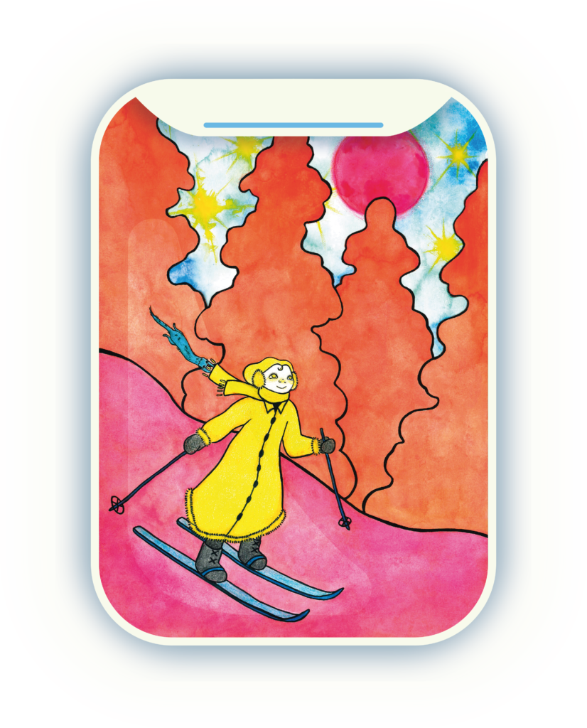
In the Snow theme the girl is looking up to the sky and the contellations.
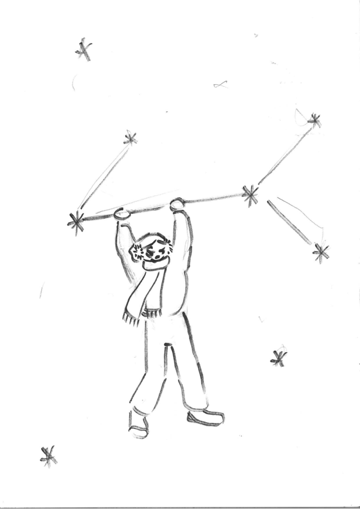
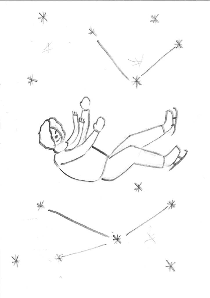
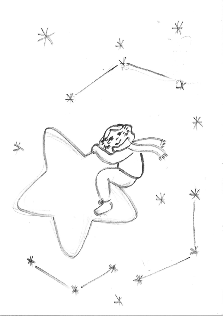
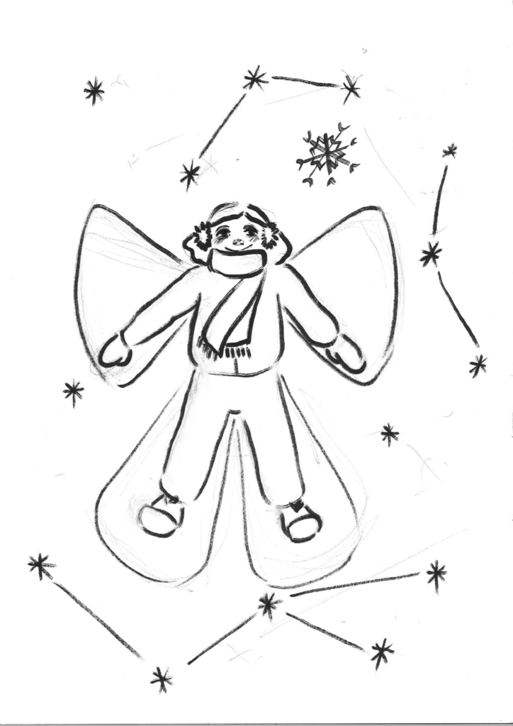
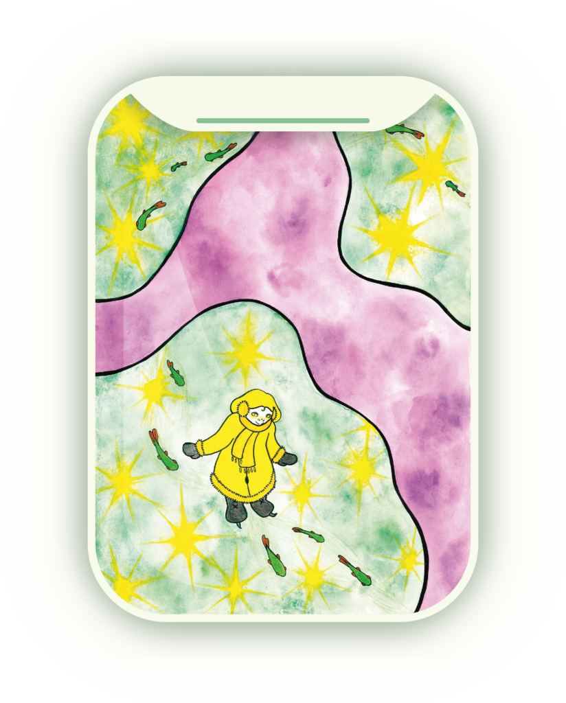
In the Space theme the girl is among the constellations, floating and holding onto stars.
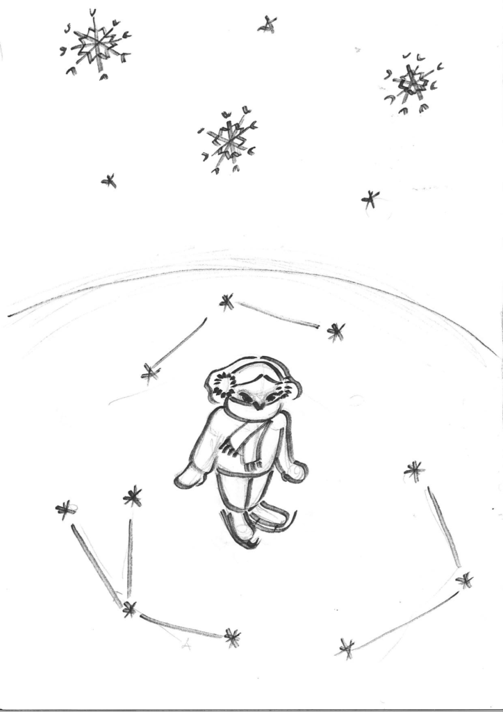
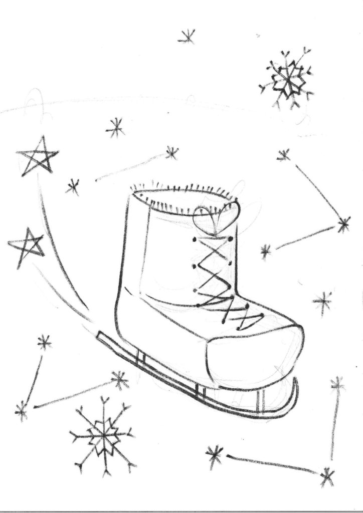
In the Ice theme the girl is ice skating and the constellations are in the ice rather than in the sky.
Feedback
Lotte suggested that I could change the girl into different animals ice skating which is an adorable idea! They could I either be nordic animals or animals from the warm countries. I think it was a good idea but I still wanted to keep the girl as the main character.
Rob questioned that does the girl have to have skates in the Space theme, she could also be dancing or doing gymnastics among the stars. I really liked the winter theme though so I won’t be going with this. I also got feedback for the Ice theme from him that the ice skates could create cracks in the ice that are in the shape of the constellations which I really loved the idea of!
Lars said that the Space theme reminds him of the book Le Petit Prince. I got the idea from him that the girl could be skating on different planets or different colors of ice to make the Ice theme more interesting.
My personal favourite was the Ice theme, since I really liked the idea of the constellations being cracks in the ice and not in the sky. I was also very inspired by making the the ice colourful or possibly a foreign planet.
2 proposed brands
I was sick this week so I couldn’t show my process in class but these were the two brands I considered. I wanted to do a magical travel campaign and sought for travel agencies and such.
Proposed brand 1
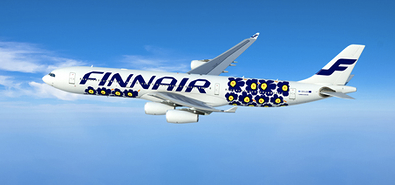
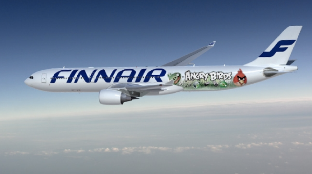
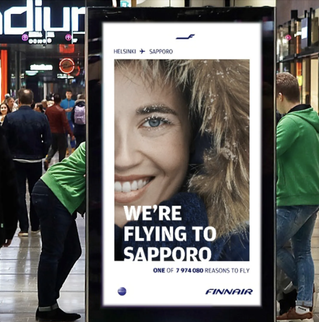
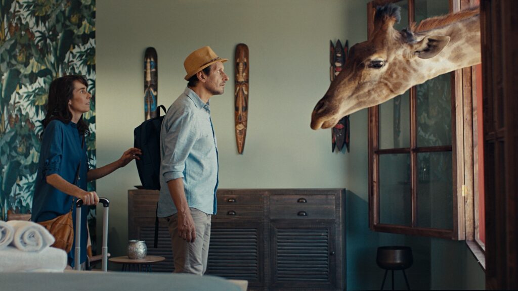
I thought Finnair would work well with the campaign I was planning. Looking at their previous campaigns they do a lot of collaborations with Finnish brands.
Earlier relevant communication by this brand
Proposed brand 2
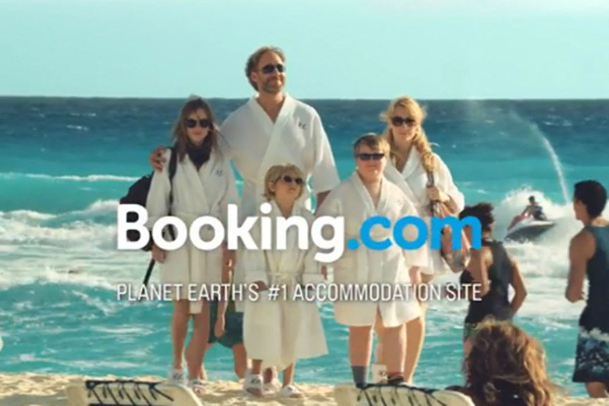
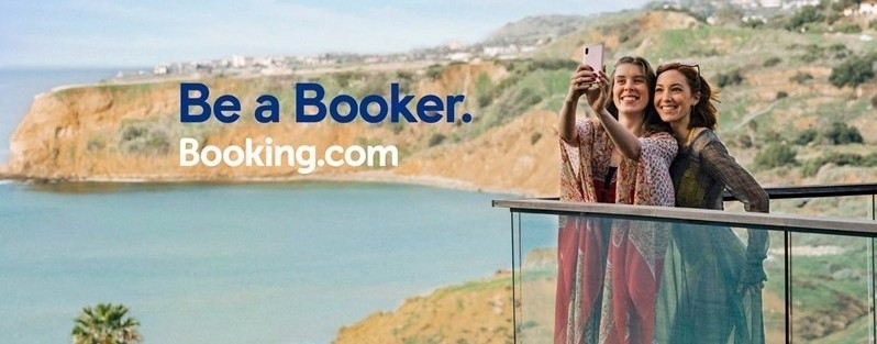
I was also thinking of doing a travel agency for example. I’ve used Booking.com myself so I started looking more into that. Their campaigns are mostly in tropical scenery.
Earlier relevant communication by this brand
Decision
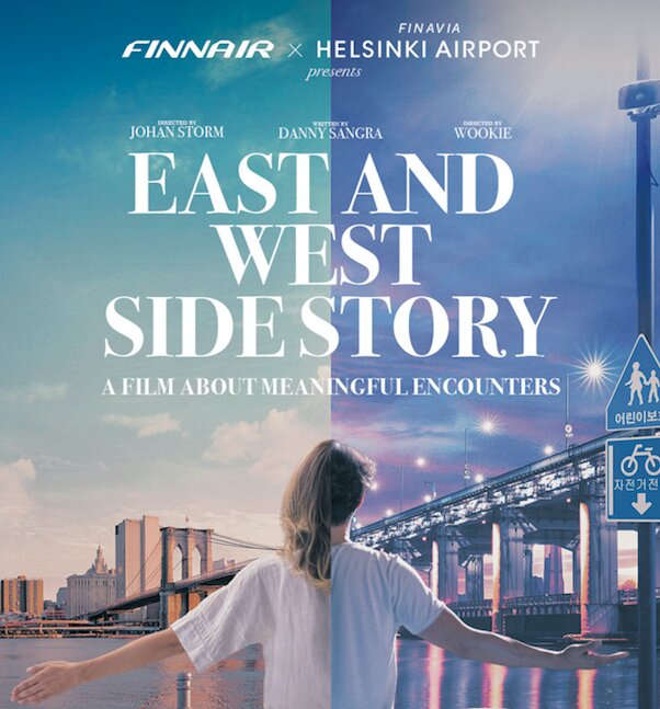
So I decided that Finnair would work better for the purposes of my campaign. It fits with the brand because they have a lot of collaborations with Finnish brands and I wanted to advertise Finland. I have a colourful outer space world in mind and not a tropical island. I thought they had more imaginative campaigns also and that’s why it would fit better with my concept. I liked that the planes had different prints with Angry birds and Marimekko, and they made a whole film to promote Helsinki Airport and Finnair.
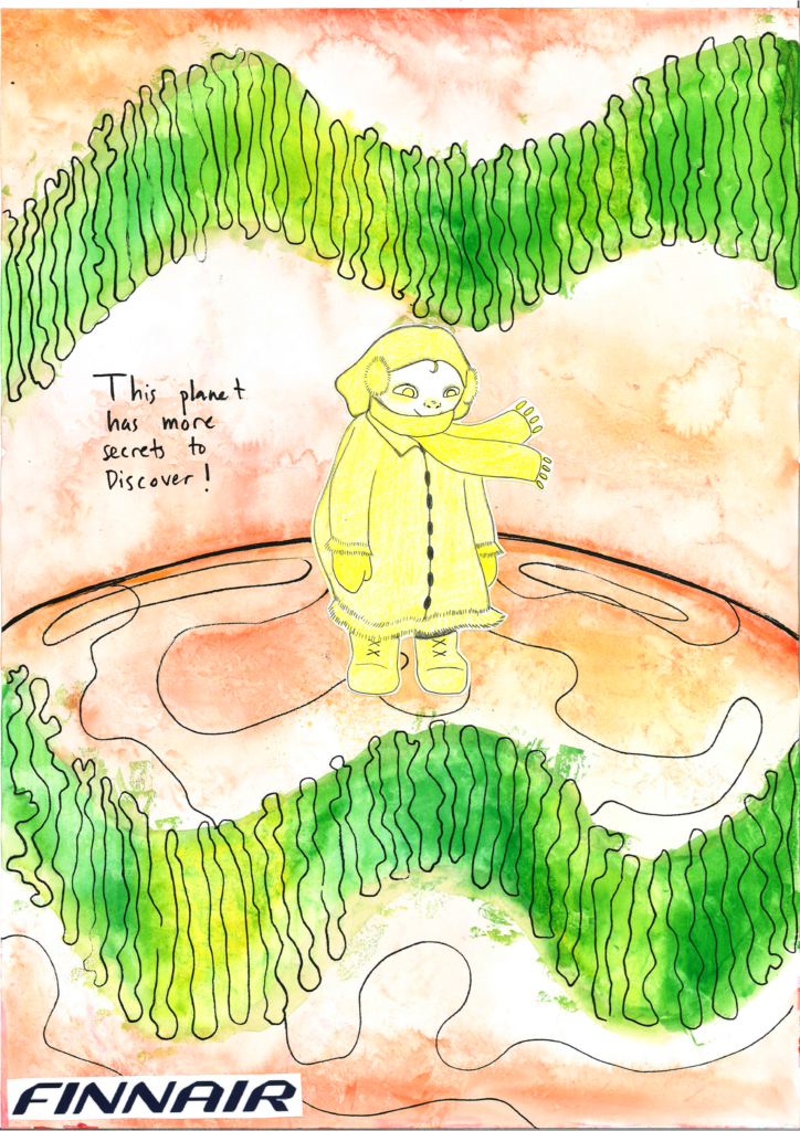
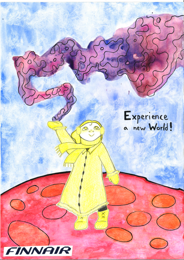
2 sketches with brand logo
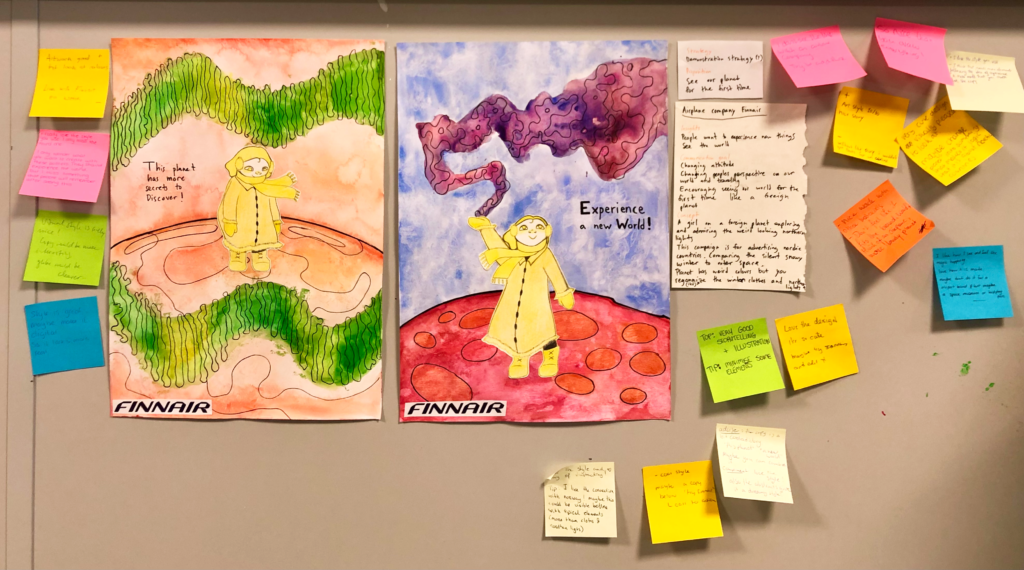
Presentation
I made two posters for Finnair which is a Finnish airplane company. This campaign is for advertising traveling to nordic countries. I wanted to pair it with Finnair so it would make sense that they are advertising the nordic countries.
Insights
People want to experience new things and find something new. People want to travel to interesting places and see the world.
Communication goal
Attitude. Changing peoples perspective on our world, nordic countries and traveling. Encouraging seeing our world for the first time like a foreign planet.
Proposition
Experiencing our planet for the first time.
Strategy
Demonstration, Showing facts? I’m not quite sure.
Concept
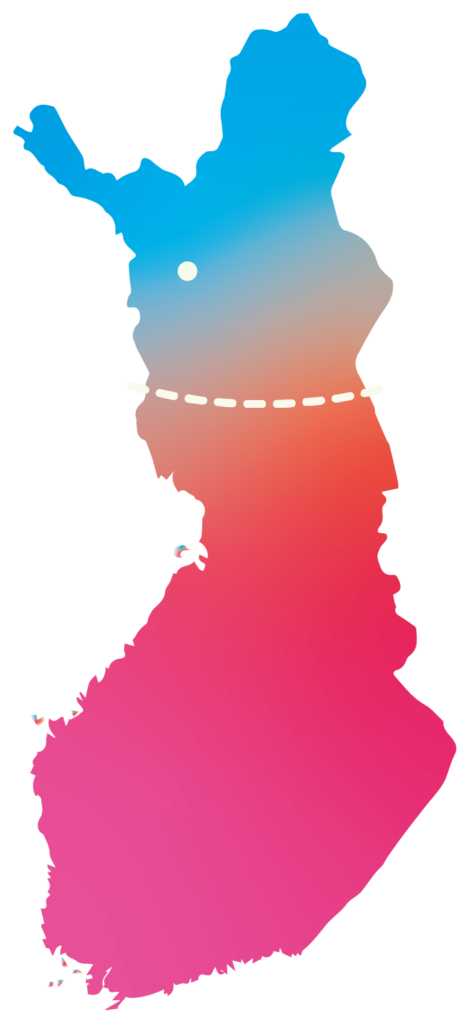
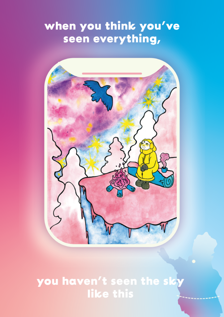
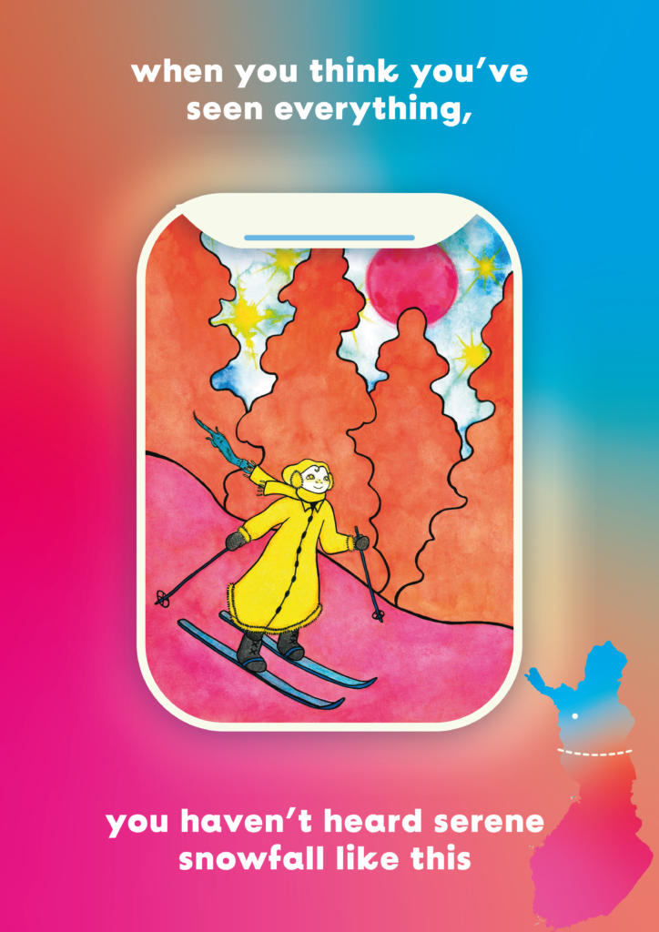
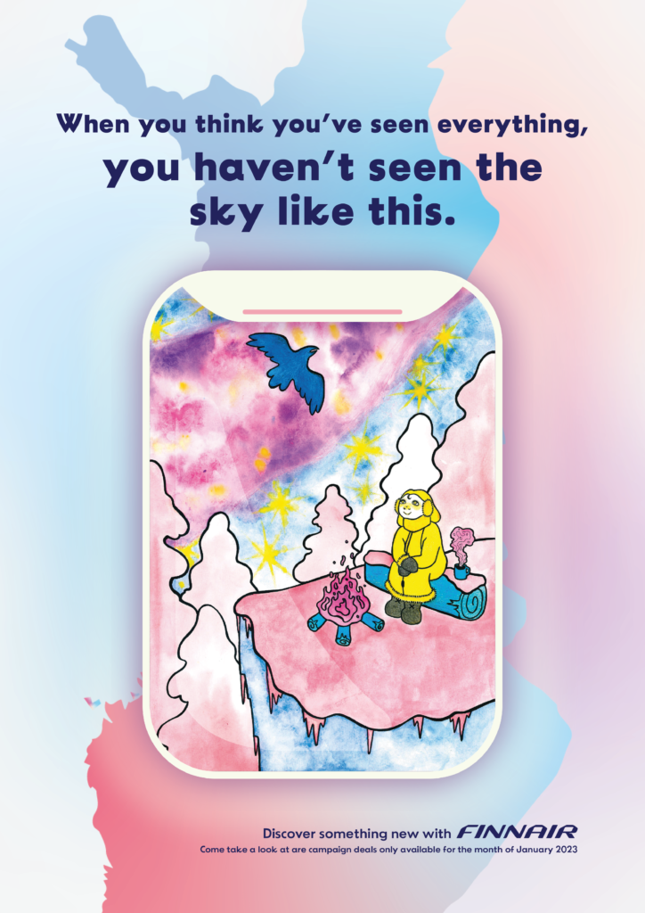
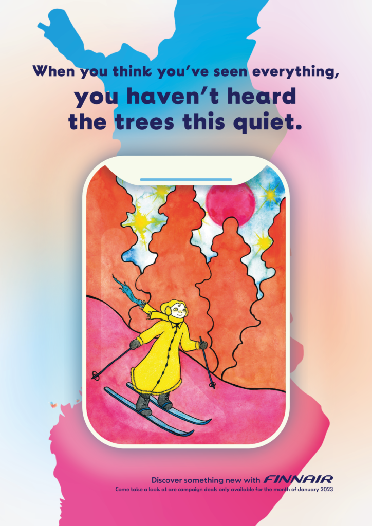
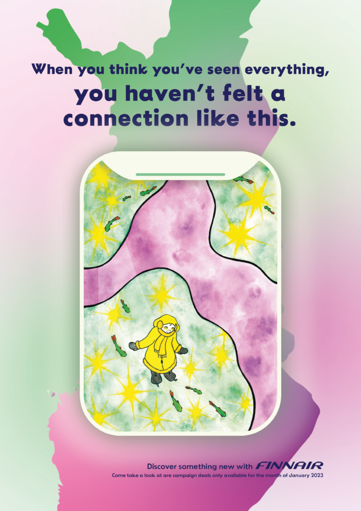
A girl on a foreign planet exploring and admiring the weird looking nordic lights. I wanted to compare the silent snowy winter to outer space, because I think it is very special. The planet is weird colors but you can still recognise the Lapland/nordic scenery because the girl is wearing winter clothes and the northern lights are lighting up the sky.
Feedback
Feedback from my classmates
- People liked the art style and they liked the magical, dreamy feeling.
- People didn’t really get the correlation with airplane without the explanation, so I should work on bringing the nordic scenery better into the picture.
- I should show the things to discover, now it’s a girl on a lonely planet, what is she seeing?
- I should better my copy and add a call to action.
I feel like like the illustrations are quite disconnected still from the brand and the idea I had. It should correlate better to the nordic nature so people can understand it is a travel campaign.
Feedback from the teachers
Rob suggested I’d make one poster with the northern lights, another with forest on one with lakes. Rob gave me feedback that he liked the childrens book illustrations style. He suggested for the copy I could use real quotes from children why they like nordic/Finnish nature, to convince families with kids to travel there.
Lars said that the quotes should refer to the landscape more so if it’s an illustration with forest the quote should refer to the woods too. He also said that he doesn’t mind that the scenery is a foreign planet.
Lars and Rob both pointed out the importance of keeping the logo on the bottom right corner because the western order of reading. Now I will never forget this haha!
Making the final executions
I painted my final illustrations with watercolour and some coloured pencils. The lines are with black marker to give it that cartoonish clean look.
Sadly the bright colours didn’t reach CMYK colours. In Photoshop I tried my best to bring the colours back.
I wanted them to connect more to the airplane theme, so in Illustrator I made an airplane window they could sit in.

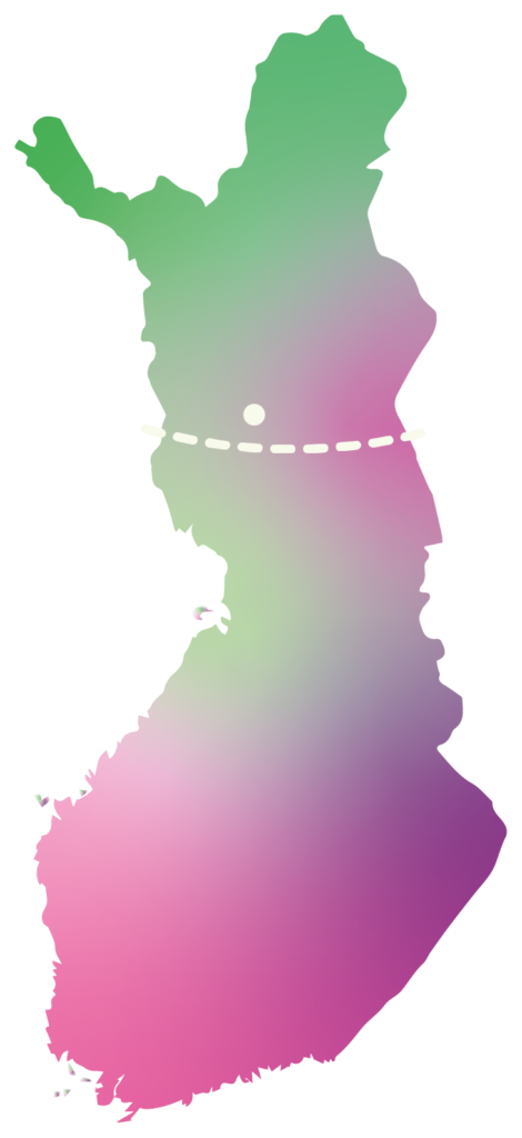
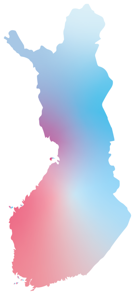
My boyfriend suggested I could add Finland in the poster and give locations where the illustrations would hypothetically be located. So I searched where my illustrations could take place in Lapland. I added the respective gradients to link them to other.
When I was compiling the layout, I couldn’t figure out how to put the country and window together in a balanced way. In the end I ditched the locations and layered the illustrations.
(First attemps)
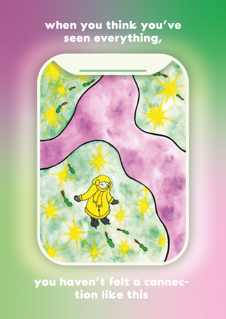
Final executions
Copy
I wanted the copy to be magical and inspirational. It fits with the promise “experiencing our planet for the first time”. It encourages the reader to go and experience something new to them. It reminds the reader that they haven’t seen everything, there is a whole world out there to be explored and that moments are special and one should be present and experience them to their fullest.
Typography
I’m really happy with the typeface I found. It’s playful but still looks professional. I’t reminds me of the typeface that Finnair uses themselves. I made the text the same dark blue Finnairs logo and text is.
Illustrations
I was most excited for the illustrating of this project. I wanted to try something new and get better at water colours. I am not experienced with water colour but I thought it fit best with my concept because the colours blend together nicely and won’t come out even in the end. It gives a whimsical feeling to the piece. I went for a story book type illustrations to show future workplaces that I’m capable of doing different styles.
I’m happy with the silhuette of the country behind the airplane window, I think it gives it a more travel ad feeling.