We swapped Brandbooks with our classmates and we were instructed to make a campaign with it. In the end we would give a Pecha Kucha presentation of our process and our final executions. The executions would include 1 digital expression for an online ad campaign, 1 physical expression for offline marketing and 1 physical POS (Point of Sale) material that can be used at the retail location. In this assignment I was the “hired graphic designer” and the creators of Momento where my clients.
Momento
I got the brand Momento which is a store where people can go and get inspiration for a piece of art to remember their loved one. It could be an unique urn or a beautiful jewelery piece for example. The brand has a calm and serene feeling to it but it is not too sorrowful because Momento wishes this to be a happy memory of capturing your loved ones memory.
Plan for Momentos campaign
Death can be a touchy subject so I wanted this to be well done so it wouldn’t come off as a joke or disrespectful. Momento is a taboo shattering concept because it doesn’t want death to be a very sad and terrible thing, at Momento they wish to celebrate the deceased person and capture their aura in a piece of art.
First thing that came to my mind was a phoenix. It fit well with the theme of death and reincarnation. Since the phoenix is a fantasy immortal being that dies and reincarnates itself over and over again. But I thought that maybe that would be a little too ritualistic, since Momento should fit well in the modern times.
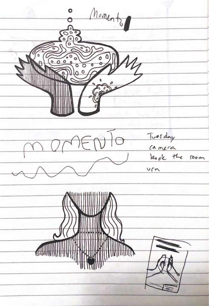
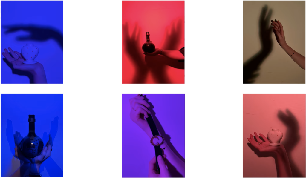
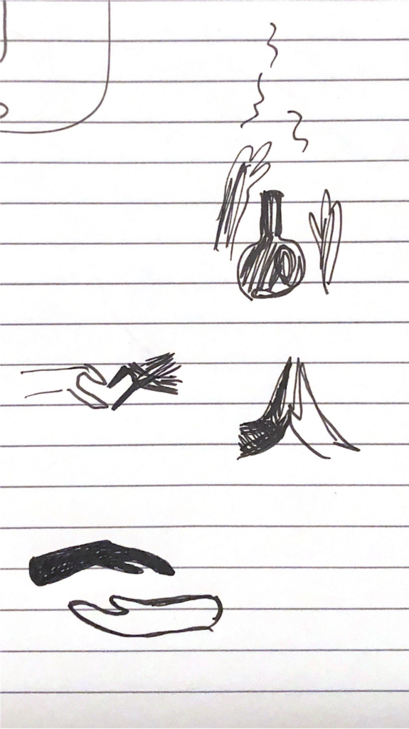
I wanted to show the connection between the deceased person and the one in the living world. I thought this could be best shown by hands holding the urns or jewellery from Momento. One hand would be the deceased person and the other the one still living. I decided to show what I had brainstormed until then to Laurijn and Sarah and they help me to further my idea and make it more symbolic.
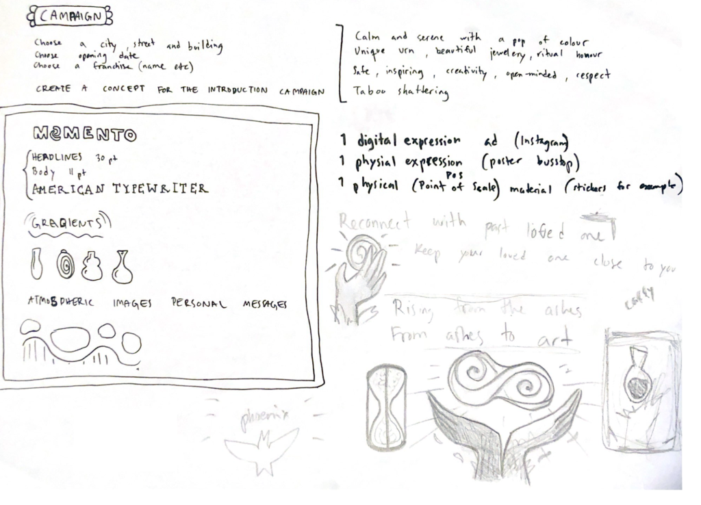
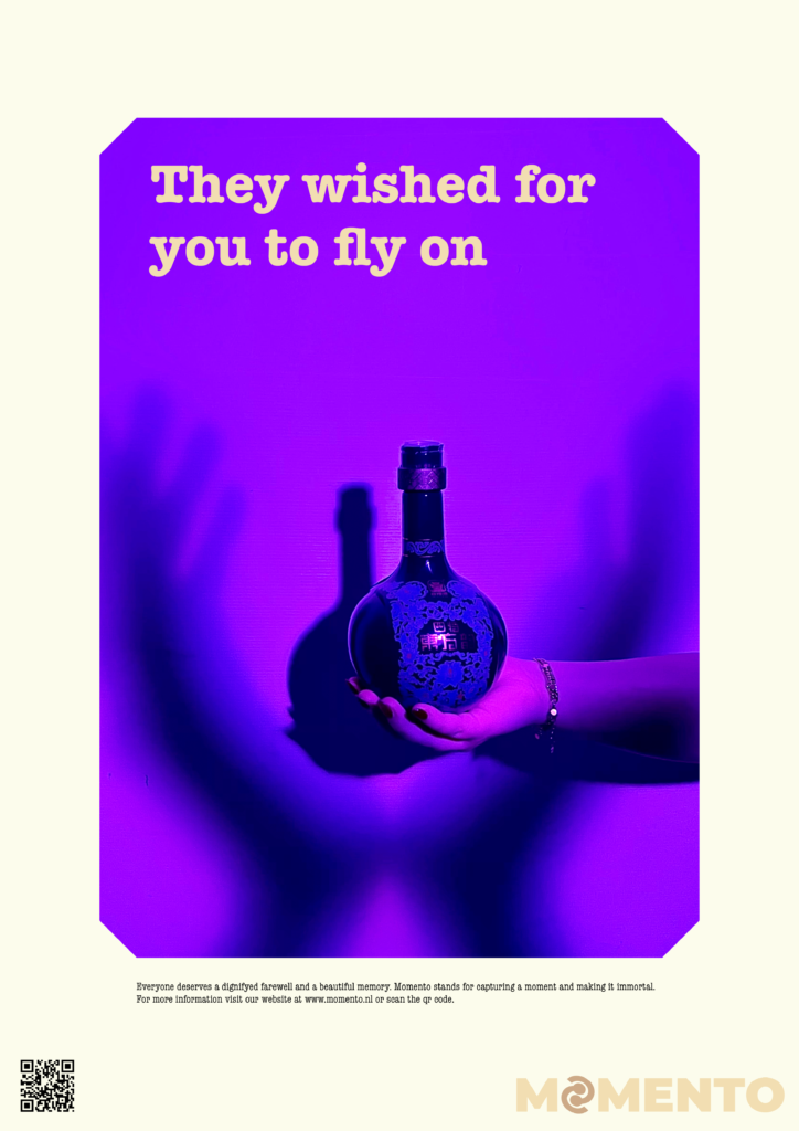
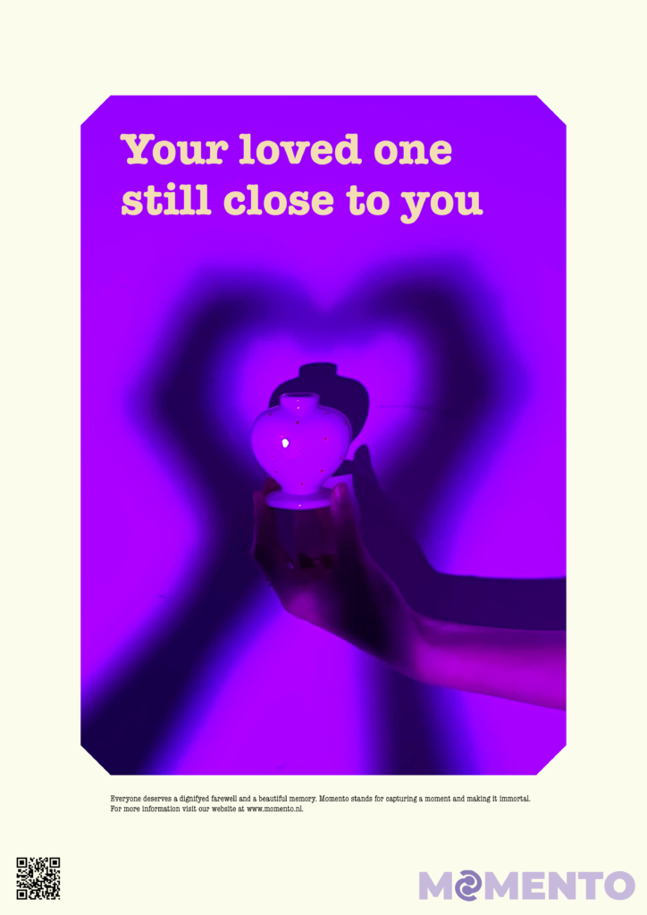
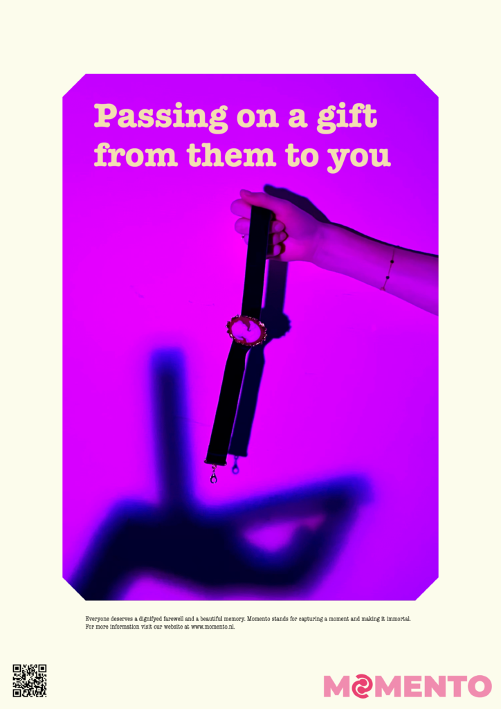
From our talk the idea bloomed further. It was to make one of the hands a shadow to represent the past loved one, together they would hold the urn. The hands position would remind a little bit of a phoenix with it’s wings spread out. The phoenix represents freedom death and reincarnation.
The other idea was to display the jewellery on a shadow person to represent the person whose ashes it had been made of.
Taking photos for Momentos campaign
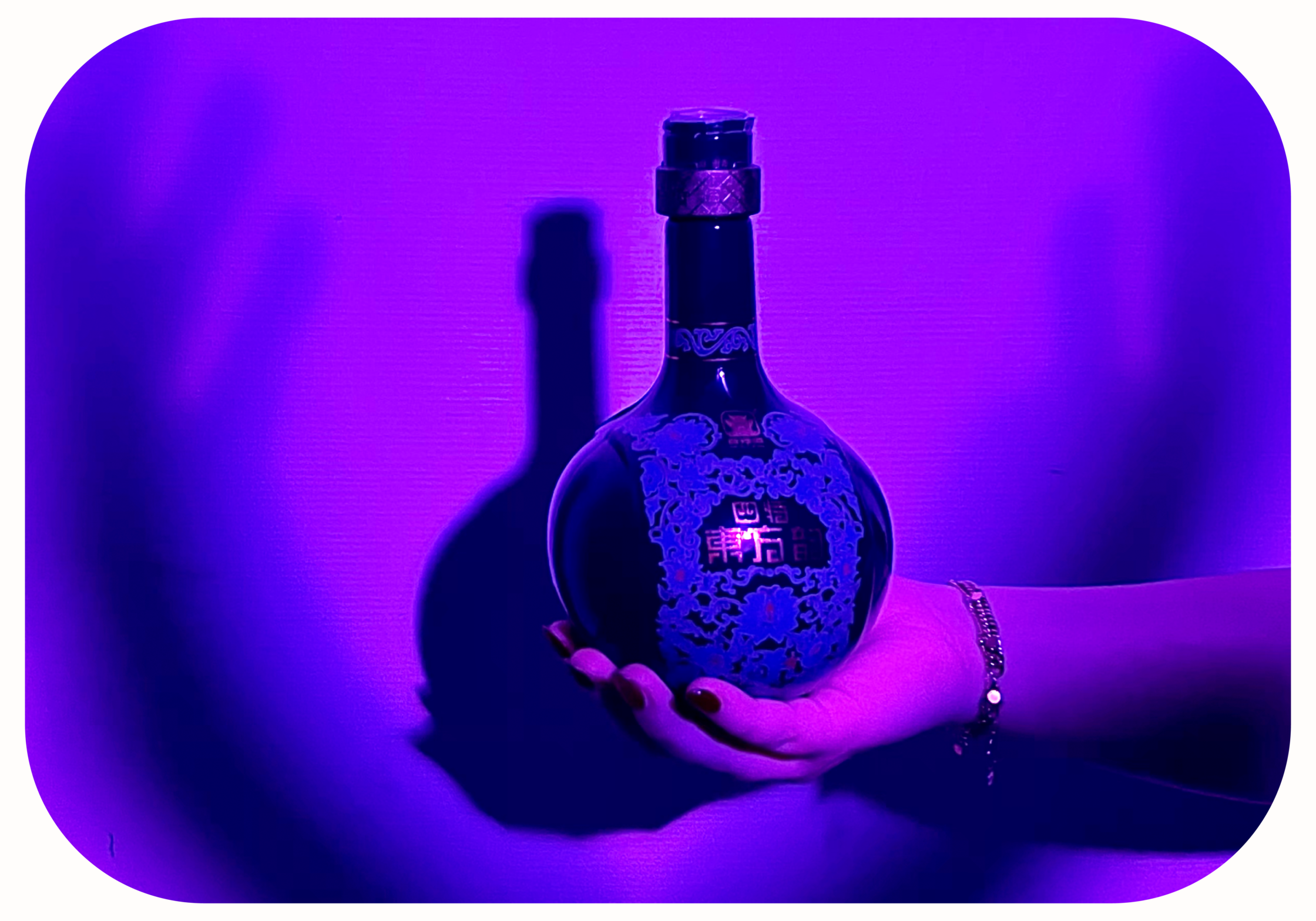
I wanted to take some photographs for my campaign idea, but I couldn’t do it alone, so Laurijn and Sarah naturally came along as the creators of the brand. I booked the photography green screen room and brought a decorative vase we could model as the urn. Laurijn had a colourful light, which she brought with her, along with some decorative vases she had and jewellery. We set up the backdrop and lights and started taking some photos based on the sketches I had made. It was a fun collaborative process and I was very happy with the photos that came out.

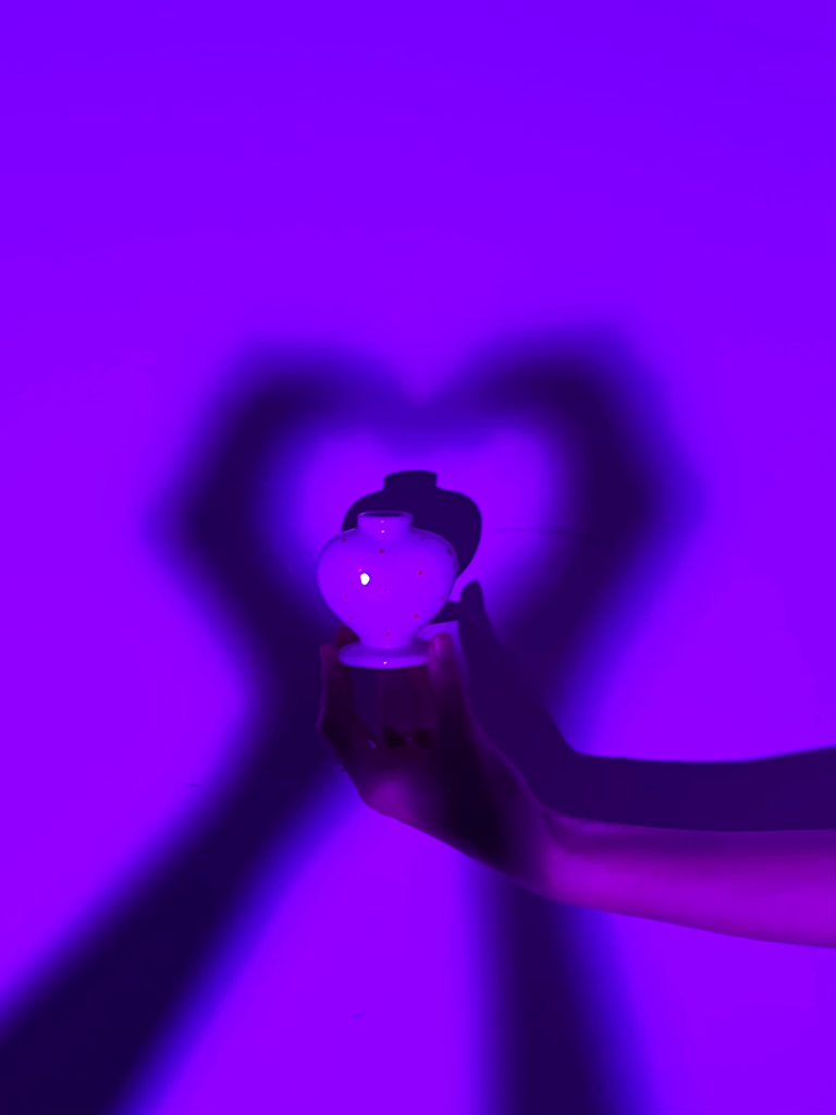
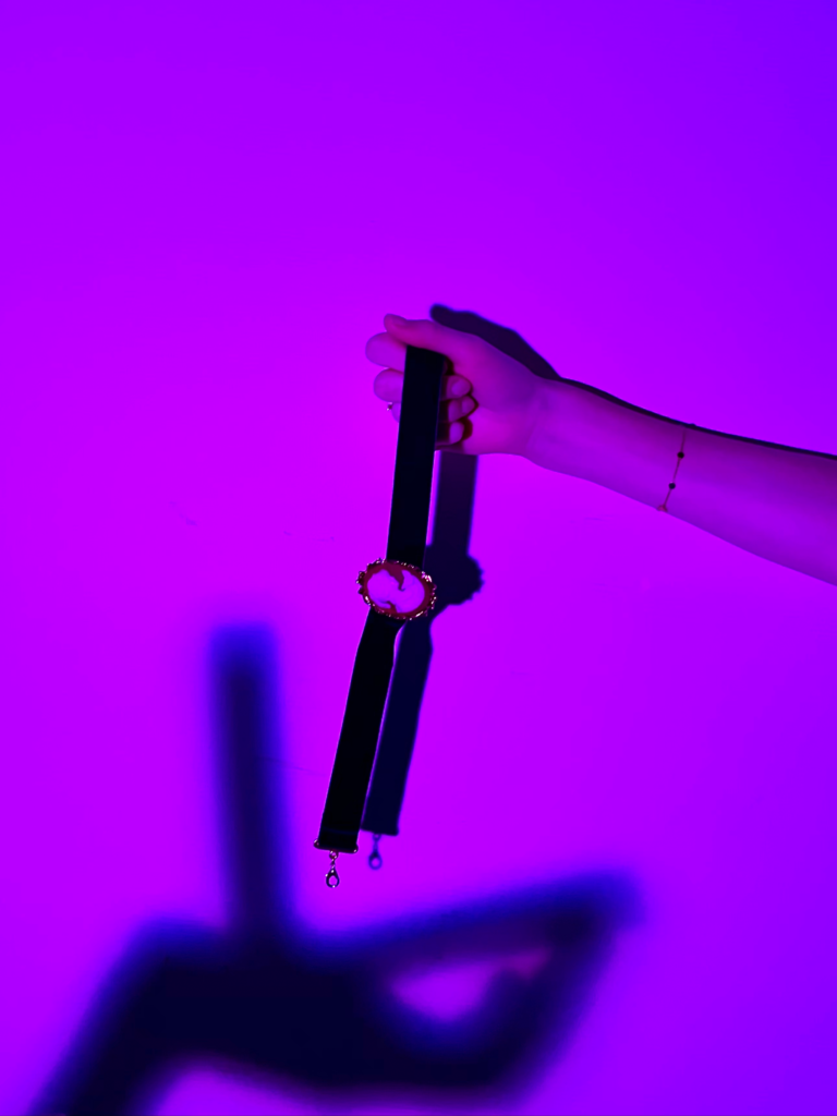
We took multiple but ultimately I chose these three as my favorites to work further on. The shadows represent the one who is passed away and the hand holding the piece of art is the person left with the memory of their loved one. I made sure that the photography aligned well with the style in their brand book.
Final executions
Physical expression for offline marketing
For the offline marketing I made a poster for a bus stop.
I made a series of 3 offline posters because I wanted to figure out the main copy that I would use throughout my expressions. I wanted the text to be comforting and inspirational. The edges of the photos give an old photo album feeling to it to give it a sentimental feeling.

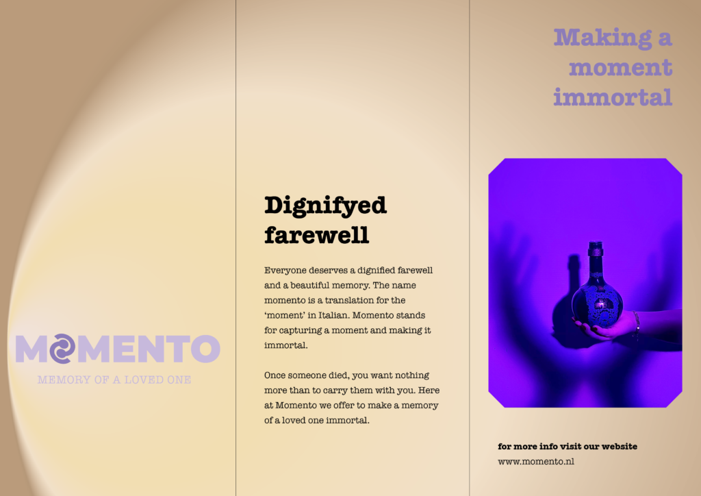
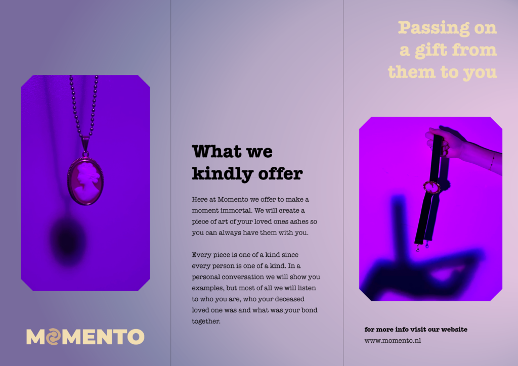
Physical POS (Point of Sale) material
For the POS material I made a brochure. It introduces Momento and what they do for new customers. This way they can take something with them from the store to make a carefully considered decision.
Digital expression for an online ad
For the digital expression I wanted to show an instagram mystory ad.
I think it’s very important for Momento to be active social media. One of their most important goals is to brake the taboo that death has.

PECHA KUCHA
For our last class of this semester (sniff sniff) we had Pecha Kucha presentations about our process of creating the campaign for the other BIG.
Here are my 20×20 slides:
Here is a link to the presentation moment that was filmed in class:
How it went
I was quite nervous to present my work and to talk in front of audience. Prior to this i practised my speech a lot so I wouldn’t freeze during my presentation. All in all I thought it went well, so I was relieved! I got to say all I wanted to and I talked slow enough! Yeyy go mee!
This was my first time doing a Pecha Kucha so as I was compiling it together I looked for inspiration on the world wide web on how other people had done them. The ones that I saw had no text or max three words on screen and a lot of graphics to keep the audience engaged and to drive the point home. I wanted to talk about my process and how my executions came to be, based on which feelings and themes I wanted to convey. First it felt quite overwhelming but around slide 6 or 8 it started making sense and coming along nicely. I think Pecha Kucha is a smart way of presenting your ideas and perhaps i will use this format in the future.