3 concepts
For this Brand Design module we had to create a franchise for our own imaginary product. The idea was that the crazier the idea the better! It didn’t have to be the most logical thing as long as we could explain how it would work hypothetically. We had to think of three concepts to get feedback for.
The first idea was a sleeping bag franchise called “Silly Sleep”. The sleeping bags would all be funny designs like bananas or tuna tins and they would be made from climate proof materials.
The second idea was a bottle that could capture scents and make them into drinkable flavours. For example, if you’re walking past a bakery you could make that into a delicious drink or when you’re at your grandmas place you could capture that nostalgic homey scent.
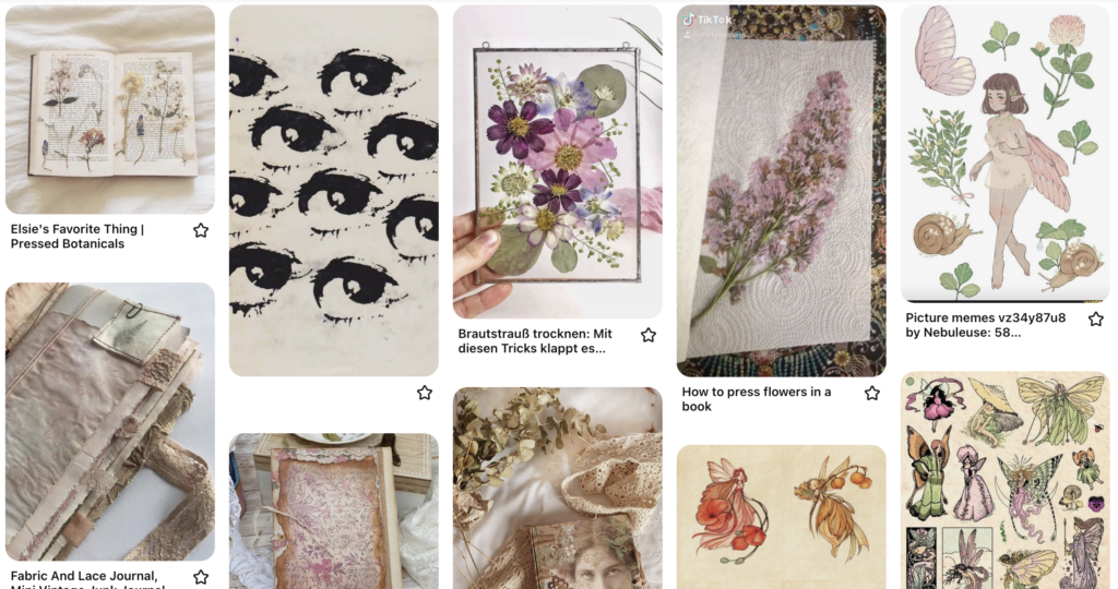
The third idea was called “Flower Notes” a book that could press flowers and make them into stickers all in one go. Usually this process takes long and has many steps so it would be fun to have an arts and crafts book like this to make pretty things very easily.
Feedback
Are silly sleeping bags a good idea if it’s only going to be a trendy thing for a while, how will this be a sustainable solution? The Flower Notes book is not a big enough idea for a whole franchise. How would the scent thing work in real life? Right now it’s a very abstract idea and hard to explain.
Back to brainstorming
From our feedback we understood that we had to go back to square one! We had to cook up new ideas to get feedback from the teachers. We liked the idea of capturing scents so we developed that and got really inspired by the thought of a memory stick that could capture moments and put them into frames. So looking at the frame you would feel like you are reliving the moment.
Feedback
After showing them to our classmates and teachers we found out that that idea wasn’t realistic enough and we did not really like the other ideas, so we went back to brainstorming and came up three new ideas: A vegan candy store, a store for upcycled clothing and a store for making your own booze.
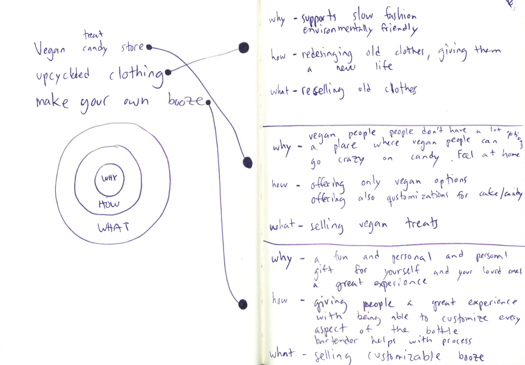
Feedback
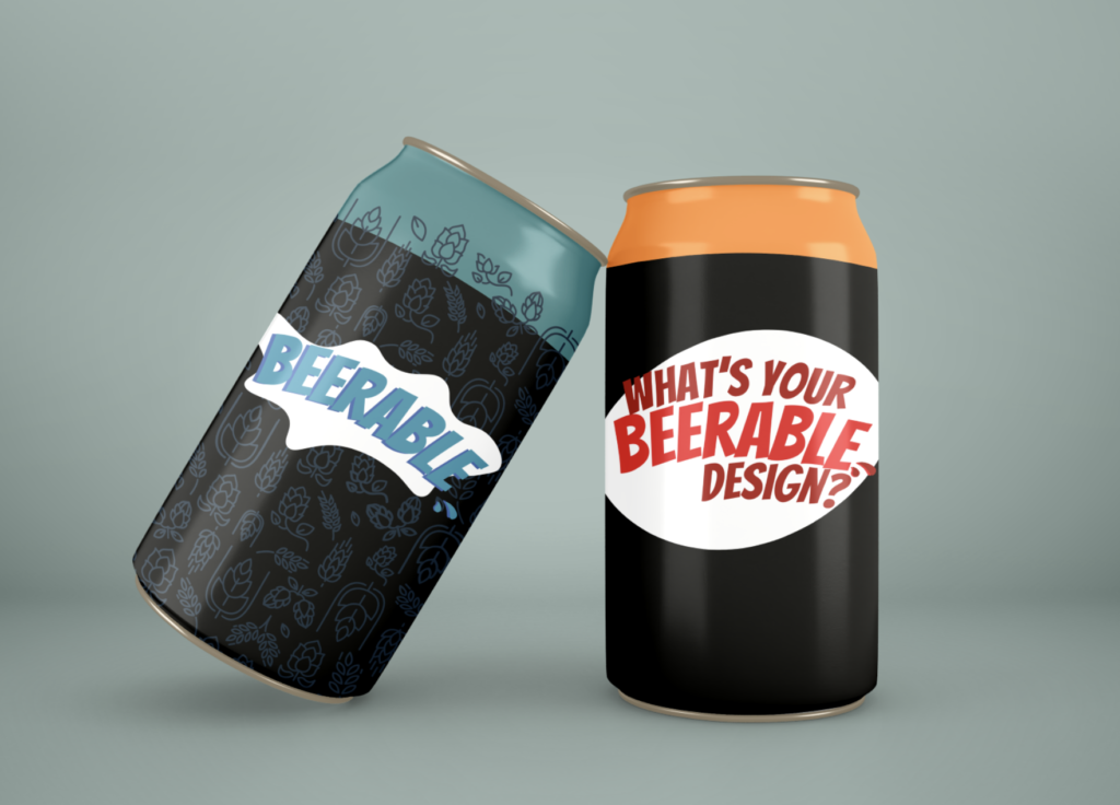
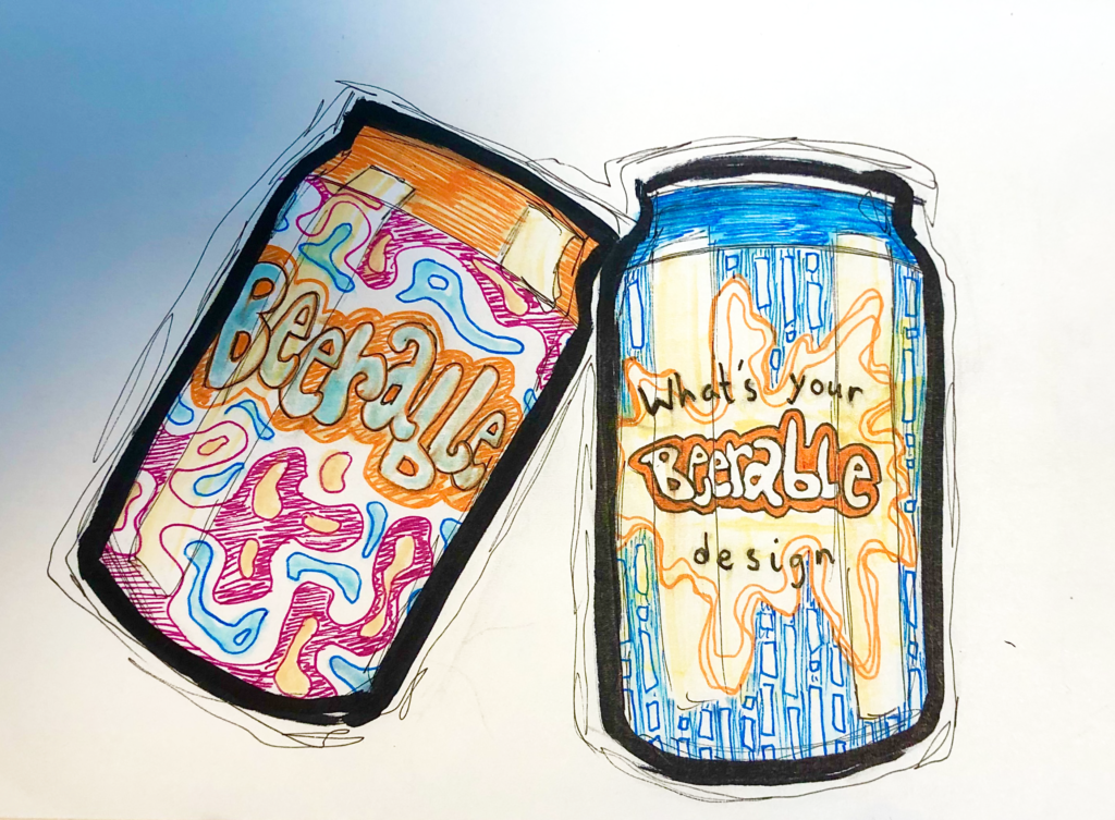
From the feedback we got from these from Jorgen we went forward with Beerable. An interactive store experience where you are able to create the flavour of your beer yourself with the help of an experienced bartender and you can also make the design of your beer can yourself.
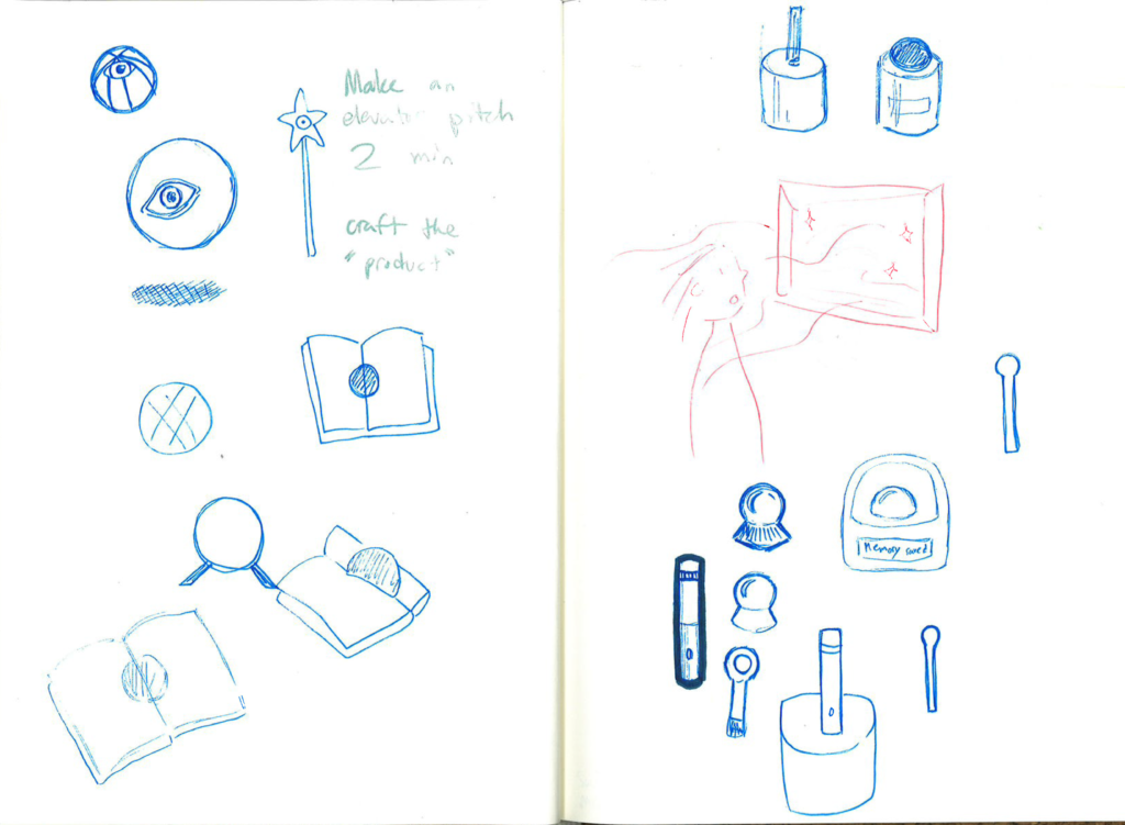
Elevator pitch
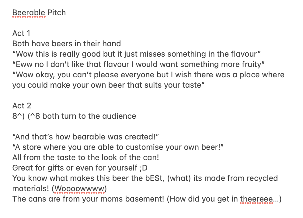
We had to do a 2 minute elevator pitch about our product Beerable for our classmates and teachers. This was our script:
Feedback
Jorgen and Jeremy were questioning how our brand truly would work. Would our brand be a workshop thing were you would create the taste of your beer, let it brew in the store and then it would be sent to the customers house? Or would there be readymade mixtures in the store that the customer could choose from and get their products immediately? So those were things we would have to work on to make this a more believable brand.
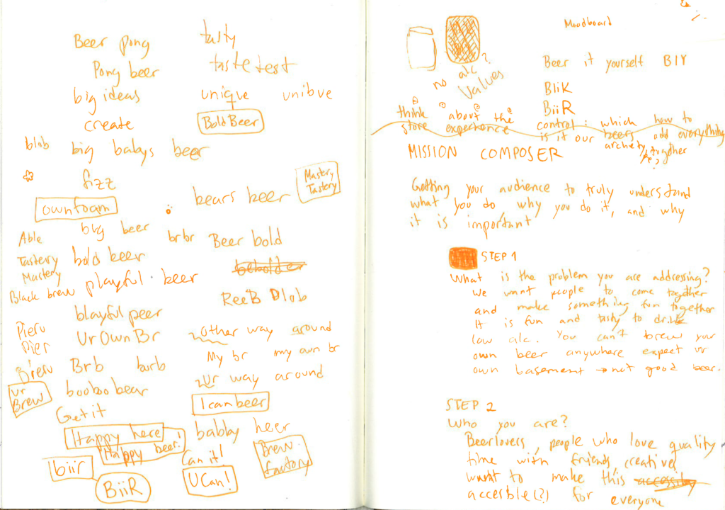
Brand Identity
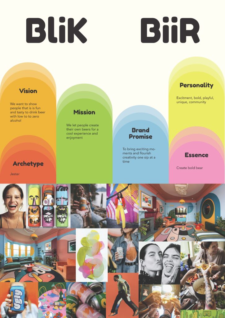
Vision
We want to show people that it’s fun and tasty to drink beers with zero to low alcohol in it.
Mission
We let people create their own beers for a cool experience and enjoyment.
Personality
- Excitement
- Bold
- Playful
- Unique
- Community
Promise
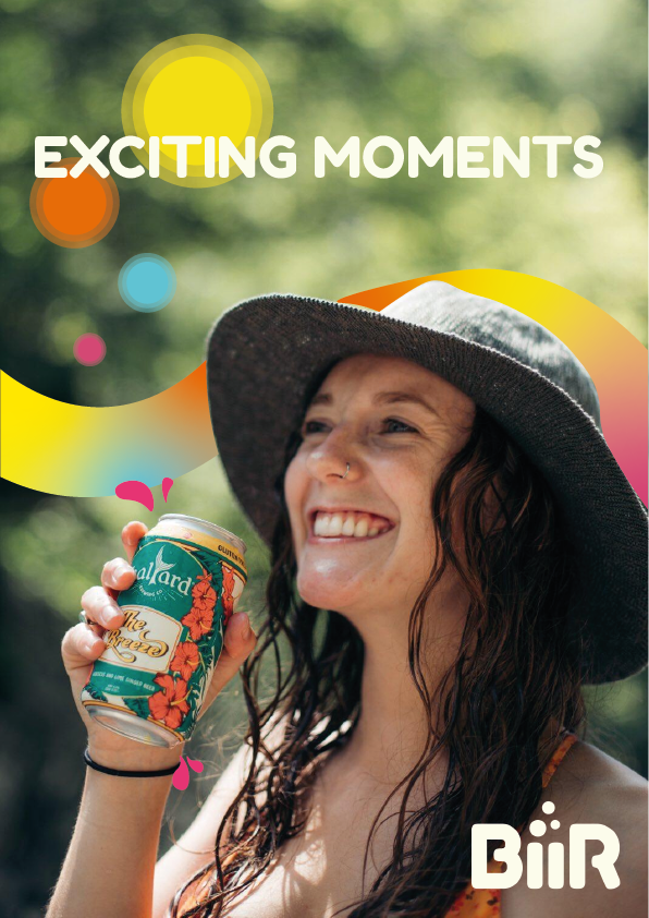
To bring exciting moments and flourish creativity one sip at a time!
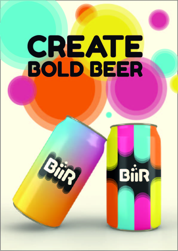
Essence
Create bold beer
Brand Archetype
We want to make a fun and cool experience for our customers. That’s why we agreed on the Jester almost immediately. Our brand has a very playful, bubbly and humorous feeling to it. We were also thinking about the magician because of the magic of creating your beer and your own look to it. We still felt like the Jester fit better because we are a very light-hearted company.
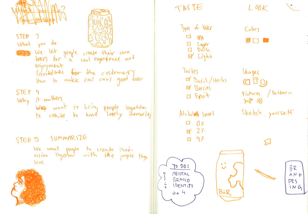
Answering Why How What
Why?
We want to give a fun experience to our customers; we want to see their vision come to life! We want people to have quality time, making your own BiiR with your loved ones or for your loved ones is a new fun way to give memorable gifts tailored to the person themselves. We want to bring people together.
How?
We have the space and tools to make it possible for our customers to customize every aspect of their beer. Our skilled bartender will help you create your preferred taste and you can create your own look in the store with a computer game.
What?
We create tasty beer with a lot of customizable elements to make it feel your very own. Our goal is to bring exciting moments and sponsor your creativity one sip at a time!
Brand Name
Our first solid name idea for our brand was Beerable but we wanted to change it, because Beerable looked a lot like bearable or unbearable and that was not our intention. It was not correlating with the positive feeling we wanted our brand to have. We were brainstorming a lot and the four names that we liked were:
- BliK BiiR
- BIY: Beer It Yourself
- Brew it (screw it, just brew it!)
Feedback:
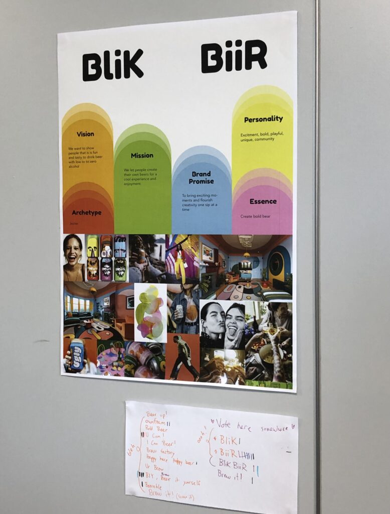
First, we chose BliK BiiR but after talking to Jorgen about it we changed it just to BiiR. Having BliK BiiR as our name, we are stuck to the only cans in our concept. If we would want to create other beers in bottles, glasses or anything else, you couldn’t really do that.
BiiR is also a strong name, because it’s short and concrete, it explains the product immediately. Also, with the font we were using (Fredoka One) our brand name looked almost like a logo on its own already.
Brand Story
Store experience
Visual Family/Image policy
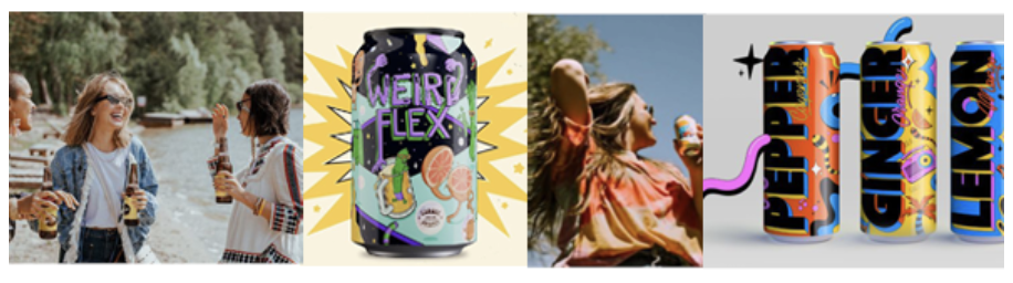
We had to come up with visual families to get a perspective on what our image policy would look like. We wanted to do happy colours and smiling people. That’s why we chose to do illustrations mixed with fun imagery. We wanted to use round and bubbly shapes because are seen as friendly and flexible shapes.
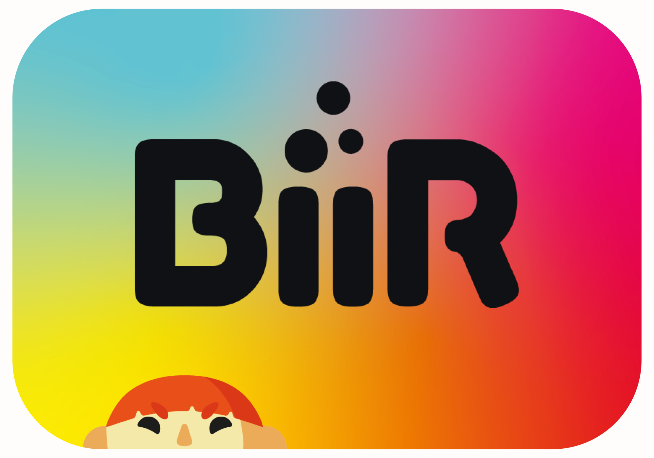
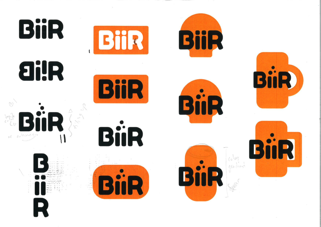
Logo
We were pretty happy with the way our brand name was already looking with the font we chose but we wanted to take it further and make it our own. In the beginning we tried to link our mascot into the brand but that didn’t work.
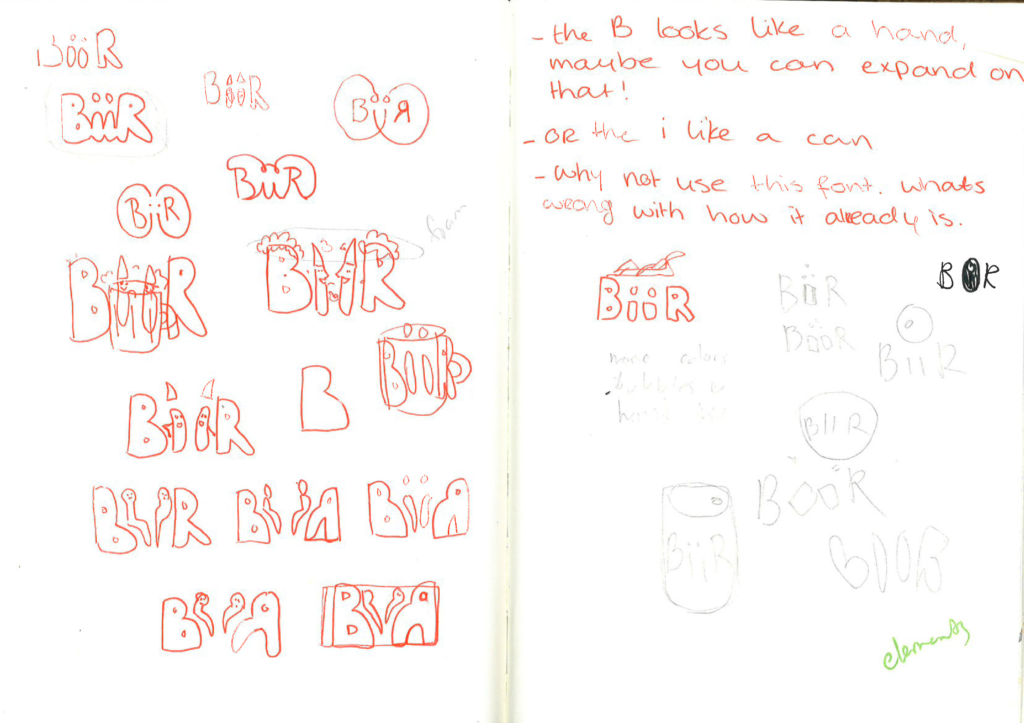
Feedback
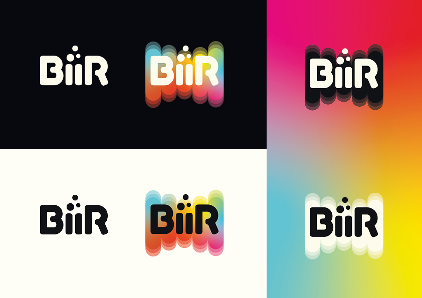
From one of the feedback sessions I got a lot of new ideas from our classmates and teachers. People really liked the bubbles idea for the dots of the “ii”. Eline wasn’t able to show her logos but still keeping them in mind, I used the circles behind BiiR as inspiration. I also liked the shapes in Brand identity poster from a couple weeks ago so wanted to integrate them here.
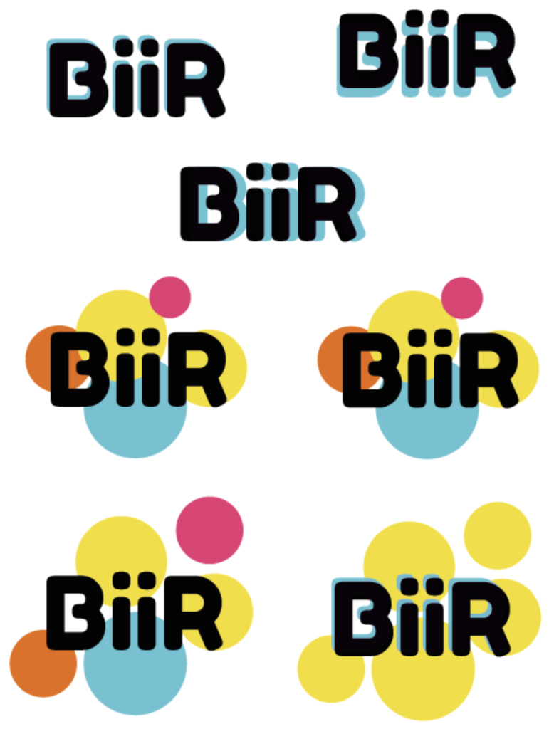
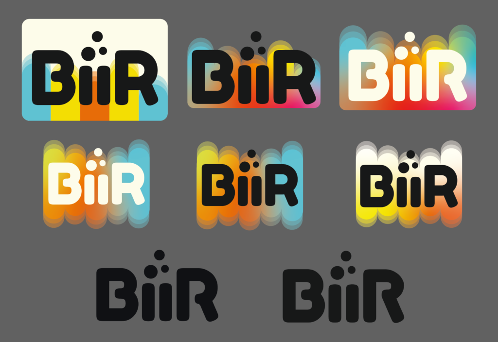
The logo needed to represent the bubbly brand we are creating so the shape behind the BiiR is a colourful gradient.
Jorgen also pointed out how the letter R is shaped differently than the letter B so I edited them to fit each other better and making it special to our brand.
Mascot
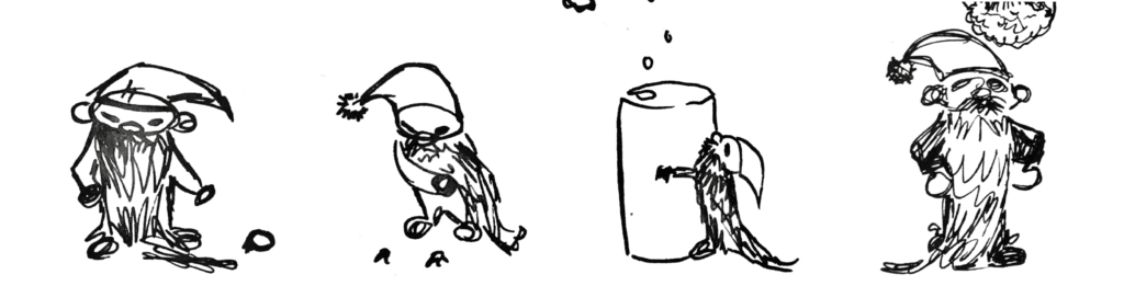
After presenting and looking at our visual families page, Jeremy gave us the amazing idea that we could create our own mascot for the brand. Since we wanted a very cartoony feeling, this way we could visualize our style more by having our own characters. We wanted a silly magical elf guy that could help and speak to our customers (from the computer screen) when they are making their own mixtures.
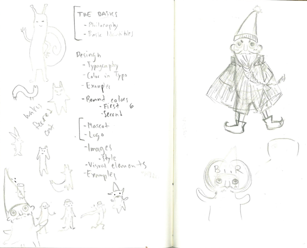
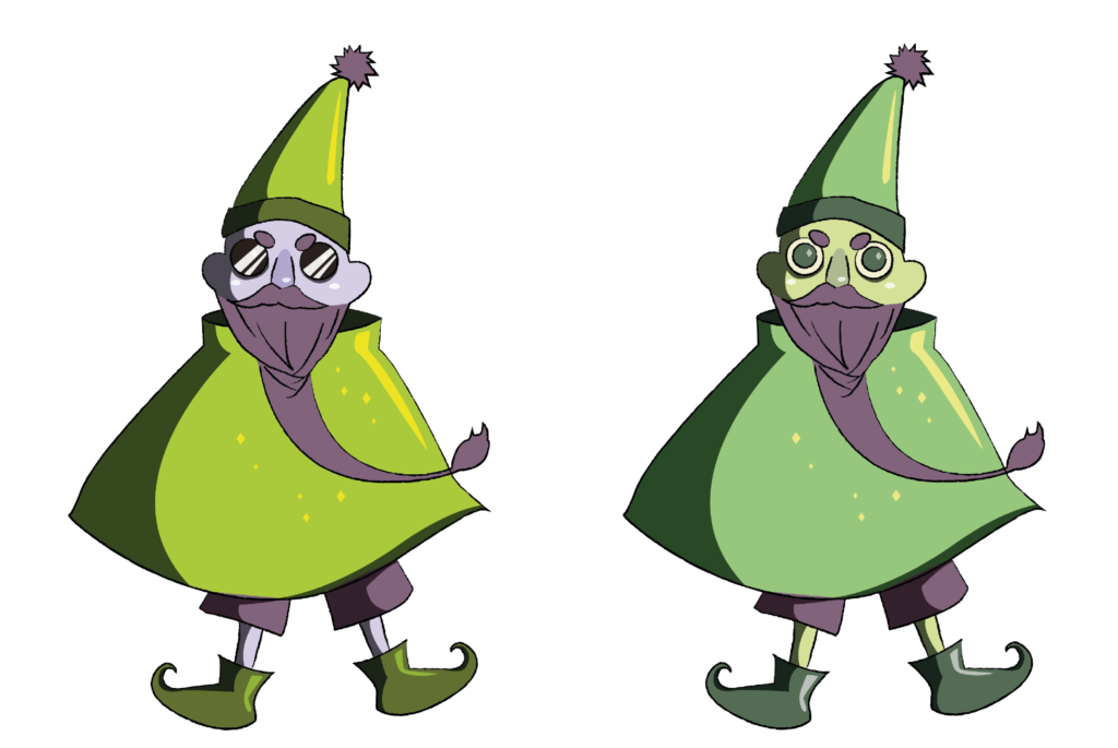
These guys were the first elves, just to get an idea what we were going for. We got feedback that he didn’t really fit the brand.
This is the second guy; the idea was to make him more of the shape of the “i” in the logo, so they fit to each other shape wise. The feedback from this was that this also doesn’t quite fit the other elements of our brand. The mascot is drawn in a cartoony style and his outlines look like a pencil sketch, when all our other elements our quite geometric and clean looking. Right now, this guy is linked to the brand with the colours of his clothes but not really anything else.
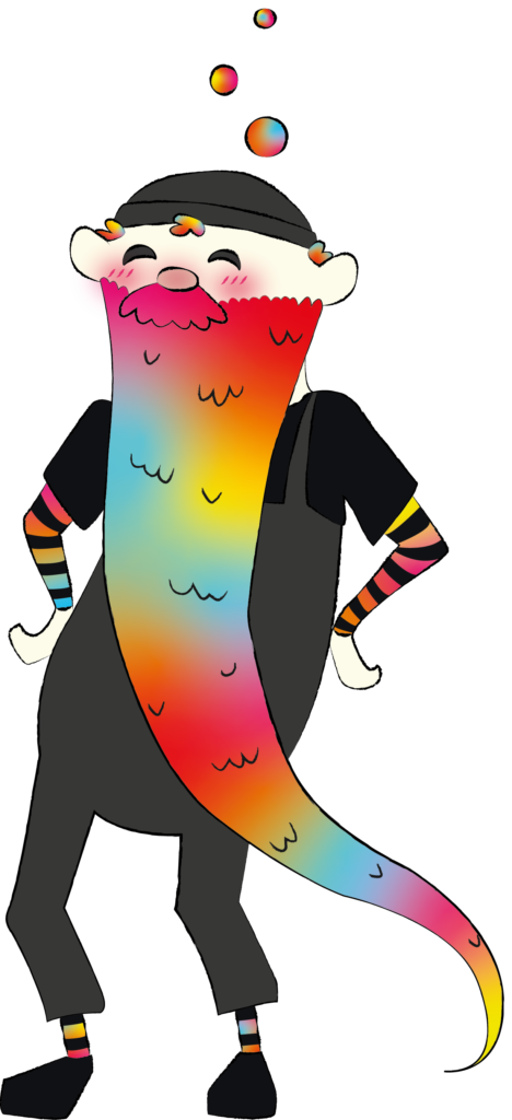
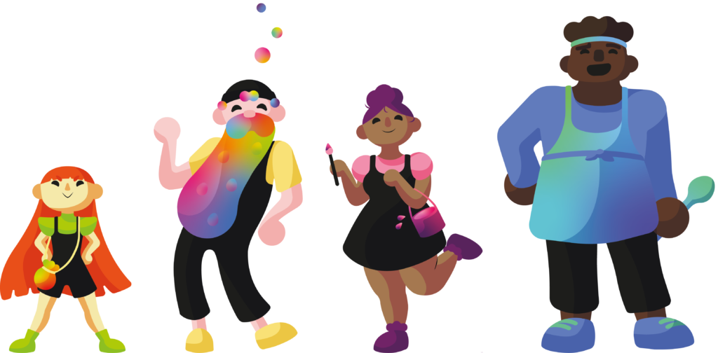
These are our latest characters! Now the shape language fits our brand much better. The idea was to use basic shapes and make them into characters: triangle, oblong noodle, circle and square.
These characters all have their own special power and are part of the creation process. Our main character is the old man, he is the Captain, the Art Director of this crew he speaks with the audience. His magical beard stores all kinds of flavours where he gets new ideas from for new combinations. The tiny triangle girl is the spice, she adds the spices and flavours the customer chooses. The girl with the round shapes oversees the aesthetics of the design. With her the customer chooses the colour of the can and the stickers they want to add for their design. Lastly, we have the square boy who is the cook, he mixes the customers choices together to create the finished product. And all of them are of drinking age. ;D
First Brand Identity Book
Feedback
I got feedback from Jeremy that it is still lacking, a bit too minimalistic and it should have more connection to beer since we have a beer brand. Right now it could be a toy brand for example. We should write out our points more clearly and give more examples on how our brand elements should be used.
So me and Eline met up, made a plan and divided the updates we should still do.
Final Brand Identity Book