
Brand yourself
We started out by thinking about what we are good at and what we would like to get better at. After that we paired up with the people that had the opposite strengths and/or weaknesses to do the Zine together with. This way we could actively work on these areas of our personalities. I got paired up with Mila. Her strength was planning and organising and her weakness was working in a team.
This is what I wrote down on our first reflective lesson about myself:
Strength
Self-Knowledge, Guts
I feel like I’m pretty good at thinking big ideas and I feel like I can do anything with enough time and research. I’m not scared of creating. I’m empathetic.
I feel the most fulfilled when I’m
- Exploring
- Learning
- Creating (Drawing, dancing)
Weakness
Planning and Organising
I want to get better at this because it really causes me a lot of problems that I’m bad with time management and organising my work. I want to better my critical thinking and creating more cohesive ideas. Good graphic design is simple and powerful.
I want to get better at
- Control
- Cohesion
- Consistency
Archetype
Explore spirituality, Explorer
Looking at the pie graph we have in our Reflective folder and researching more about the archetypes on the internet, I felt like I related most with the Explorer. I was also thinking of the caregiver and visionary.
I feel like the explorer archetype suits me the best because my core belief is that there is always something to find and it is worth it to go the extra mile to experience something special. Because you probably will never have that chance again than where you are right now at this moment.
Myerss Briggs Personality test
The Myerss Briggs test is a tool on how you can understand your personality better, and possibly see your blind spots better to understand them. Ofcourse it a online test that must be taken with a grain of salt but I thought it would work well with this assignment that we had.
ENFP Extraversion, iNtuition, Feeling, and Perceiving
Following text copied from the Myerss Briggs website:
ENFPs are energized by time spent with others (Extraverted), focus on ideas and concepts rather than facts and details (iNtuitive), make decisions based on feelings and values (Feeling), and prefer to be spontaneous and flexible rather than planned and organized (Perceiving).
Campaigners (ENFPs) are true free spirits – outgoing, openhearted, and open-minded. With their lively, upbeat approach to life, they stand out in any crowd. But even though they can be the life of the party, Campaigners don’t just care about having a good time. These personality types run deep – as does their longing for meaningful, emotional connections with other people.
In their unique way, Campaigners can be quite introspective. They can’t help but ponder the deeper meaning and significance of life – even when they should be paying attention to something else. These personalities believe that everything – and everyone – is connected, and they live for the glimmers of insight that they can gain into these connections.
Campaigners are independent and creative, always on the lookout for the magic and meaning in everyday life.
When something sparks their imagination, Campaigners can show an enthusiasm that is nothing short of infectious. These personalities radiate a positive energy that draws in other people, and Campaigners may find themselves being held up by their peers as a leader or guru. But once the initial bloom of inspiration wears off, Campaigners can struggle with self-discipline and consistency, losing steam on projects that once meant so much to them.
My take on it
I read the whole profile on the website and I feel like a lot of it suits me. I want to see the positive sides of life. I am good at taking everybody in the group into consideration, I don’t want anyone to feel left out. Sometimes I might get stuck in my own bubble of my thoughts. It’s really fun living in my head in a world just for me. But that can be seen as kind of rude or like I’m not concentrating on the other person that well. Mostly I zone off when I’m by myself though.
I’m a very independent person so enjoy being by myself and I also really like being around other people. Especially with school work for example. If I’m home alone trying to do school work I might get distracted easily (unless it’s a crunching deadline coming along), but when I’m surrounded by other people I’m a lot more productive. That is why I like to go to school to study or going to a library for example.
I’m a creative person and I have big ideas which is a lot of fun but also they can be quite overwhelming. That is something I’m trying to get better at, making my ideas more manageable. I also have a tendency of being a perfectionist because I want it to look a certain way. It is a blessing and a curse. I believe it sets me apart and makes my work good because I am able to focus and edit my projects until the end of time. With this ability to be creatively precise I can create anything I want when I have enough time to figure it out. It can also be a hindrance for me because my projects can take way too long. It is something I am getting better at. I realise now that it is better to create something even though it’s not perfect rather than nothing because I’m getting too overwhelmed by the workload.
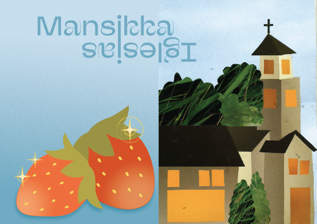
Milas and my shared spread
Me and my partner Mila designed the middle spread for our zine that would represent the both of us. I made an illustration and Mila did a collage.
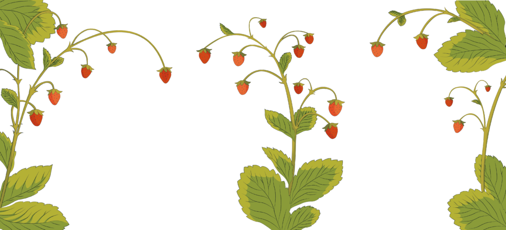
We chose to lean into our surnames. My last name Mansikka means Strawberry in Finnish and her last name Iglesias means church in Spanish. We also connected our last names and mirrored them to eachother.
Different approaches to the zine
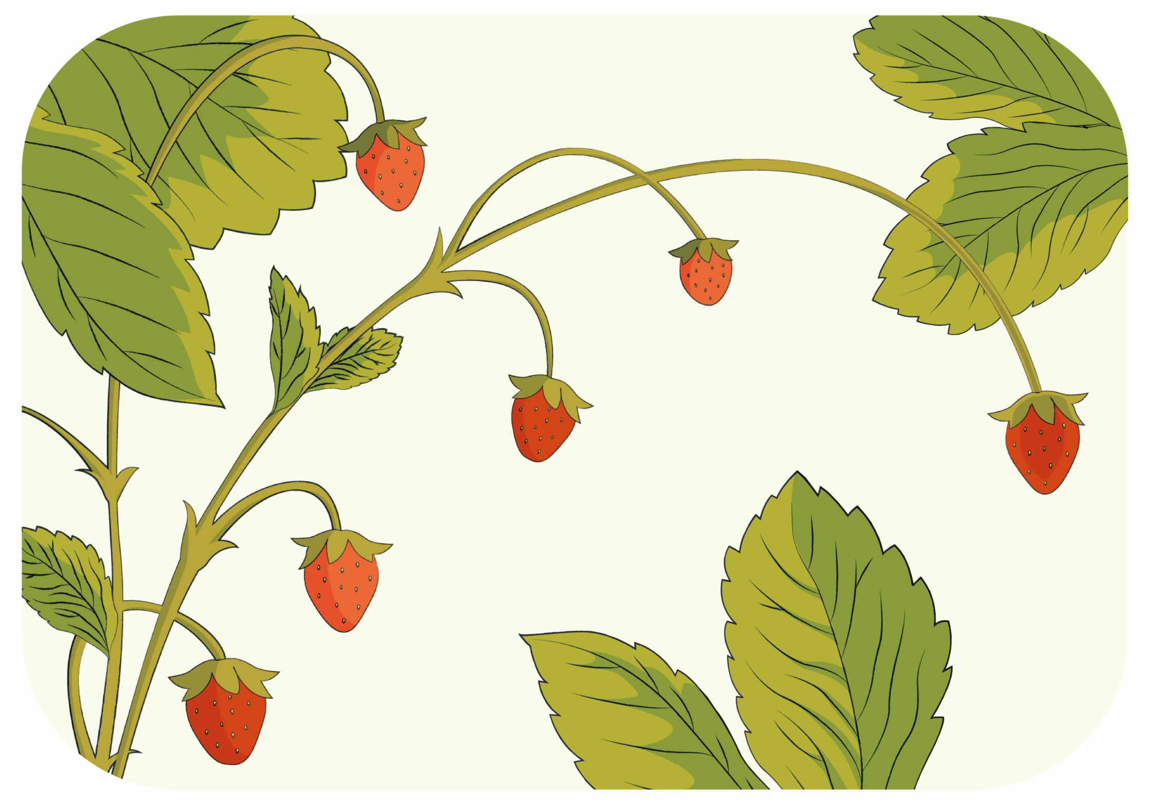
My last name is strawberry in Finnish so that is why i wanted to lean into the strawberry theme with visualizations. i thought it was a fun way of branding myself.
I tried quite a few things but I felt like nothing was really feeling right.
I made multiple separate illustrations and had one go at a collage trying to connect it to the Zine but I was having trouble with the message I wanted to convey.
The first theme I was planning on was “First impressions” I wanted to write about how when you first meet someone you get a certain picture in your head but as time goes and you get to know them more it might change a lot. At first people are nervous, they are wearing a protective mask trying to convey themselves more cool, more chill, more smart or whatever. As time goes by your impression changes as people allow their guards down. It is also interesting how people see yourself in their eyes. You have a full idea of what you are like and all your different sides, but every person makes up their own version of you. I wanted to make collages or illustrations of my exchange time here in the Netherlands.
I feel like that wasn’t really going anywhere and the illustrations i was doing didn’t work well with message I was thinking of. So then one of the late classes I got a burst of rage and energy of our schoolwork this semester and just wrote down my thoughts with the theme “Give me time”.
Making the final illustrations
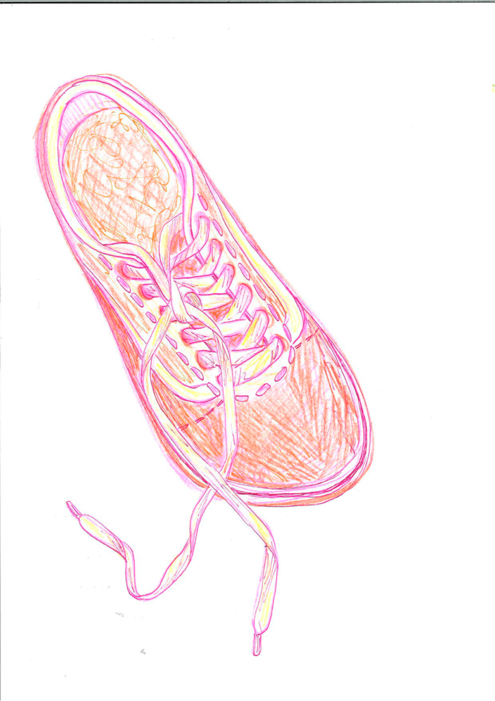
I drew these illustrations with pencils and markers and scanned them with my phone. Then gave the lines more contrast in photoshop, moved them in Illustrator to expand them into vectors and then blocked the shapes with the strawberry colours I had chosen.
I thought this would work well for the Zine because it looks a little rigged and unperfect and that is what I wanted to do. I have a tendency to make everything look polished although I love unperfect looking artworks. So I really tried to stick to doing it and then not editing it much more. It felt really freeing to just slap out artwork and be happy with it. It’s good for me to practise making more art and not being so scared about how it’s going to turn out. Because the more I create the better artist I will be!
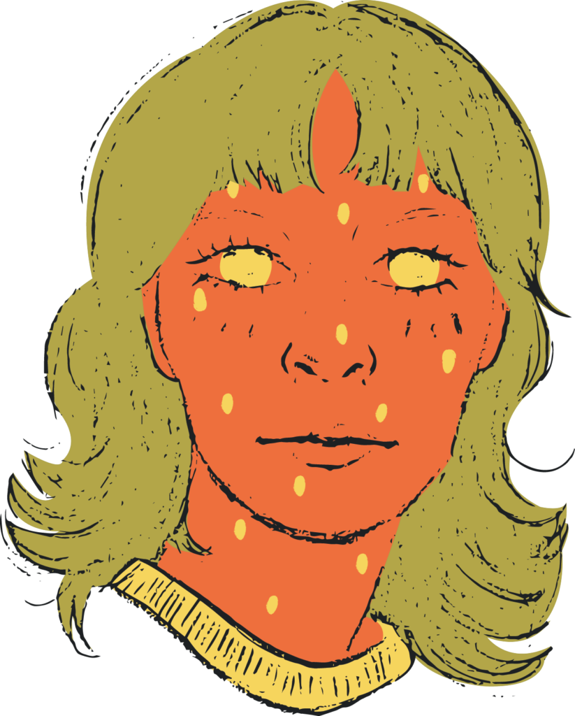
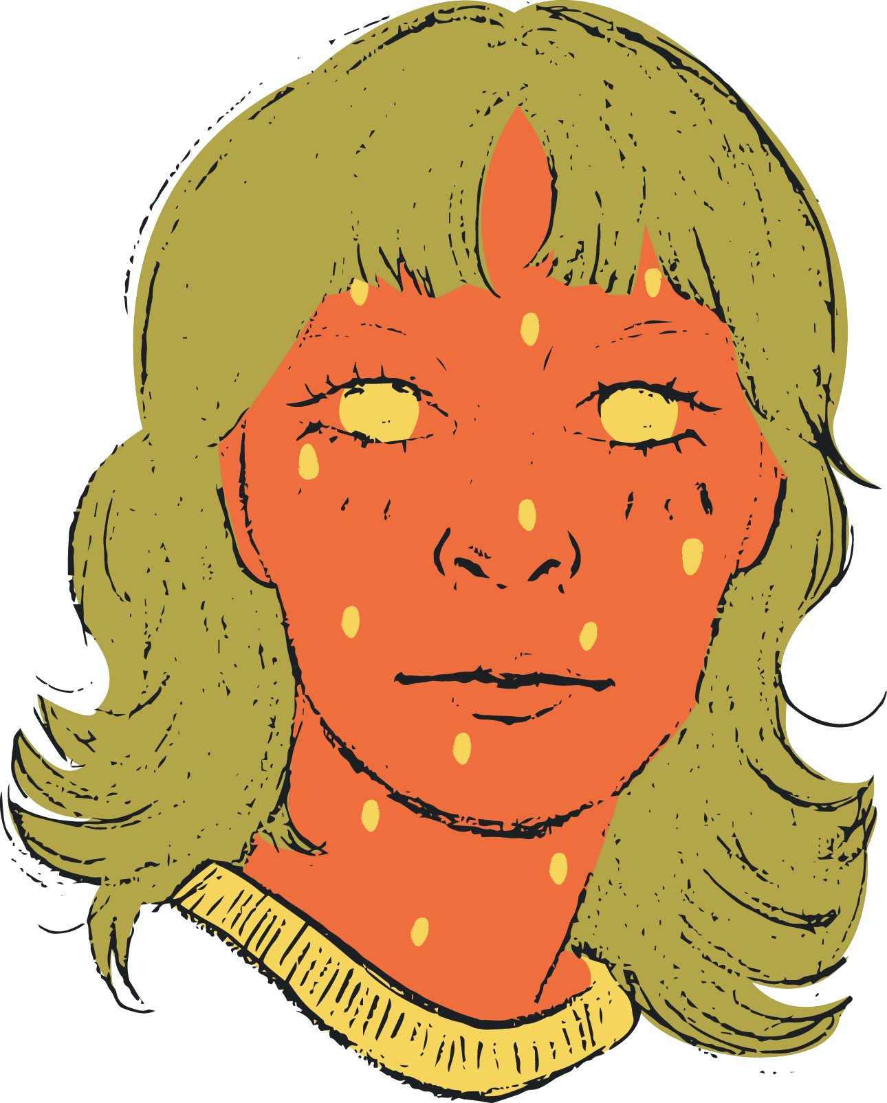
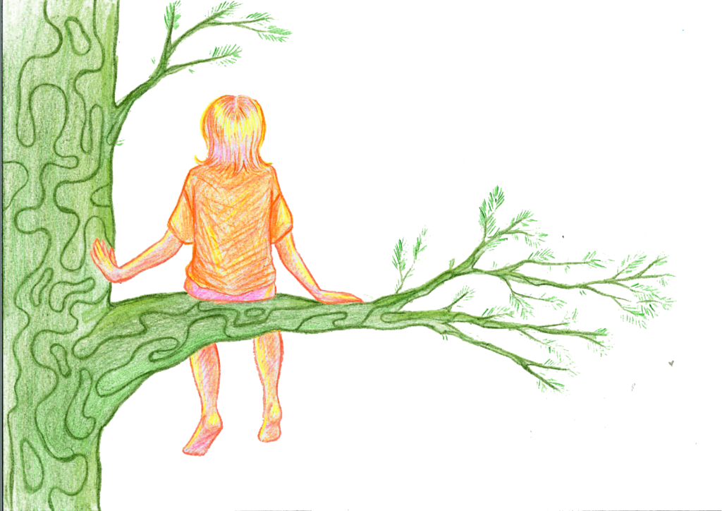
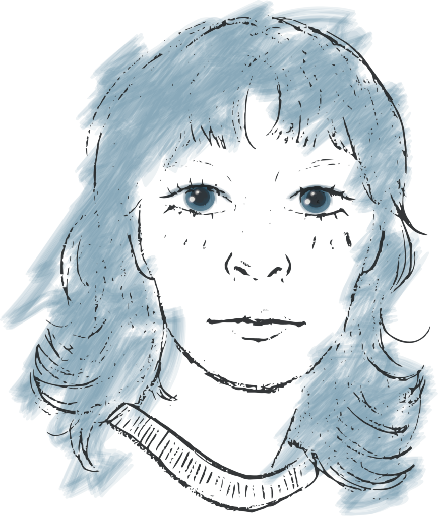
As I was wondering the meaning of branding myself and what that means, naturally I tried to draw myself. It is quite difficult I had fun doing this quite stylised version of myself with big bambi eyes. (O_O) I really like the way the vectored face turned out with the strawberry colours because it has less details. Drawing my face was more for passing the time and pondering but I’m glad I did it because it started this style I ended up choosing for my Zine. It’s bold, flat and colourful. I was excited to try this with the Riso printer because I believed it would work well with it.
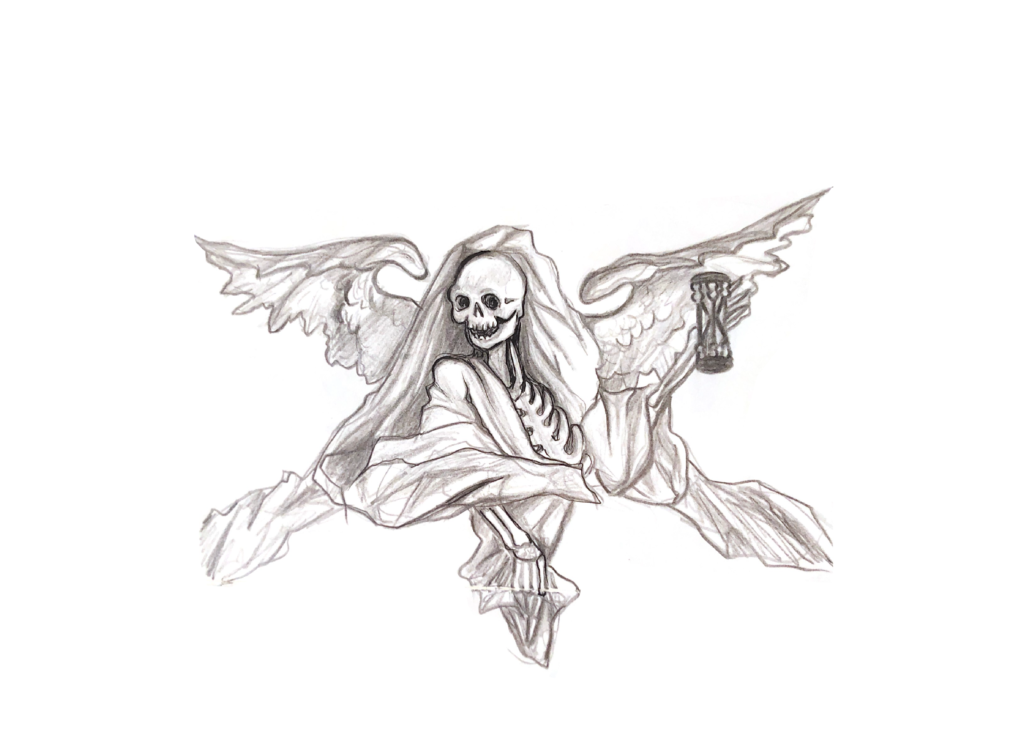
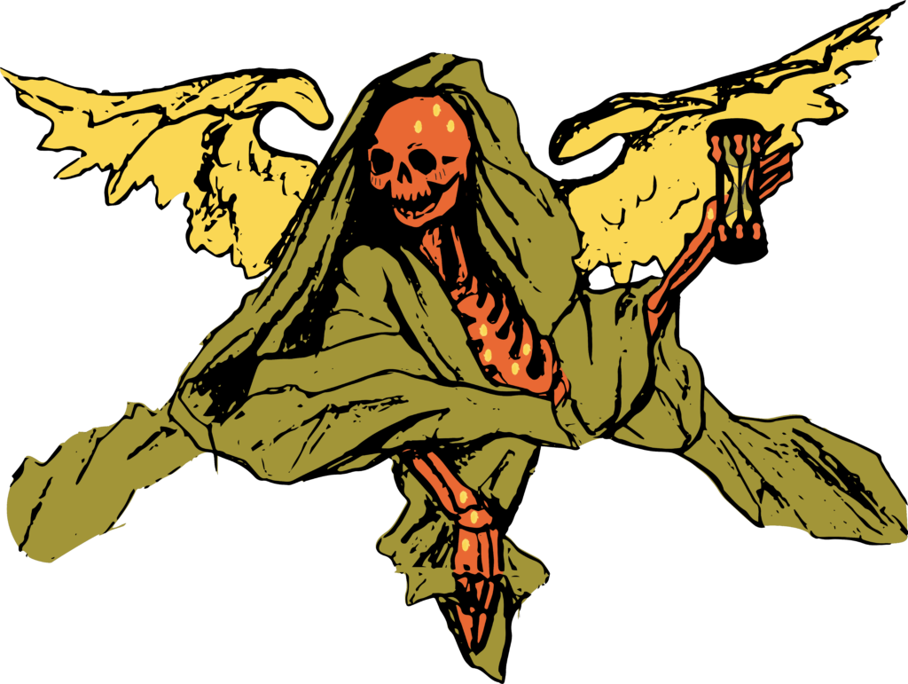
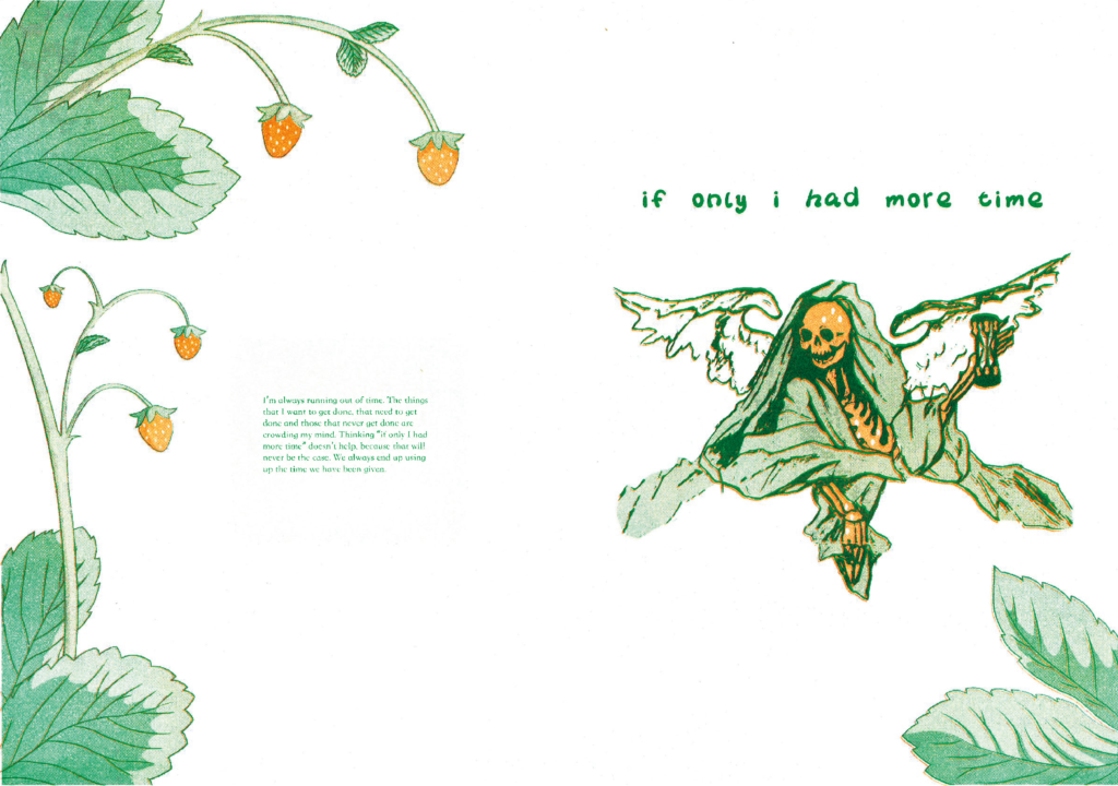
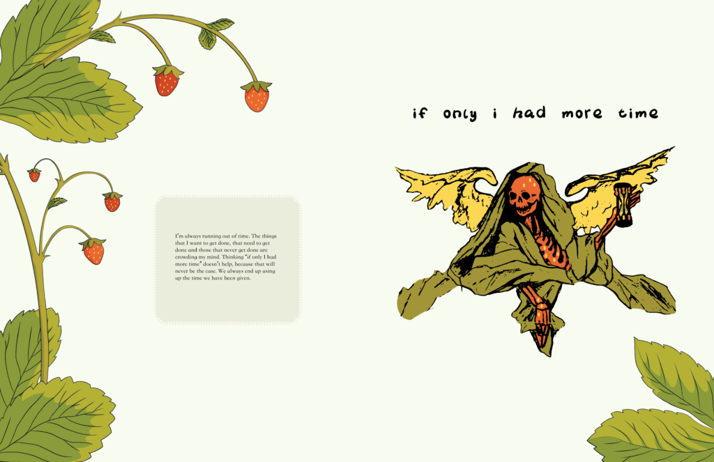
I am not religious but I do like to visit churches and other holy places from different religions. I think religion is a part of the countries culture quite deeply, it sets the values mostly for what is right and wrong in peoples minds. Churches are also quite beautiful so it is nice to look at. I drew this time lord in a church in Belgium because I really liked this statue. Rarely do you see skeletons in a church usually it’s always human figures and angels. I felt really inspired by this and I thought it fit well with the hourglass and the anxiety inducing skeleton for my essays theme.
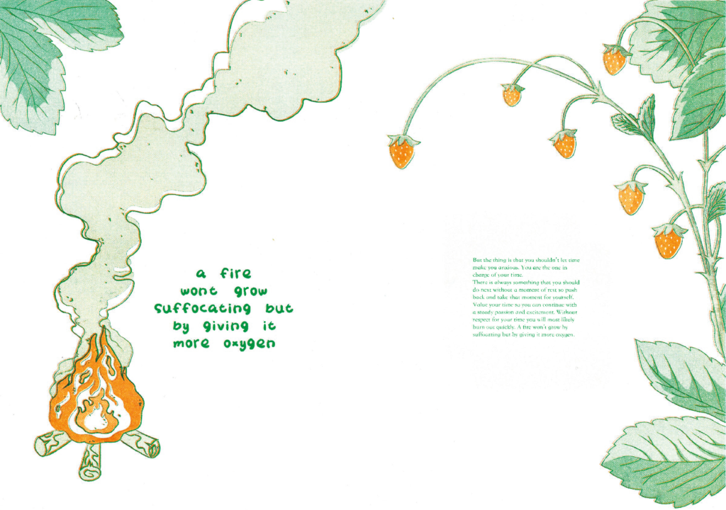
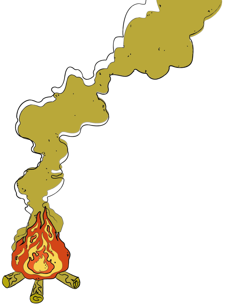
One can compare fire with creating. If an artist doesn’t take care of themselves aka their fire, their motivation, it will burn out quickly because they are not adding enough wood to keep the fire burning. Or if an artist feels anxious or overworked it’s similar to suffocating your fire and not giving it enough oxygen. So an artist must take care of their basic needs like food, sleep and socialising and also take time for themselves to recenter. This way they can keep feeling passion and excitement towards art.
Going full force with the strawberry theme I made these vector illustrations to add a cute and foresty setting for my Zine.
Angry essay
Give me time!
I feel like i have learned so many valuable things this semester. I can feel myself growing as a designer! But I also think that it has been a lot of work to complete.
Making this Zine has been difficult, it’s a personal project every other week. I don’t feel like I have had time to think about my branding very deeply because I have focused on other projects that need to be done. I’m annoyed, I wish we had one less course or at least time in between to finish the courses that “ended”. A case ends, but that is not the final product yet, but you are starting right away with a new case so when are you supposed to finish something? I’ve been concentrating on other schoolwork, so i feel like reflective always gets pushed down because I know I need time to think about this Zine and the meaning for it. Then I do something quick with no meaning for Reflective and hate it. Give me time!
You can’t get far without respect for yourself.
In Finland my graphic design teachers are always preaching to us students that we shouldn’t push ourselves to the extreme because they don’t us to burn out. They want us to value our time so we can work for many years to come, burn steady with passion and excitement for what we do. If you have no respect for your time and do to much you burn violently and quickly. They make us count the time we have used for each project to train us to ask enough pay for our work in the future.
They come forward to us students, if someone is having a hard time mentally they can make some arrangements for that student. We are in a creative field and there is a lot work that goes unseen, a lot of thinking time that if you don’t learn to respect it will go unnoticed and taken for granted. A designer can’t go very far if they value their time.
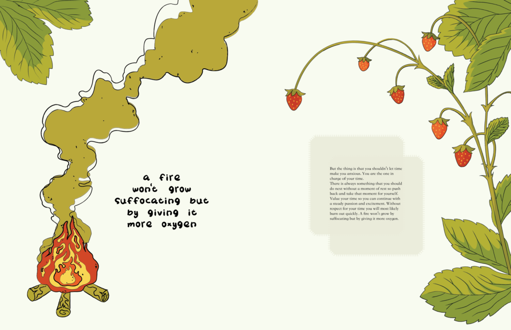
A fire doesn’t grow bigger by suffocating it, it grows by giving it more oxygen.
I’m thankful for the teachings of my Finnish teachers because I feel like it has made me a more confident and strong person also for this module. I’ve been steadier than some because I hear their voices at the back of my head to not burn myself out. Here in the Netherlands some of my classmates have really had a hard time with the workload and if they don’t have the best self confidence. They will more likely crumble.
We have the power to choose.
Having respect for your work will make you a better designer. More confident, more steady. We are the ones doing this work, we can choose what we work on and how.
Refined text for Zine
I’m always running out of time. The things that I want to get done, that need to get done and those that never get done are crowding my mind. Thinking “if only I had more time” doesn’t help, because that will never be the case. We always end up using up the time we have been given.
But the thing is that you shouldn’t let time make you anxious. You are the one in charge of your time.
There is always something that you should do next without a moment of rest so push back and take that moment for yourself. Value your time so you can continue with a steady passion and excitement. Without respect for your time you will most likely burn out quickly. A fire won’t grow by suffocating but by giving it more oxygen.
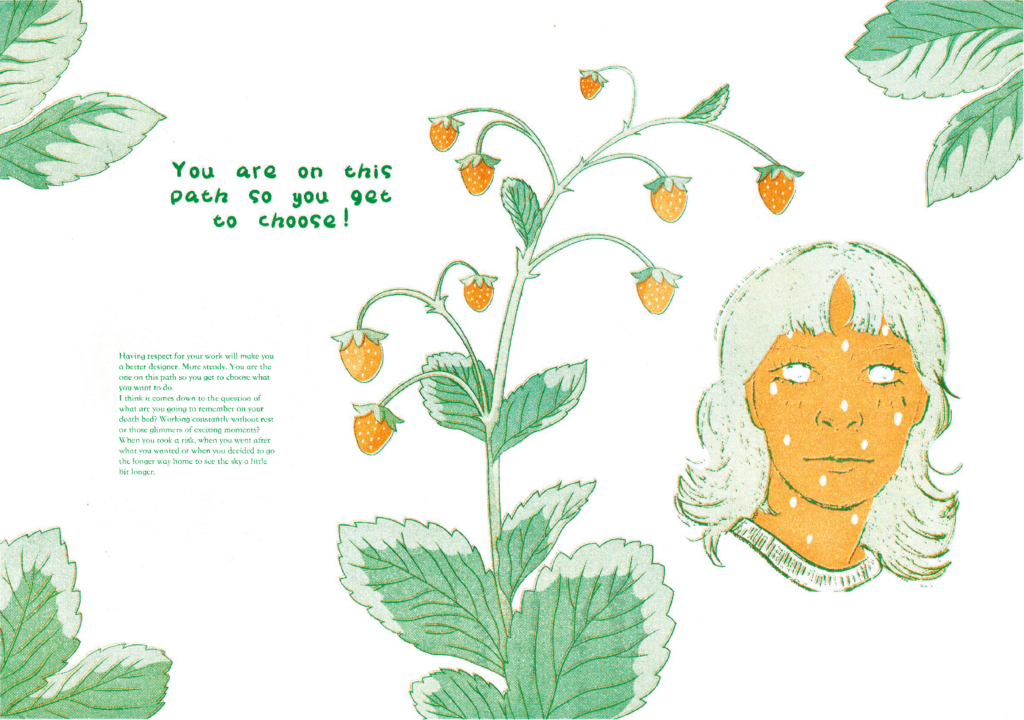
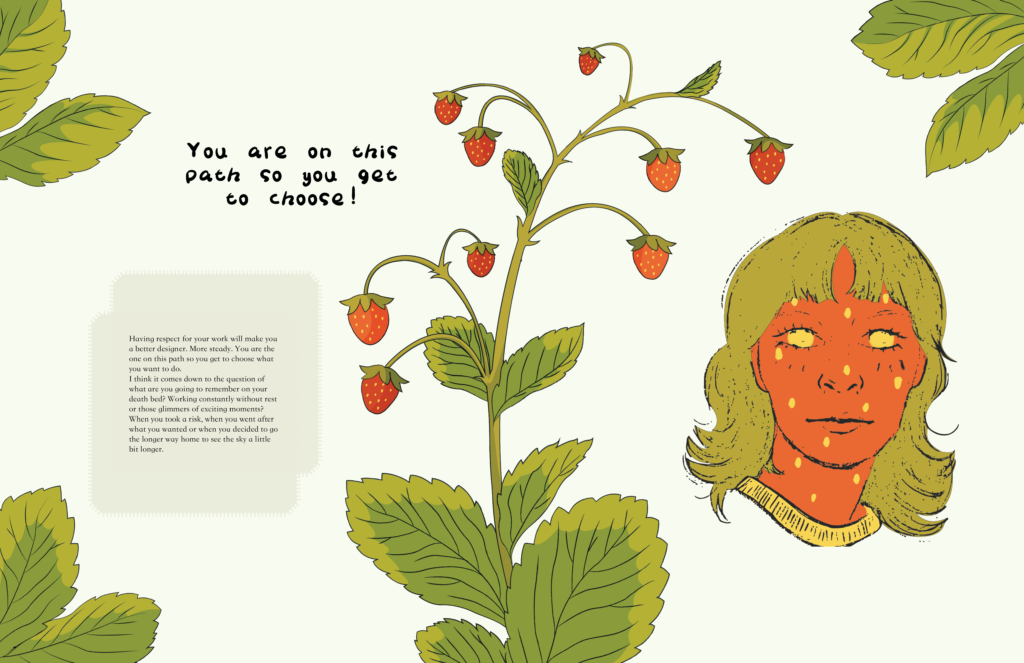
Having respect for your work will make you a better designer. More steady. You are the one on this path so you get to choose what you want to do.
I think it comes down to the question of what are you going to remember on your death bed? Working constantly without rest or those glimmers of exciting moments? When you took a risk, when you went after what you wanted or when you decided to go the longer way home to see the sky a little bit longer.
The spreads
My thought process
I wanted to make my zine a motivating piece which would remind people in creative fields to be the ones in charge of their own time. I have absolutely loved my semester abroad but the workload has been quite stressful.
I wanted to keep the colour palette very limited with the muted red, green and yellow colours. The copy is small to create a bit of a romantic diary feeling. The quotes are a more thick and uneven handwriting to go with the illustrations raged black outlines. The copy texts are in these patch work looking boxes to give it a little interest and also to represent maybe feeling like you are in a box with your work or thought bubbles.
Digital version
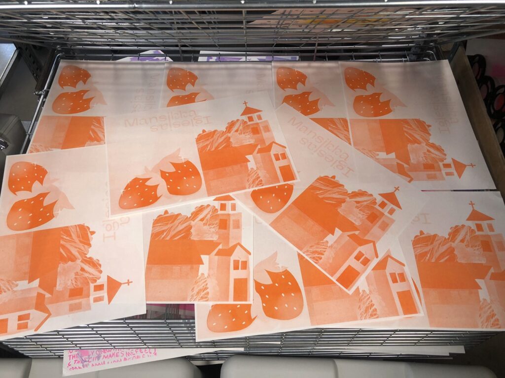
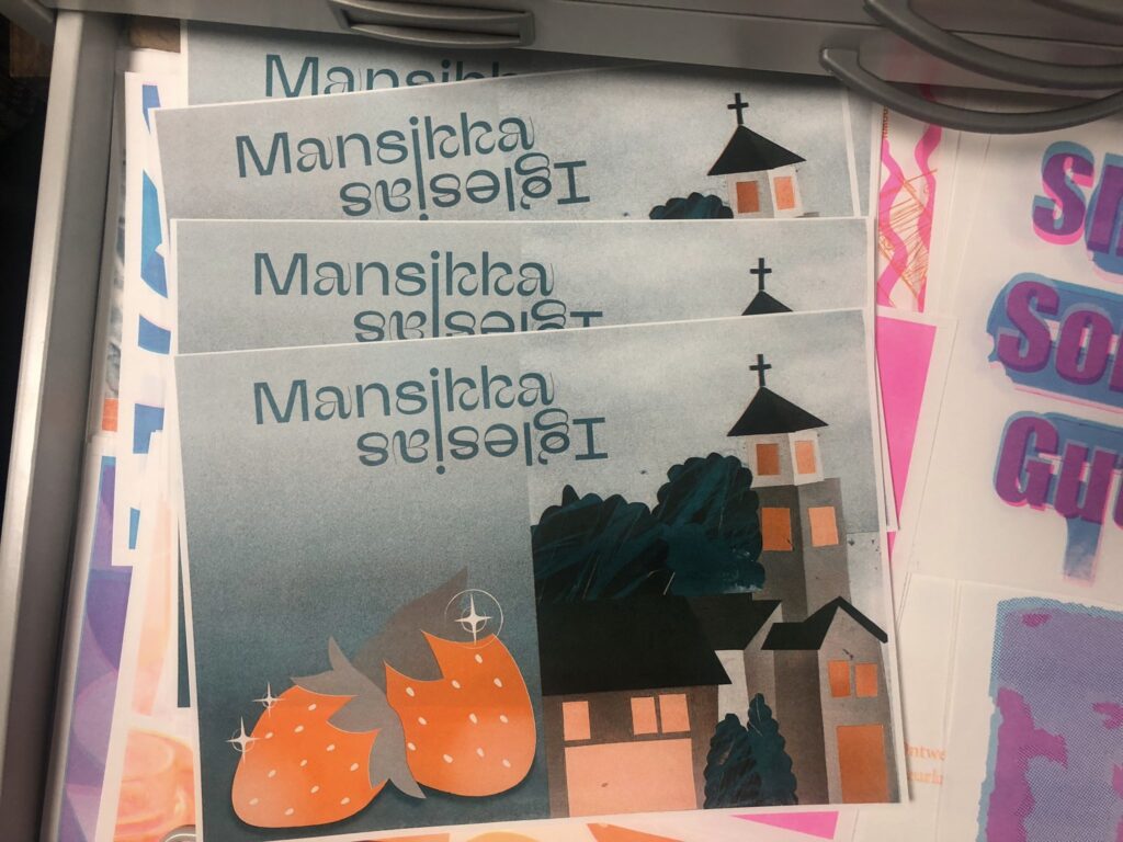
Riso print version