Table of contents
- Redesigning brands
- Brand story
- Designing letters
- Copy
- Editorial
- Visual Sequencing
- Art direction
- Riso
- Photography
- Conclusion
Redesigning brands
Rogier Bisschop from Total Design came to our school to give us a lecture about redesigning brands and what goes on during these projects. I’m very interested in the redesigning progress and I wish we could have seen more of that. In the end when we showed our work I hoped he would have given us more concrete feedback what was good and what was bad.
Notes:
- Get inspiration from other brands, see how they are doing. Doesn’t need to be a same type of brand like yours
- When you are creating a brand book simplify the contents to make it easy for everyone in the company to make consistent branding
- A brand needs to have clear principles to make cohesive and good-looking branding
- Loose -> Rule-based -> Princibles
- Don’t make the guidelines/princibles too strict so people can feel inspired with the limits you set
Assignment
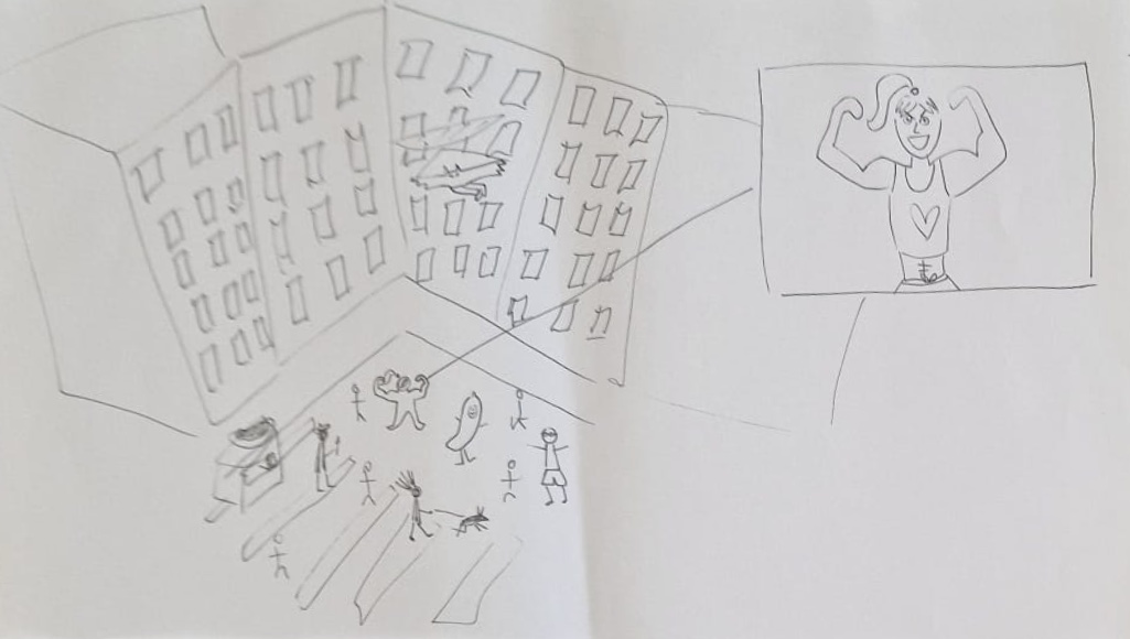
Imagine a new “screen chapter” for the headquarters of bank ING for the waiting area. It needs to represent the slogan “Do your thing” and it has to be interactive. I was in a group with Carly and Eline and we made three variations.
The screen is in your point of view of your hands doing different activities. The object in your hands and the activity is always changing until it reveals the the text “Do your thing”
A doll house view of apartments, everybody is doing their own thing. The rooms are slowly sliding from left to right as a video compilation.
People on a busy market square doing their thing. Box frames pop out highlighting one person at a time like spy glasses from movies.
Brand Story
Daan Hermelink came to our school to talk about creating a brand story. He clarified the process of creating a brand story which I think was very helpful for me.
Notes:
- A brand story is connecting the store/company to the people
- The retail formula elements have to be well thought out
- The brand experience must stay the same in different locations of the same stores
- Retail =
- is knowing your customers and their buying reasons
- is creating a preference in a world full of choice
- you have to work hard to stay relevant everyday
- omnichannel (easy and smooth) shopping experience
Assignment
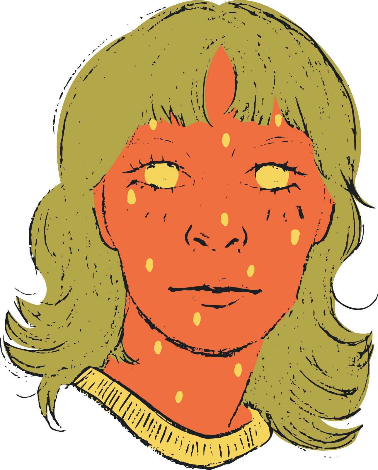
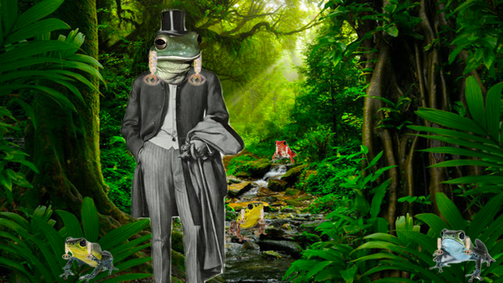
Make a window display for De Bijenkorf using your favorite animal as inpiration and combining it with something they sell there.
I worked with Catherine on this exercise. We both liked frogs and were very inspired by combining these colourful and poisonous frogs with luxury products. We thought that the colourful frogs are like the jewellery of rainforests. In the middle we have the gentleman frog in a suit wearing a top hat and luxury earrings, around him are other colourful frogs also wearing the earrings.
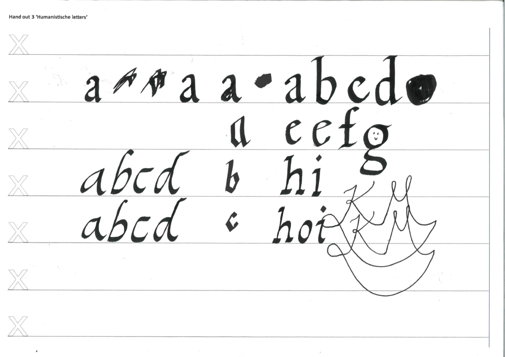
Designing letters
Dick Swart gave us a lecture about the history of typography. This was very fascinating to me because it was so interesting to know that every era of the main typeface had a reason it was created the way it was created. I guess that is similar to decisions with graphic design. Every element should have its purpose. Not only for the ~aesthetics~ it should have an explanation behind the decision.
Assignment
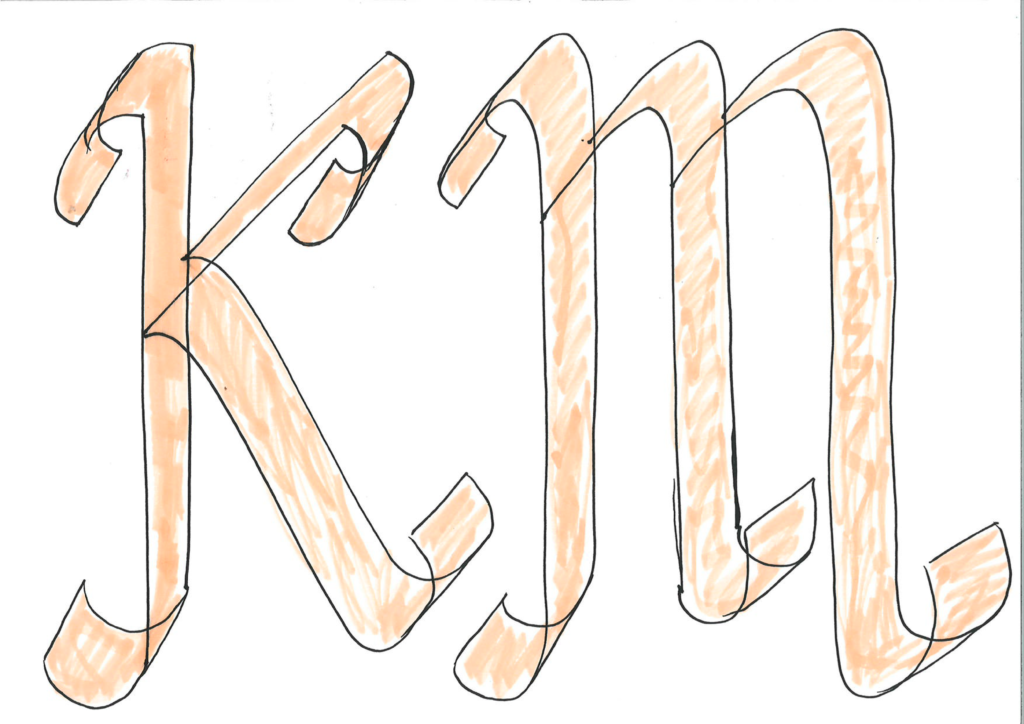
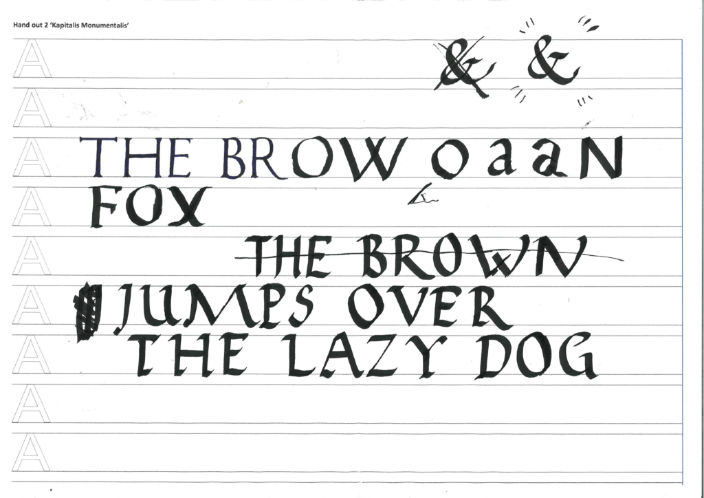
We made lettering from different eras by hand using interesting techniques with black markers.
Copy
Kees Winter gave us a lecture about copywriting. I really liked his passionate lecture, it was very eye-opening! The assignments were a bit of a miss for me. I feel like my group didn’t really come up with anything awesome. Maybe it was the lack of time. I feel like copy is my personal weakness, I’m not very good at creating text. So that’s why I thought this was a helpful lecture for me. It was also quite funny that Kees had worked in Nokia and lived in Finland so we talked a little about that.
Notes:
- Copywriting is text with a purpose, but copy alone won’t make an ad concept
- Copy + art = concept
- Copywriting brings the brand alive so people will like them
- NEVER explain what is going on in the picture or you will get shot by Kees
Thinking and cooking up concepts
- Listen don’t shout
- Listen to your target audience what they like about the product and what they want more
- Empathize
- Try to understand you target audience. how they think and why
- Show respect
- Respect the target audience. Don’t treat them like a fool
- Impact… IMPACT!
- Make a strong impression, concrete and cohesive. Art and copy that fulfill each other
- How do you rate a campaign? VIPS
- Visibility
- Identity
- Promise
- Simplicity
Assignment
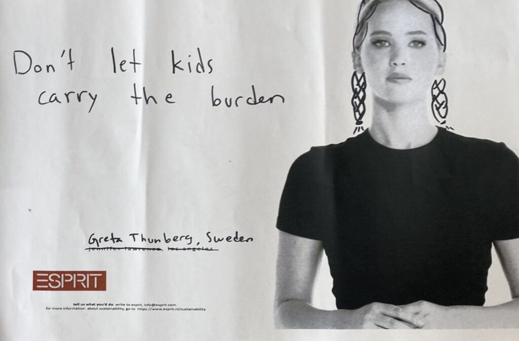
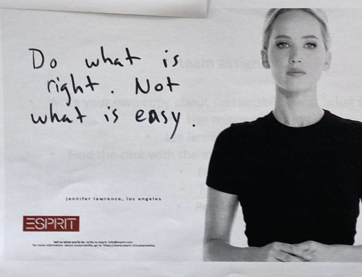
Create copy for the ESPRIT campaign “What would you do” using the voice of a celebrity. The copy should have something to do with sustainability. I was in a group with Laurijn, Mila, Eline and Julia.
Greta Thunberg saying “Don’t let kids carry the burden”.
Jennifer Lawrence saying “Do what is right, not what is easy”.
We also had a third quote from the son of David Attenborough saying “Be more like my father”.
Editorial
Marjolein Spronk came to our class to give us a presentation about editorial design. I really liked her class because she was doing the things I wish to do in the future so I was very inspired by her.
Notes:
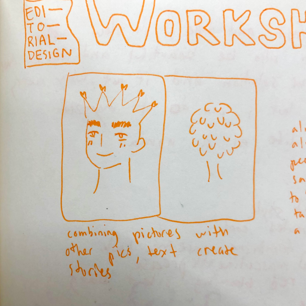
- Combining your pictures with other pictures and/or text create stories
- People almost always say yes to be taken a picture of
- Font 9 / leading 12
- Min 5 words, max 10 words in column
- Choosing a colour palette is important
- Use columns and grids to make your InDesign life easier
- Think of the photography concept and consistency of that
- Your text needs to be edgy and inspire the reader
- Sprinkle little out of the box ideas throughout your spread to make it surprising
- If you aren’t excited about the topic, bring your own interest in it to get you excited
Assignment
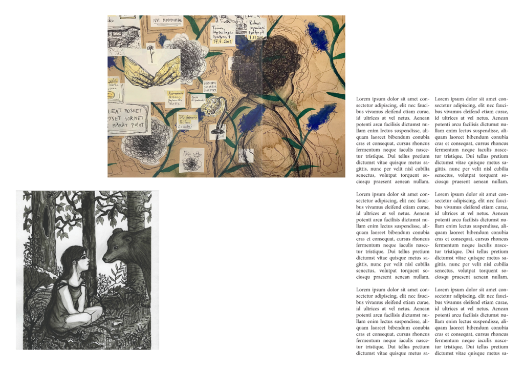
We had to prepare ahead of time photos and quotes from ourselves and also artwork we had done. For the actual assignment we had to switch our material with our partner to make a spread about them. I made a 2 spreads of June.
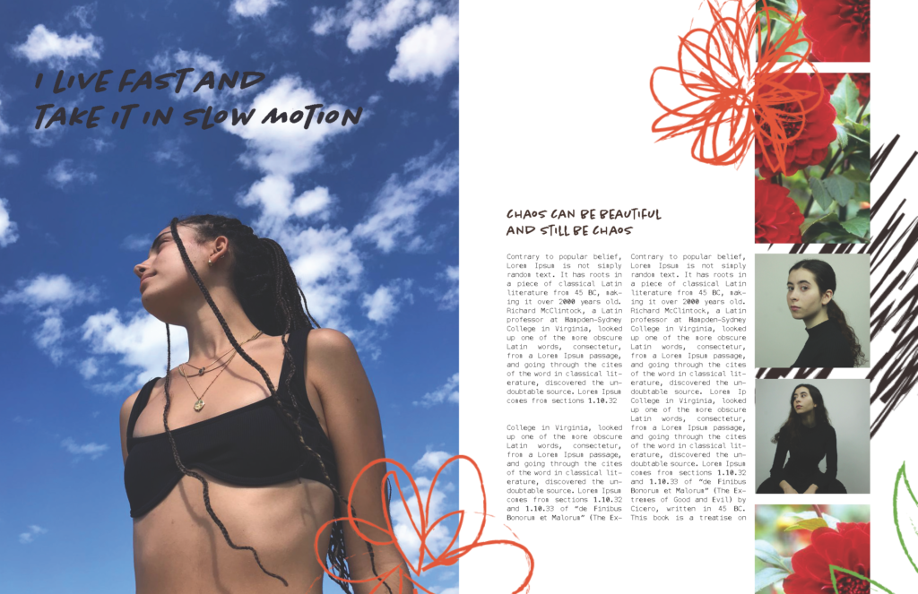
I think June has a distinct atmosphere to her. She likes muted and cool colors. She has a nice fusion of a feminine carefree look and a more masculine street style. I feel like grey concrete and red blooming flowers would represent nicely her cool, quiet masculine side and her cheerful blooming feminine side. A red blooming silent bang. Key words for this spread were beautiful, chaos, forgiving and unapologetic.
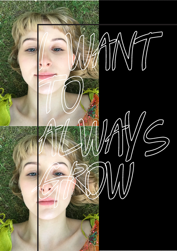
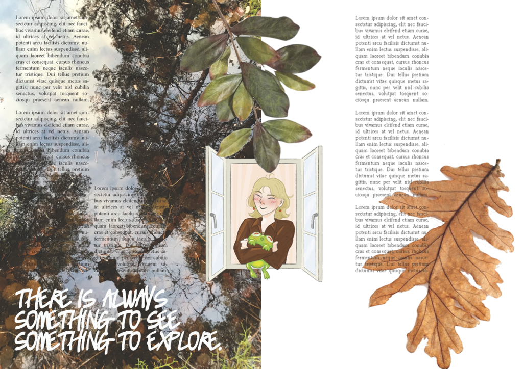
These are Junes spreads of me.
I really like that June added the leaves to my spread! It gives it a whimsical feeling to it.
Visual Sequencing
Bob Mollema talked to us about illustrating and how to make concise work. I really liked his examples. I have a tendency to think really big so then the project becomes too complicated. That’s something I want to get better at!
Notes:
- When creating cartoons or ideas the perspectives and frames have to be well thought of. A cartoon doesn’t have to have words for it to be interesting and dynamic if you concentrate on the right things
- When your promoting yourself be very determined, email new companies everyday
- It’s okay to steal ideas, just make them your own
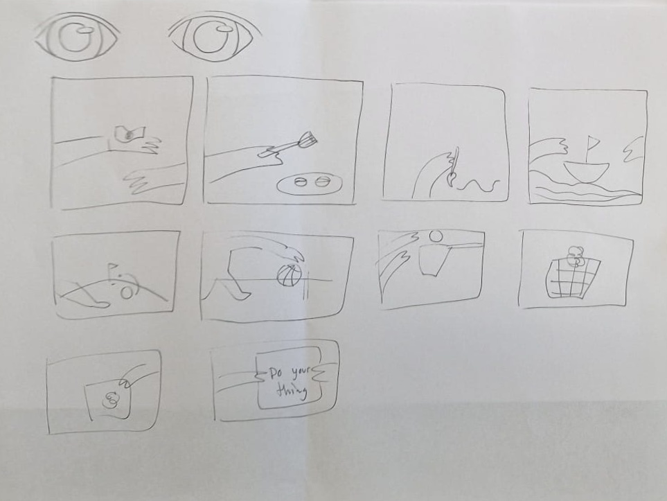
Assignment
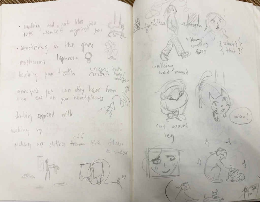
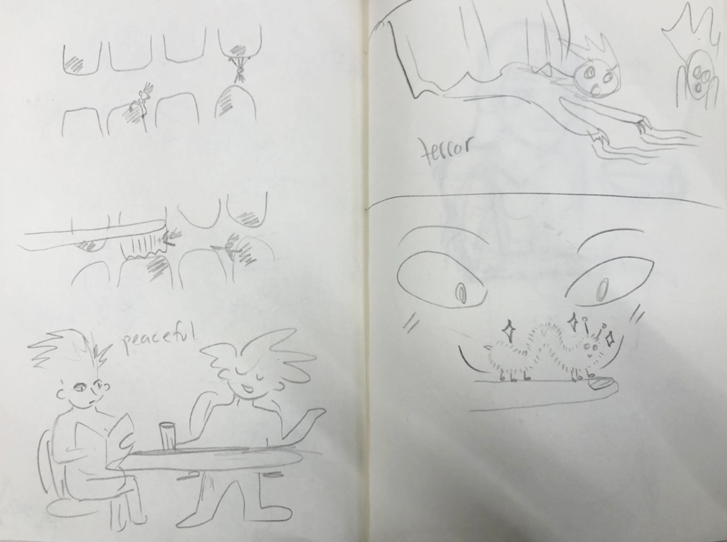
Make a cartoon of anything, preferably something very mundane. Right down all your ideas to get them out of your system.
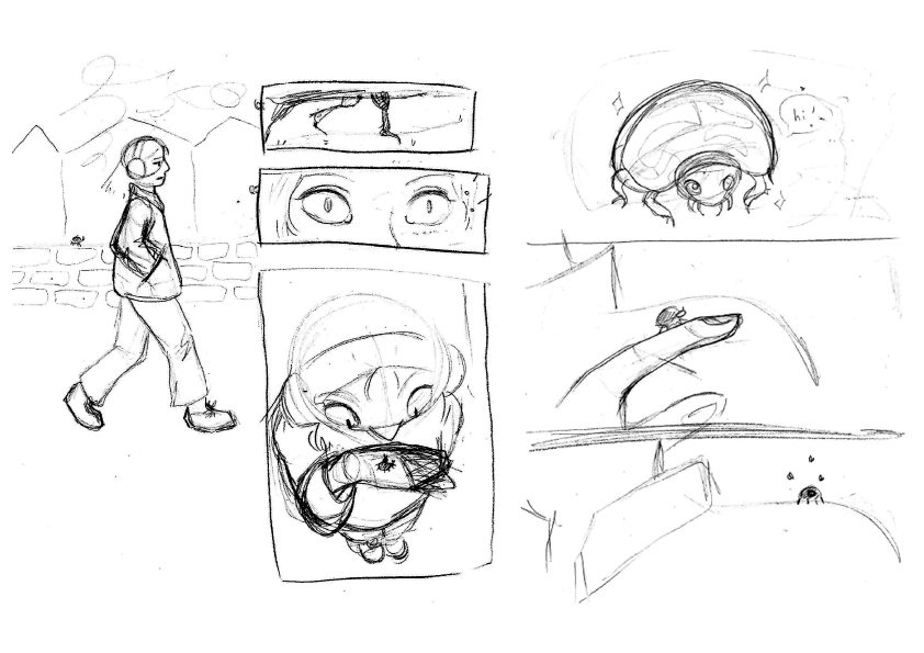
I made a cartoon about a girl and a bug. I wanted to concentrate on the different perspectives to make the cartoon look interesting. I was really inspired by that from the presentation so that is something I want to implement in my own work.
Art direction
Before this workshop we did the assignment below. In class Mark and Maarten gave us a presentation about Art direction. Then everybody presented their work and we discussed the expressions together as class and got feedback from each other.
Assignment
I was in a group with Lotte, Beau, June and Eline. This was a big assignment so we divided the research and tasks. I researched the current trends in graphic design and benchmarked some similar organisations to get an idea what they are doing. I also drew the offline expression.
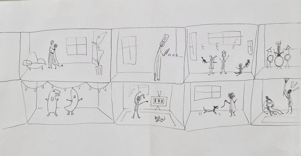
We created a Guerrilla campaign to promote an exhibition for the organisation Mental Hoop. Mental Hoop is a starting organisation that focuses on creating a community to help people with mental health issues to cope and fight through it. The campaign had to include an offline and online expression and a poster for the exhibition. We also needed to propose creators who Saran could outsource to do these things we proposed. We needed to present our research and concept idea in class to our two workshop teachers Mark, Maarten and Saran the creator of Mental Hoop.
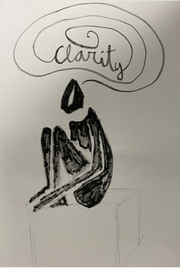
Our proposal was “Giving insight, by looking inside” and the name of our concept was “Clarity”. What this means is that through this exhibition we want to give clarity for people with mental health issues, people who might be questioning their mental health and to the family and friends of someone with mental health issues, so they can better understand what they are going through. We wanted to give clarity and a safe space to talk about mental health issues.
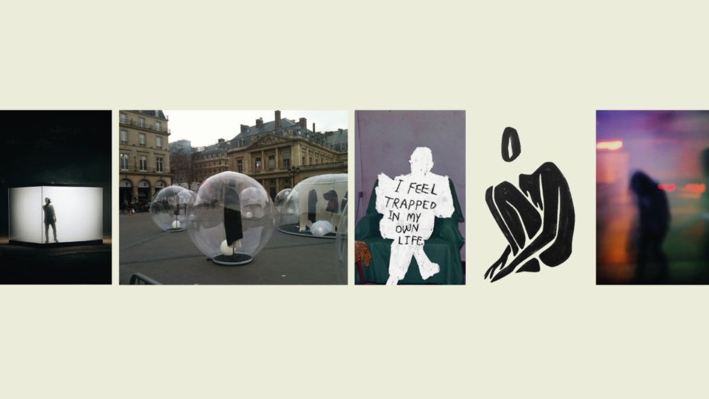
We wanted to put our Guerrilla campaign right in the middle of a busy market square so many people would see and experience it, making them interested to go see the exhibition. Our idea was to bring part of the exhibition outside so people get an idea what to expect. We made two variations of the offline expression.
Offline
In concept 1 you see a see-through person melting and people are walking all around and inside it. The space is made from inflatable plastic.
In concept 2 you see the same person laying down, now in a see through box.
In the middle you see an inside view.
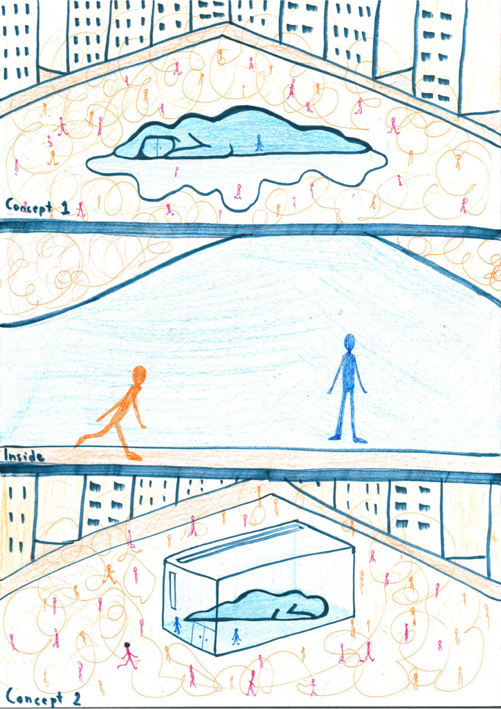
Outside it’s chaotic, people are running around doing their thing but when you enter the space you hear this buzzing white noise to represent feeling stuck, numb and trapped. People can wander in from the street to find out what the shape of a person is about, then they get to experience depressive and numb surroundings that can hopefully give them clarity of what depression might feel like. In the end, you get a call to action to go to the exhibition.
Online
We made a poster to promote it online. It lacks a call to action.
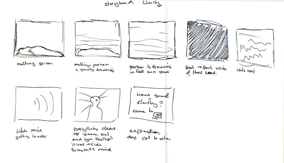
We also made a storyboard for an animated video of the person melting, falling into depression and showing the audience what goes in the head of a depressed person. It is the same person as all our expression.
Sadly we didn’t give any proposals on which creators to contact. We didn’t have time anymore and we weren’t quite sure where to start with that so we stayed with the things we knew what to do with. Next time we definitely should, since it is our job as art directors to organise these things.
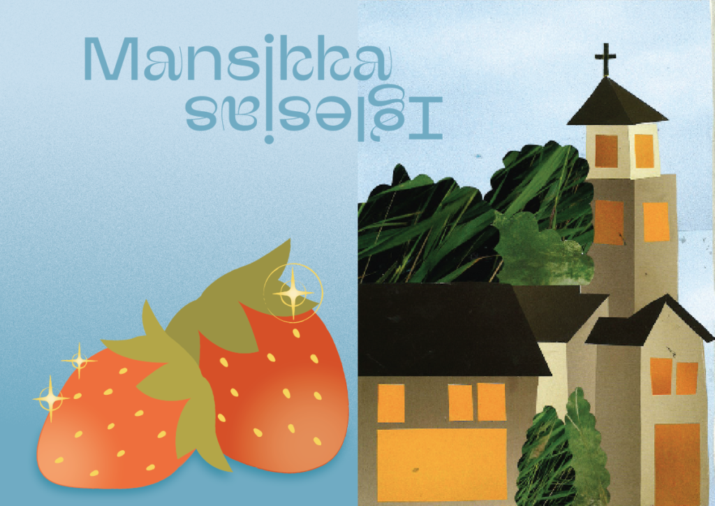
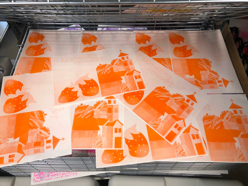
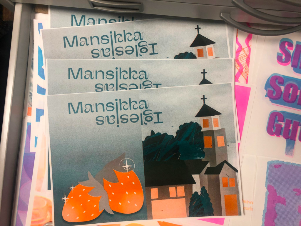
Riso
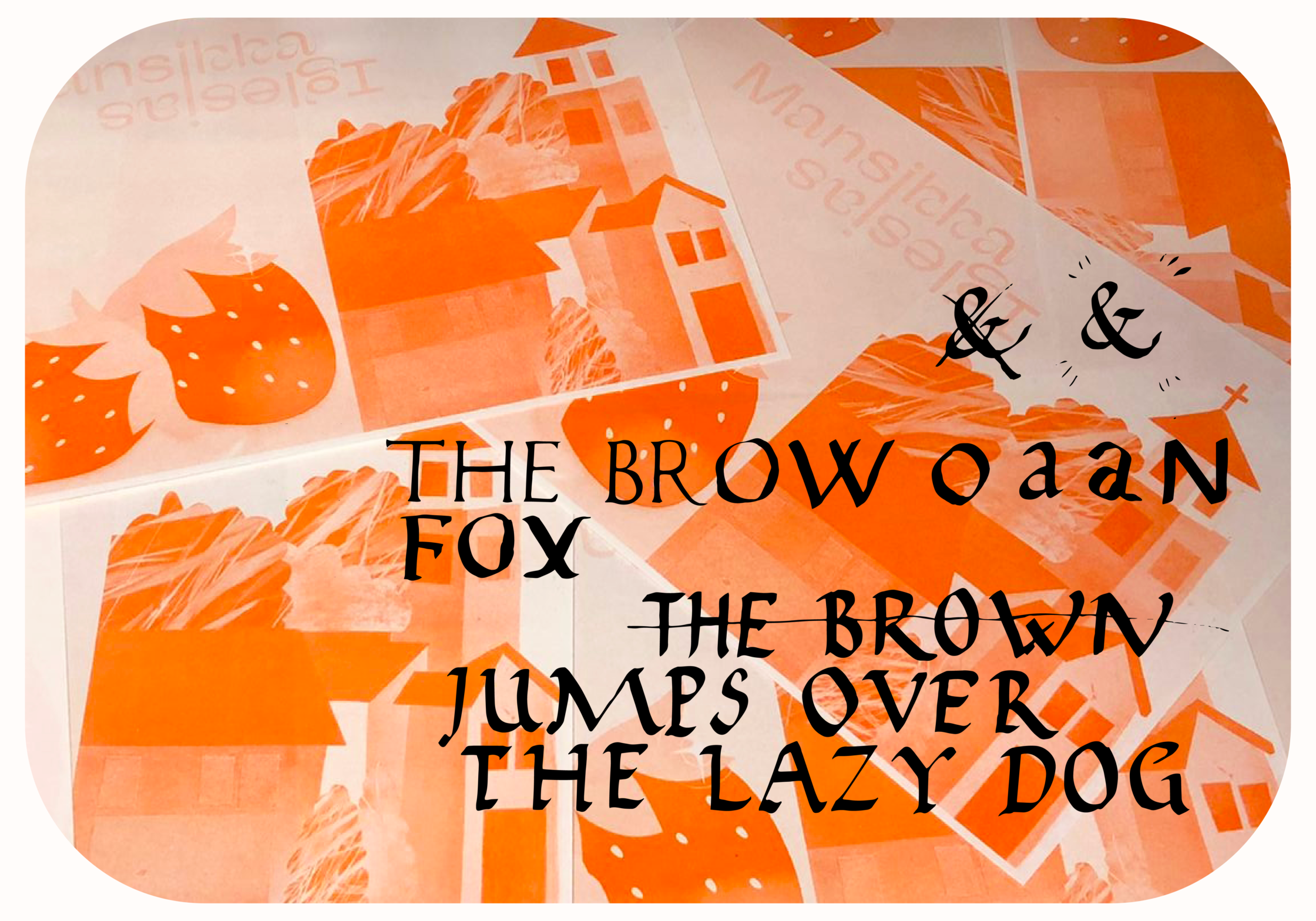
We learned about Riso printing and got to try it ourselves. For me it was the first time doing this so I was very excited!
Assingment
Me and my partner Mila designed the middle spread for our zine that would represent the both of us. This zine is for Reflective.
We chose to lean into our surnames. My last name Mansikka means Strawberry in Finnish and her last name Iglesias means church in Spanish. We also connected our last names and mirrored them to eachother.
Photography
Notes:
We had a short lecture about photography. Photography works by controlling light. With manual photography light can be controlled with these three:
- Aperture controls the lenses focus of the scenery. The smaller the number the aperture is the more in focus everything is and with a bigger number the lense focuses on a smaller area, leaving the rest of the scenery blurry.
- Shutter speed determines how long the lense is open.
- ISO determines how much light the lense takes in.
Assignment
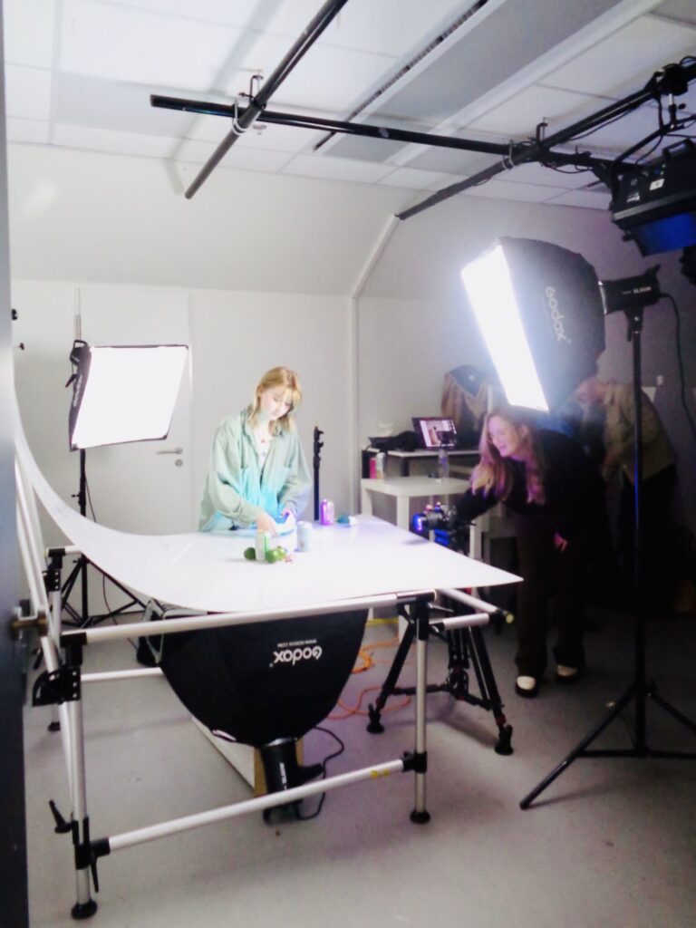
We took advantage of this workshop to create photos for our module Brand design. I took photos with Eline of beer cans and fruit to show how our brand BiiR would advertise different tastes.
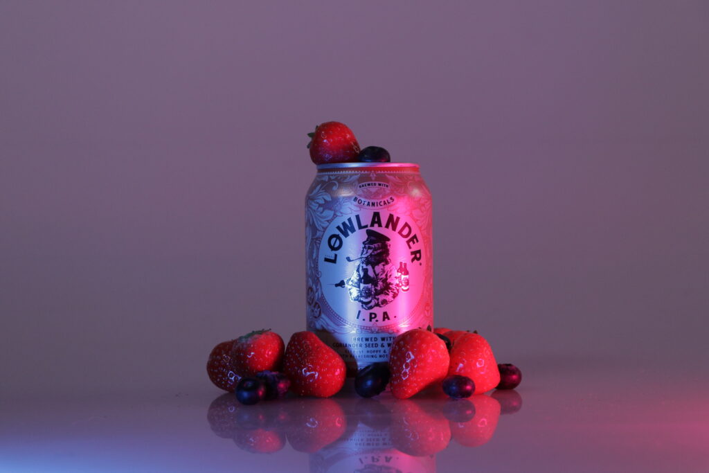
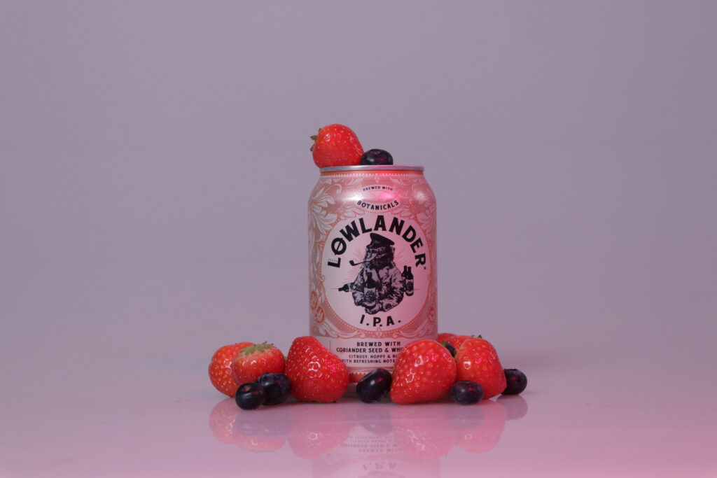
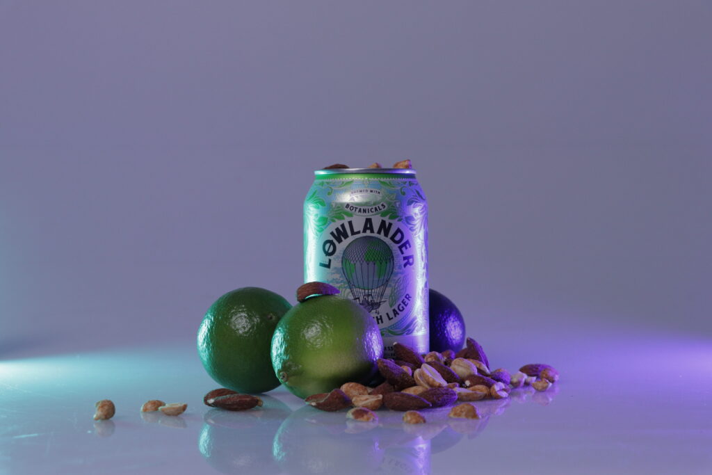
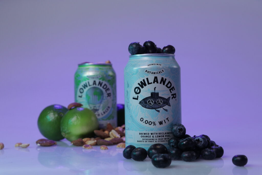
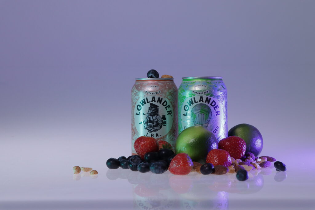
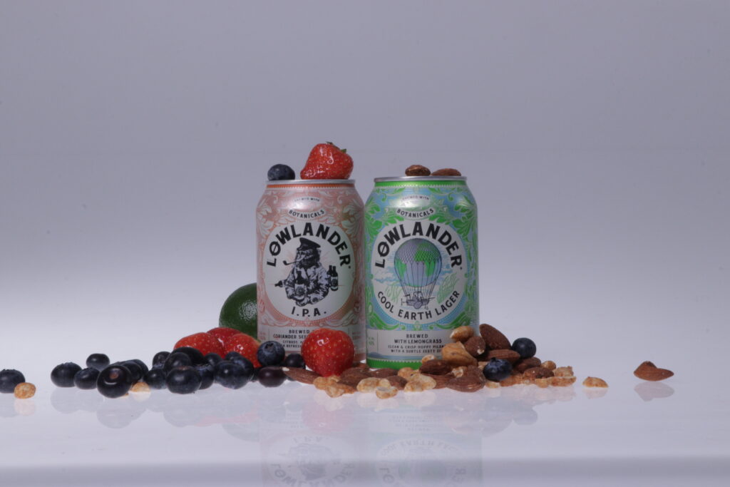
We used the green screen room. We had a white backdrop and we used three big lights, a front light, a back light and one light illuminating from underneath. We also had fun with colourful lights. We switched up the lights and their brightnesses a lot to see how that would affect the pictures.
Conclusion on workshops
The workshops were a lot of fun! I feel like they really made this Brand Design module very versatile. I learned so much and got to try a lot things! One thing I would have wished with some of the workshops was that we would have gotten faster in to the making and gotten more of an inside scoop how it actually works. I feel like I already had a pretty good understanding of the themes so the overview presentation that some of them had was unnecessary for me. I would have much rather learned about the actual making and gotten concrete feedback on what I should concentrate on. For example the Art direction workshop was a bit weird, because we were first supposed to do a lot of work for the workshop and then we learned after what we were supposed to do. xD Or the 2 very first workshops I felt like they were more of an overview on the subject.
Workshops that worked better in my opinion were the Photography, Visual sequencing, Editorial, Designing letters and Copy. My favourites were Visual sequencing and Editorial. I really felt inspired by the lecturers and was happy with the making process and feedback. I also want to give a special remark for the Designing letters workshop because I thought it was very interesting presentation!