On this page you will read and see everything that I made for my Ecoline case for Campaign.
Substation Team case
For the team part of this case I worked together with Sanne and Timo. We did a case for Royal Talens for Ecoline. Below is our substation case (team).
Ecoline case
Challenge
The products of Royal Talens are currently bought by an older audience. The brand wants a younger audience to engage with their products than is right now. Royal Talens notices that mostly older people buy their products, which is why they want to see if they can get their products to interact with a younger audience.
Insights
Royal Talens is a high-end manufacturer of paints and painting utensils for a broad range of
arts. Royal Talens believes that creative expression is essential for everyone’s personal
development and therefore contributes to a more social and better world.
Ecoline has been part of the creative landscape since 1930 and is known for its extensive range of beautiful colors. Whether artistic impressions, product design, illustrations, fashion design, calligraphy or children’s drawings, the bright colors of this liquid watercolor ink bring any work of art to life. Thanks to the pure formula based on dyes, the colors of Ecoline are astonishingly bright and vibrant. Ecoline is available in bottles, the Ecoline Brush Pen and the Duotip marker. Available individually and in sets. Ecoline also offers watercolor paper for the best results.
Big Idea
We want to create three posters with strong visuals for an outdoor campaign. In this campaign we want to incorporate the product of Ecoline and it’s USP’s. The importance is that we show the versatility of the product and a younger audience attracted.
CLIENT
Royal Talens is a high-end manufacturer of paints and painting utensils for a broad range of arts. Royal Talens believes that creative expression is essential for everyone’s personal development and therefore contributes to a more social and better world.
PRODUCT
Ecoline has been part of the creative landscape since 1930 and is known for its extensive range of beautiful colors. Whether artistic impressions, product design, illustrations, fashion design, calligraphy or children’s drawings, the bright colors of this liquid watercolor ink bring any work of art to life. Thanks to the pure formula based on dyes, the colors of Ecoline are astonishingly bright and vibrant. Ecoline is available in bottles, the Ecoline Brush Pen and the Duotip marker. Available individually and in sets. Ecoline also offers watercolor paper for the best results.
MARKET
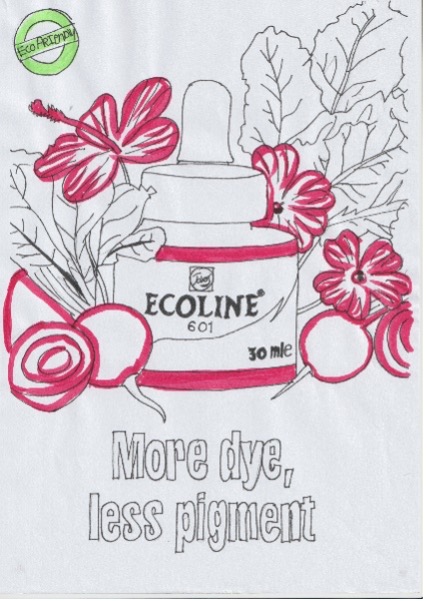
What is the difference between ecoline and watercolor paint? Watercolors are made from pigment and ecoline from dye (RoyalTalens, 2023). Ecoline is commonly considered a liquid watercolor, but there is a difference between those two. The difference is in the light and color fastness. Like I said before, ecoline contains dyes and watercolors contain pigment. Pigments are lightfast, unlike dyes (Angelique, 2022). For presentation materials that you keep in a folder you need to use ecoline, but your artwork will discolor if you left it in the sun for longer periods of time (Angelique, 2022).
COMPETITION
Avec
The Action (a Dutch store) sells their own watercolor paint, but they sell “Liquid watercolor” their paint is already thinned with water. Normally you add the water yourself (Zuidersma, 2021). The watercolor they sell at Action are from Avec and one set of 30ml per bottle costs €1,99 (Zuidersma, 2021). If you compare them they look alike, but on the downside you don’t get a dropper to make it easier to create the color palette, but the person who did the test was quite surprised with the outcome. After testing both watercolor paints they both looked good, and later the asked for more colors from Avec, so this outcome was quit surprising (Zuidersma, 2021).
S&S Worldwide Color Splash
You can buy them from Amazon and they cost €18,24 but you will get 6 bottles, so one bottle costs €3,04. But the bottles are a lot bigger. The bottles from S&S are 240 ml (Amazon, 2023). They also have 1600 reviews on their webpage and their average score is a 4.6. From the reviews I have concluded that the paint is bright and vibrant and you can still dilute them with water if you want.
Schmincke Aqua Drop
You can order a set of 10 for $44.99. If you convert it to euro per bottle it will cost €4,20 per bottle. On the website they describe this product to be pigment-based, lightfast, ready-to-use and ideal for watercolor painting and sketching (Cheapjoes, 2023). From reviews I learned that they are all sold in 30ml bottles. You can buy them individually or in sets. If you want to buy one bottle instead of a set you will need to pay €6,50 (Teoh Yi Chie, 2020). “Overall, the quality of Schmincke Aqua Drop is excellent. They have a good selection of lightfast colours included but do beware of the ones with lower lightfast rating.” (Teoh Yi Chie, 2020).
Dr. Ph. Martin’s Hydrus
12 colors in 30ml plastic bottles. They Have nice range of colors, a few strong colors no need to water down to get a light color. They also sell two others sets, so you can buy 36 different colors of this brand. Their average score is a 4.7. (Martin’s, 2023) The price is $49,99 if you convert it to euro’s per bottle they will cost €3,88 From the reviews I have concluded that these are easy to work with. They are recommended to beginners, because you can easily add water to them to make the paint lighter.
Unique Selling Points Ecoline
- Ecoline watercolors are well known for their intense and vibrant colors that remain transparent even when you layer them on top of each other (Royal Talens, 2022).
- Ecoline watercolors come in a liquid form, which means they are ready to use straight from the bottle. This format is convenient and eliminates the need for extensive mixing or preparation, you can still mix them with water to make the color lighter (Teoh Yi Chie, 2020).
- Royal Talens uses high-quality pigments in their Ecoline watercolors to ensure rich and long-lasting colors (Royal Talens, 2022). The pigments are also lightfast. This means that they resist fading over time when exposed to light (Angelique, 2022).
- Watercolors can be used in various artistic applications, including traditional watercolor painting, brush lettering, illustration, and even calligraphy. Royal Teens also sells other products you can use, for example duotips and brush pens (Royal Talens, 2022).
- Ecoline offers a wide range of colors, including traditional watercolor shades as well as bright, vibrant hues. This extensive color palette gives artists plenty of options for their creative projects (RoyalTalens, 2023).
- Ecoline watercolors are water-based and non-toxic making them safe for artists of all ages to use. They are easy to clean up with water because there are no harmful chemicals used (Amazon, 2023).
- The Ecoline watercolors come in glass bottles equipped with dropper lids. This make it easier to control the amount of paint you use and reduce waste (RoyalTalens, 2023).
Royal Talens’ Ecoline watercolors are a combination of quality and ease for painters of all skill levels. Their vivid, dramatic hues retain transparency even when layered, offering countless artistic options. Because of Royal Talens’ dedication to premium pigments, your artwork will remain intact throughout time because of its long-lasting hues. Ecoline can meet a variety of artistic objectives because to its extensive color pallet, which includes both classic and vivid hues. Ecoline watercolors provide a flexible and trustworthy option to support your creative activities, whether you enjoy classic watercolor painting, brush writing, illustration, or calligraphy.
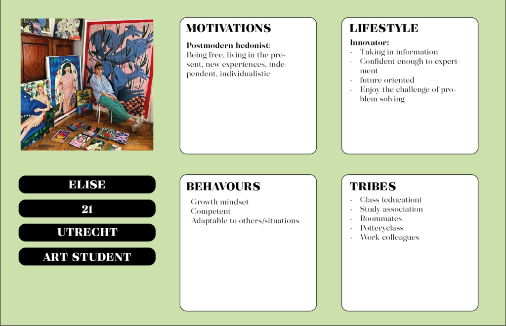
TARGET GROUP
We want to focus on (creative) students. After some basic research, we found out that the younger audience’s knowledge varies about the product. But most young people know the product by name but do not buy it regularly. Another reason to come to the conclusion to focus on students is because the posters will be hung around university cities.
We will focus on Art student’s, male/female. They are invested in climate change and sustainability. This is because they are the most known whit the product but don`t use is regularly.
PROPOSED VISUALS
Explanation final executions
For the final executions we used three strong messages instead of using one or two messages multiple times. We also used the flacon multiple times instead of using three different objects that also looked like a water bottle or maybe a peanut butter jar (some feedback we got the last time).
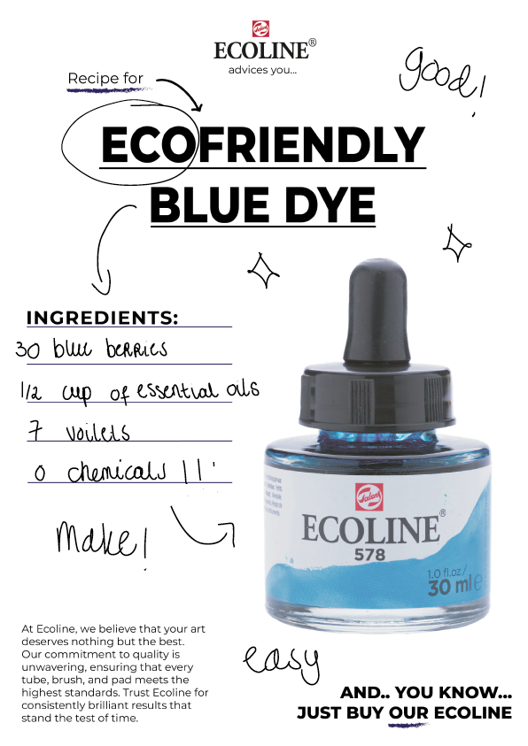
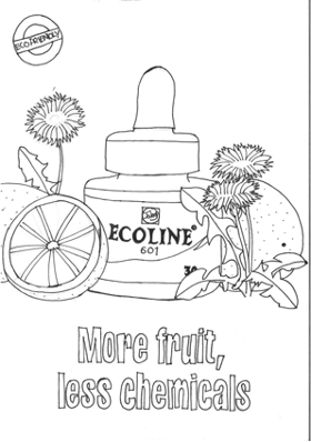
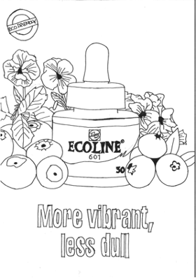
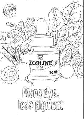
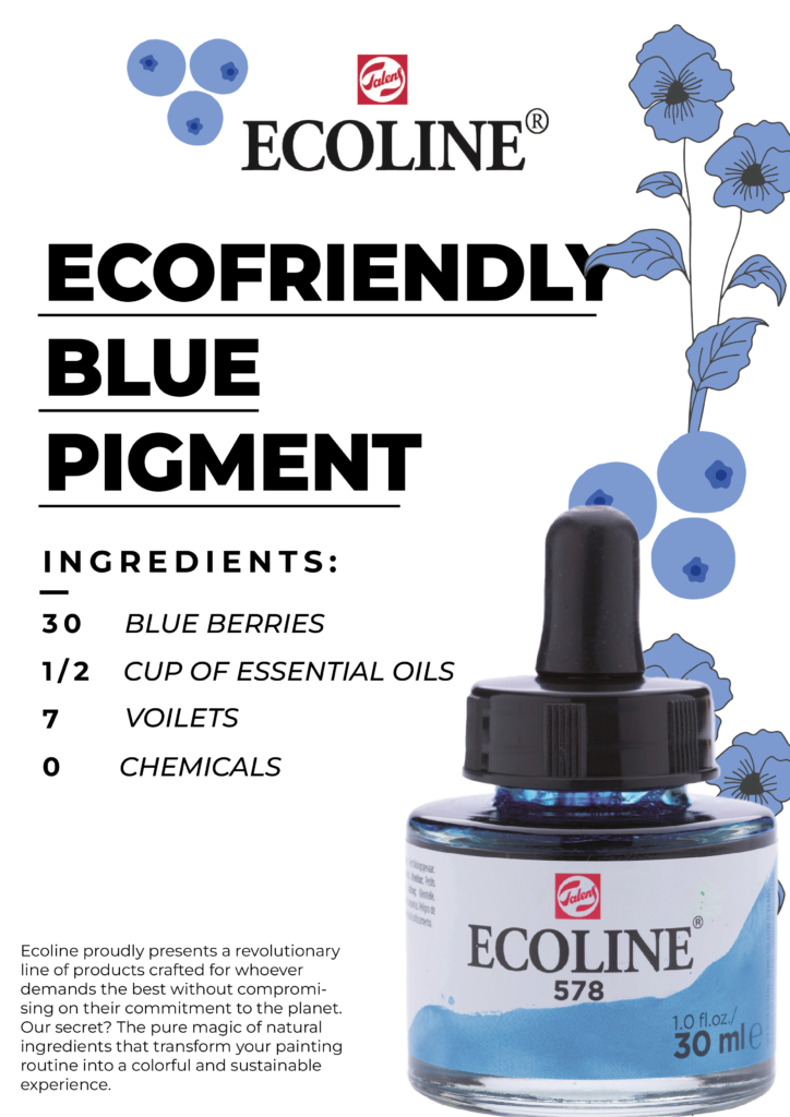
On these three sketches we didn’t used any color, but we did fill them in with the three most famous colors. We choose for Red, Green and Blue (RGB). But we only filled them in with stencils, because we didn’t had any ecoline with us. But for the final presenation we want to fill them in with real ecoline to show the audience what it will look like if you use ecoline.
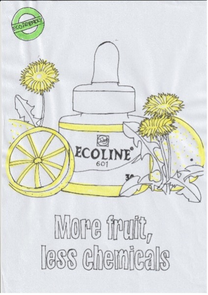
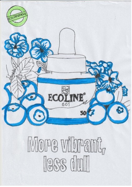
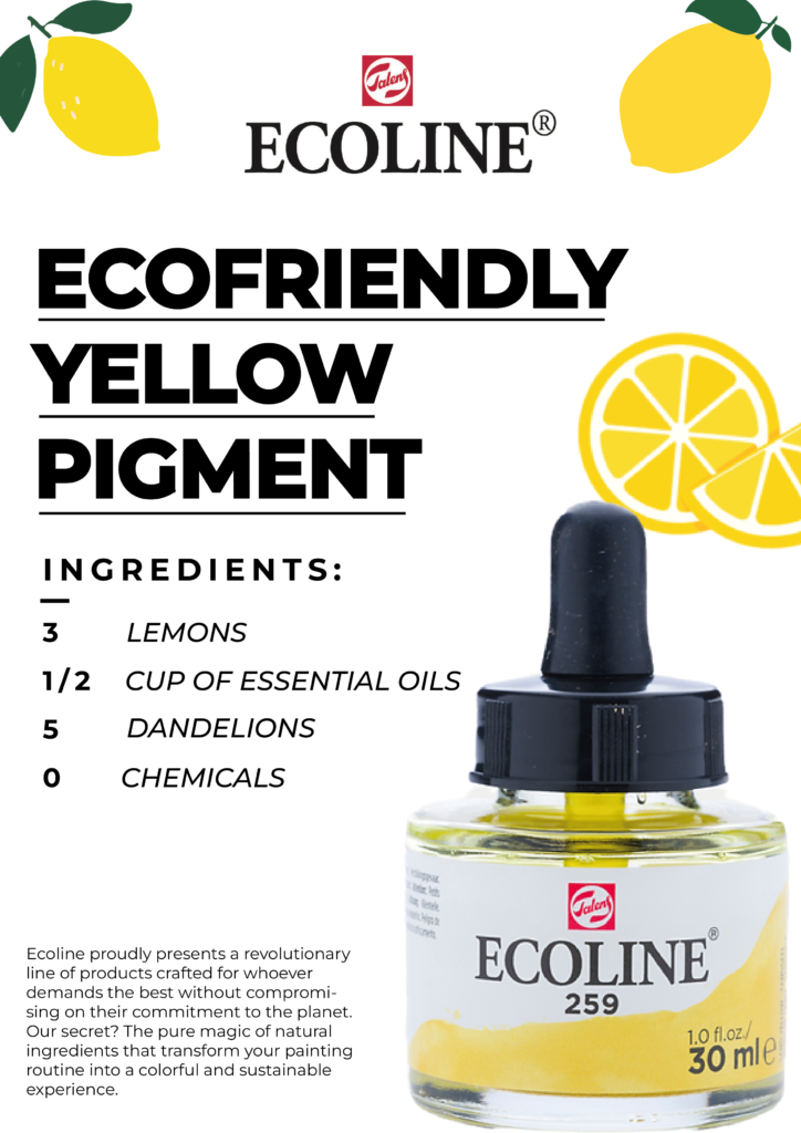
In the backgrounds of all the posters you can spots flowers and fruits/vegetables. For the first poster we used beets and a hibiscus flower. For the middle poster we used blue berry and blue sweet violet flowers and lastly we used dandelions and lemons for the color yellow.
The sticker in the upper left corner should have been green because eco-friendly things are usually depicted with the color green.
VISUALS AFTER FEEDBACK
Based on the feedback we received during the presentation, we made a few minor adjustments to the sketches.
Feedback used:
- Give the quality mark a color to make it more noticeable
- Use ecocline when coloring the sketches
Text from presentation:
I once heard someone say, “ecocline is filled with chemicals right?” Well let me tell you. Ecoline is made from natural dye such as plants, fruits and trees. Royal Talens asked us to get a younger audience to engage with their product ecocline, so this is what we did.
Our communication problem is that the younger audience needs to get more familiar with the brand and using the product.
But after some research it seemed art students knew the product, but just didn’t use it.
For our target audience we chose art students. As it seemed this bottle of ecocline is not really easy to use if you are a beginner and that’s why we chose art students bc they learn to use these products.
Ecoline is unique because no other product compares to them.
MOODBOARDS ARTDIRECTION
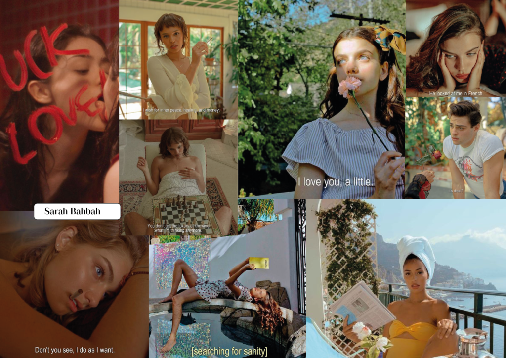
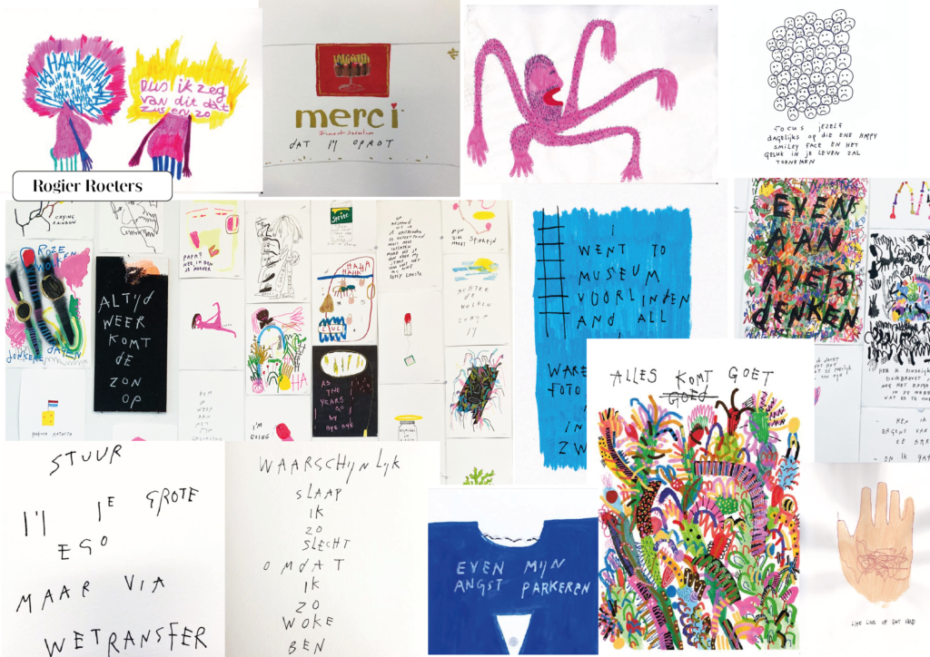
For the artdirection of the first case I made three moodboards to test out the different styles I could propose for my visuals. I made a moldboard about Shantell Martin (upper one), about Sarah Bahbah (second one) and Rogier Roeters (last).

PRESENTION ARTDIRECTOR
PROPOSITION
Our proposition is “Created from dye that is made out of natural sources, such as roots, berries, leaves, wood and fungi”. The bottles and even the pens are filled with ecoline. Ecoline has a natural root because it is made from natural products. This is something that makes Ecoline unique unlike other painting products or art supplies.
For example, the color red is made from beetroots and hibiscus. The naturally occurring color in these products is used for the high end pigment of Ecoline. This all makes Ecoline environmentally friendly.
STRATEGY
The strategy I propose is advice strategy. The reason I chose this strategy over our team strategy (product positioning) is because I think that this strategy will work much better with the targetgroup being students.
Through this strategy I want to make a sarcastic point towards students. Young people always think they know better. Giving them advice will only make them ignore them. This is the point I’m making with my visuals. I want them to ignore the advice on purpose.
My target group are postmodern hedonists (mentality motivation) which means they like being free, new experiences and making their own decisions. They also care about the environment and doing good. (Hengel, 2023)
CONCEPT
For this concept, I’m using a sarcastic/two-in-one approach. You see advice, such as a doctor’s prescription or a recipe, but the intention is to ignore it. This concept encourages the target audience to think in a specific direction, tapping into their rebellious nature. The idea is to play on the thought of “I know better.” By adding a humorous touch, I create a sarcastic undertone that the target audience can appreciate.
ART DIRECTION
For my first case I propose an illustrative style, with typography as main focus. The illustrations are a doodely style, handdrawn and imperfect. There can be scratches and lines on the paper, so it will look a bit old. For this art direction I intentianly diceded on the style of Rogier Roeters, but for the end results I also want to include typography as a style.
COPY
This copy is perfect for outdoor campaign because of it’s directness. When people see an ad outside, most of the time they’re walking or even driving past it. There is not a lot of time to make up what the poster or advertisement has to say. To be direct and straight to the point is essential for students who are in a hurry. With a clear copy on what the ad is about and some funny jokes, this campaign will catch the attention of the right targetgroup.
FIRST VISUALS
For the lay out I propose a centered layout, with large bold copy above. The image (of ecoline) will catch the attention first, so that the target audience will get filtered. Previous research showed that the target audience is known with this product.
FINAL CAMPAIGN IMAGES
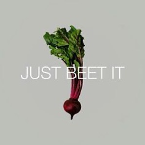
This concept revolves entirely around receiving advice and then deliberately ignoring it, a common behavior among young people. The visuals will portray various forms of advice, like a doctor’s recommendation or a recipe suggestion. These are familiar scenarios for the target audience, but they prefer to disregard them, asserting their own way of doing things because they always believe they know better.
The concept challenges the idea that students always choose the easy way. By illustrating how things can be complicated in the visuals — for instance, having to manufacture the entire jar yourself or obtaining it only through a doctor’s prescription — purchasing a jar of Ecoline suddenly seems very straightforward. This approach lowers the threshold for buying the product.
Ecoline contains only natural ingredients, so no chemicals are used. Besides that it’s such a good product, this is the highest valuable USP to the targetgroup. The target audience is strict about not harming the environment with their lifestyle, as with their workstyle. Making sure they know that ecoline is a natural product, will make them consider this product faster and buy it more.
Ecoline comes in many colors, but for this campaign I exclusively chose red, yellow and blue. Most people know these colors are used to create secundairy colors, but it also speaks to the knowledge of the art student. Which then points out that the possibilities with this product are endless.
Lastly, I inform the audience with body copy on every poster about the uniqueness of the products. One is focused on the versatility of the product, one on the uniqueness (there is no product like Ecoline) and the last on the sustainability of this art supply.