On this page you will read on my case 2 for campaign. For this case I work together with Hannah de Leeuw.
Team moodboard
For the kickoff of this case, Hannah and I made a team moodboard. For this moodboard we separately searched for pictures of our own work, work we liked, work we didn’t like and work we liked but didn’t want to make. As it turned out, Hannah and I both have the same taste in design, this is how our moodboard came out:
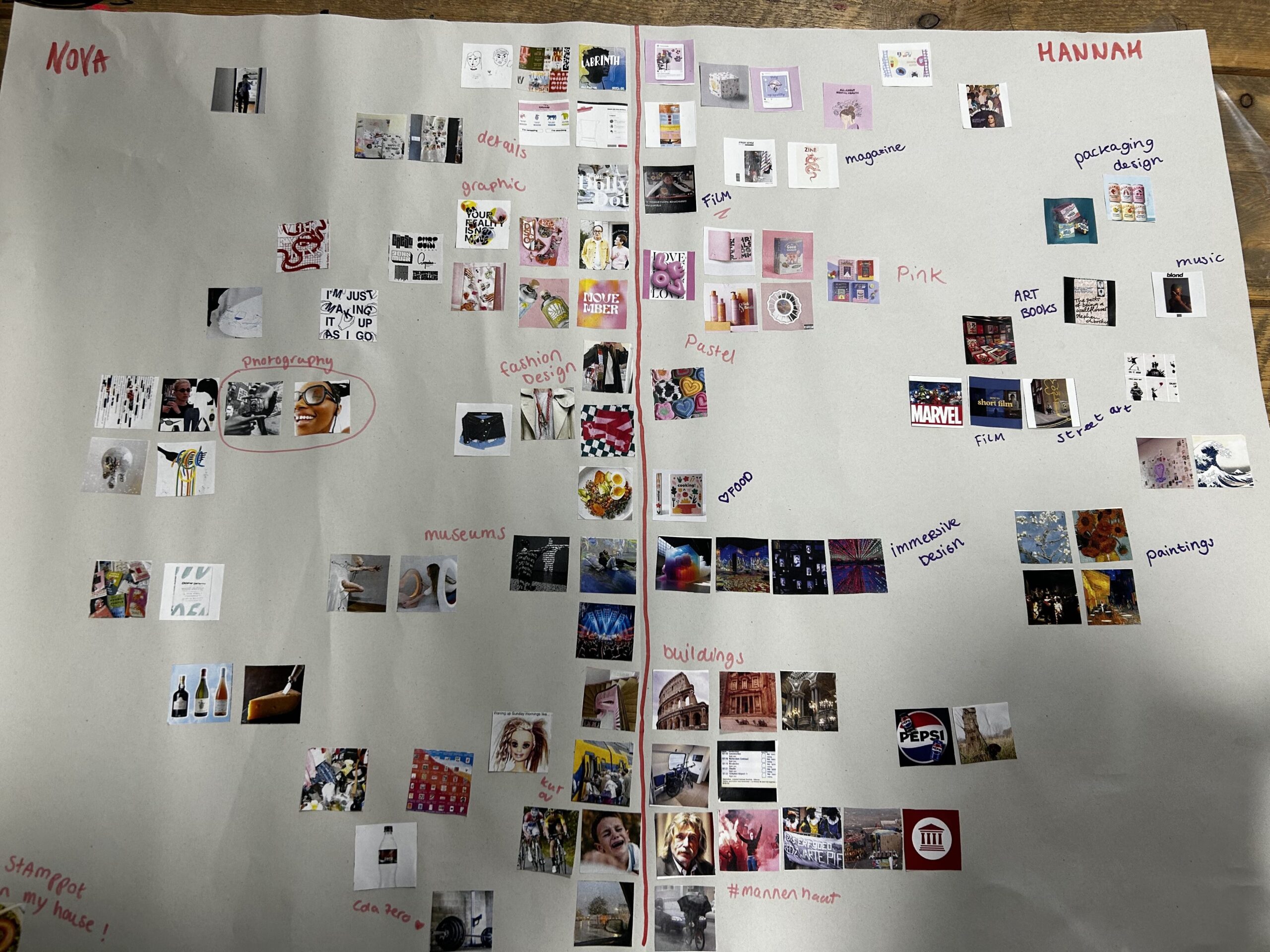
Analysis of the moodboard
The team moodboard Hannah and I made, looks really like one moodboard. You can see we share the same feel for design. Our aesthetics really looks alike and match well with each other. Hannah has a broader look on design, I think. I tend to seek designs inside my comfort zone and don’t really look outside of that. My designs are more eccentric or experimental maybe, where Hannah’s are calmer in think.
The main thing we have in common is our love for pink and pastel colors. We like the same package design where the products are minimalistic, but colorful. We also share the same hate for public transport and certain people.
In summary, in my images I can see that like to chose some pictures with different layouts. I like it when the layout looks different than ‘normal’. My style would maybe be more experimental than Hannah’s. Her style is more specific, with less crazy details, but again, our styles really match up in this moodboard.
What is missing?
Through discussing the feedback we got on our moodboard it appeared we both didn’t look at copy and typography enough. I like to look at typography and graphic design, but I can put some more effort in copywriting. This is something people say I’m good at and I like it, but I don’t really know where to get the inspiration from.
Partner interview
To get to know some more about each other on personal and professional base, we interviewed each other and compiled a piece of text that we could use for our introduction on our LinkedIn profile and/or portfolio website. I wrote the following for Hannah:
Hannah, a cheerful girl who loves films and would like to make her own one day. The thought of directing her own movie started when she was younger. “I’d like to make a film that people want to rewatch at least once a month, just like I did with my dad and brother. Iron man was screening in our living room more than once.”
Besides directing her first movie, she would like to be present in the whole proces of filmmaking. “I get the most energy out of working with people. I like to get in contact with a lot of different people because you can learn a lot from them. I like projects where I get the creative freedom to make what I want, not what somebody else wants.” Her creative ambitions lay with writing, music, (art)books, films and clothes.
“I want to be an art director. I want to create lay-outs for magazines, copy and text.” Hannah knows art director is not your usual first job, but when there is something she wants, she believes she can get it. “I’d like to be a junior artdirector first. Maybe work in a team with people working above me. Then later, I can work my way up to art director and start making the calls.”
Hannah’s inspiration is a wide range of work. She uses a lot of pink and purple colors and just like me, no primary colors. She gets inspiration from immersive design and museum paintings, but she would never make those her self. Just to admire. We share the same hate for trains, rain and men. Especially Johan Derksen.
Art director presentation
For my presentation on a famous art director I researched Liza Enebeis. I chose her because she does a lot of work with motion design. I have been interested in everything motion design and animation for some time now. That’s also why I really liked the workshop After Effects. This is something I would like to learn more, so it was nice for me to look at someone who is really accomplished at this. Liza Enebeis made work for Avro tros, Alzheimer Nederland, The Social Hub, North Sea Jazz and she is one of the founders and hosts of DEMO festival!
Downloaden
Word brainstorm
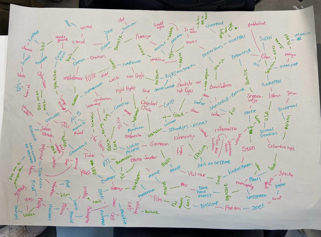
This lesson I tried a new brandstorm technique. For this assignment I worked together with Ning and Ephraim. It was really funny to see how everybodys brain worked differently with coming up with words. For this assignment I was the green pen. Doing these sorts of assignments work really well for me, because I can just do, instead of think.
Using these prompts, I generated 50 sentences, each beginning with one of the following phrases: ‘More people should‘, ‘It is a shame that‘, ‘Why‘, ‘You can see that‘, and ‘It is logical that‘. In each sentence, I combined three different words, focusing on grammatical correctness rather than conveying a specific meaning.
Below you can download the Word document with all 50 sentences.
Five sentences to sketches
I chose five sentences to make my first sketches with for my second case. I chose the following sentences:
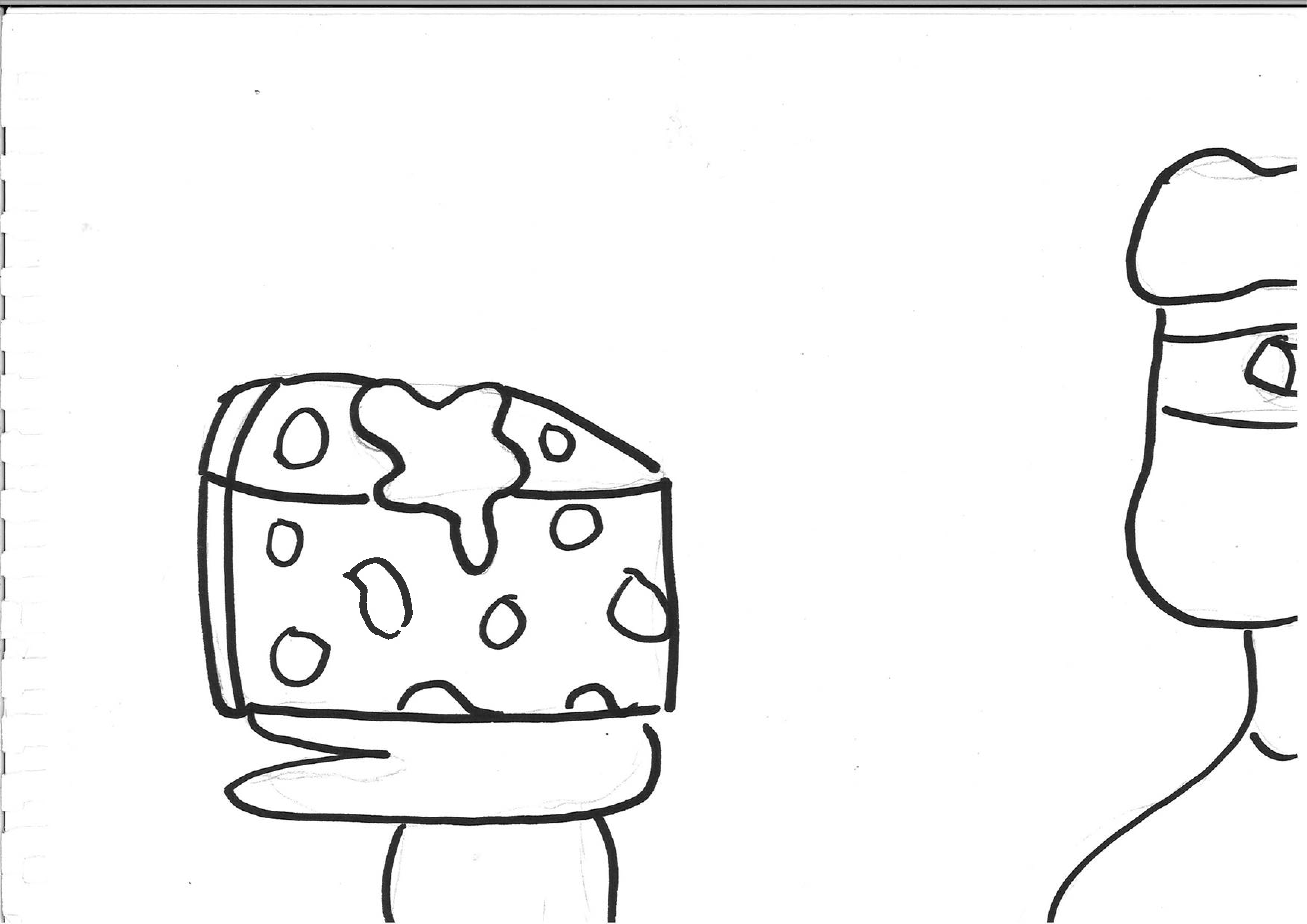
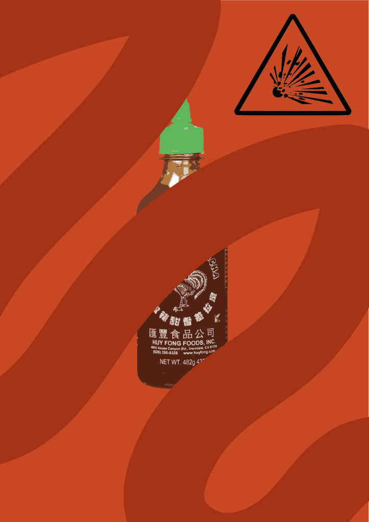
- More people should put siracha on their cheese because its wat superhero’s do
- It is logical that after running a fast marathon you get aggressive.
- You can see that John Deere (trekkers) is more important than Bernie Sanders
- It is logical that the ducks are laughing at Marco B after what he has done.
- It’s a shame that crossed eyed people are very aggressive if they chose sweet instead of salt.
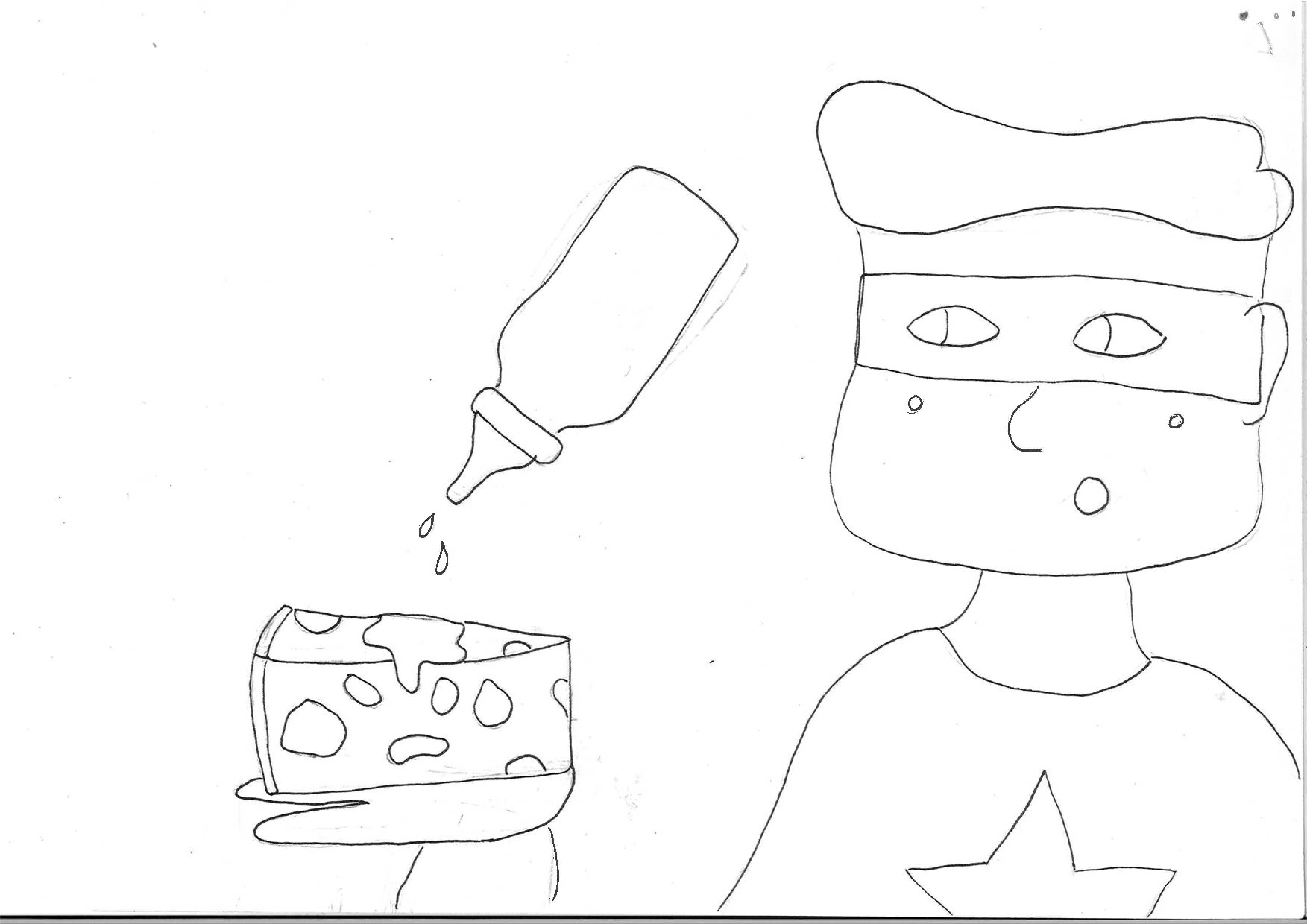
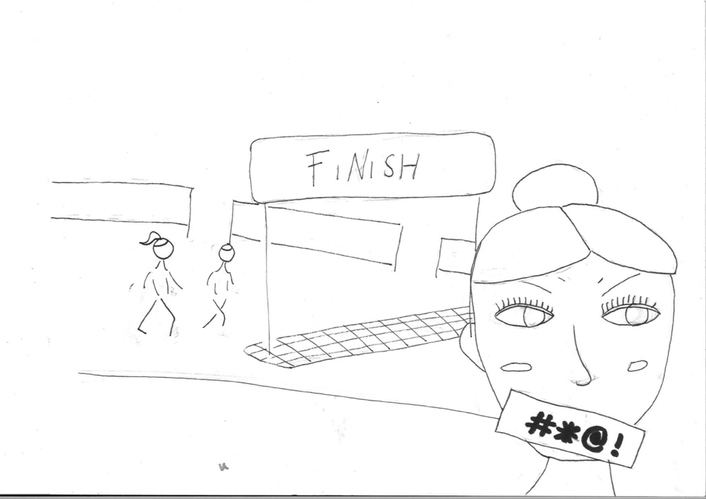
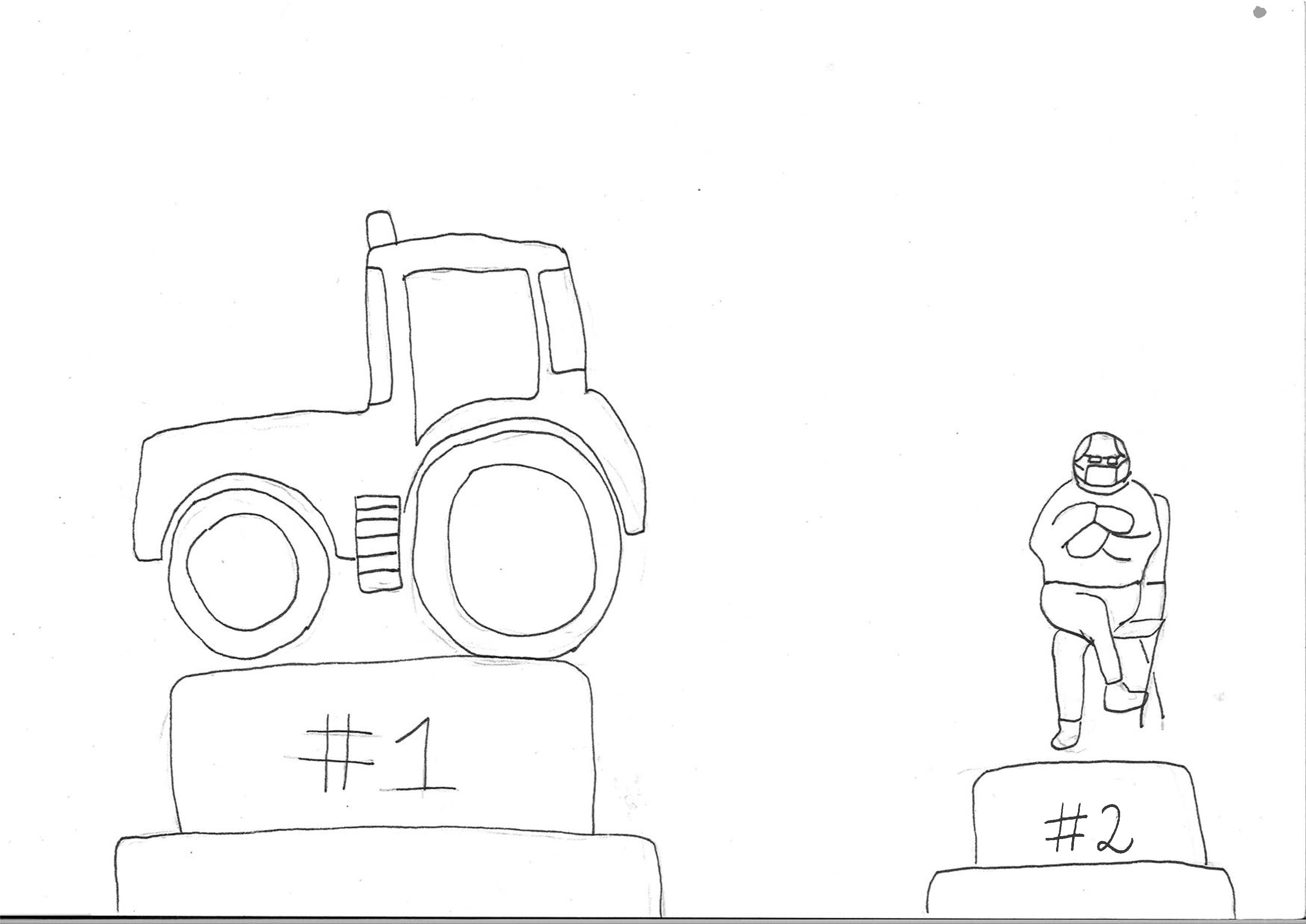
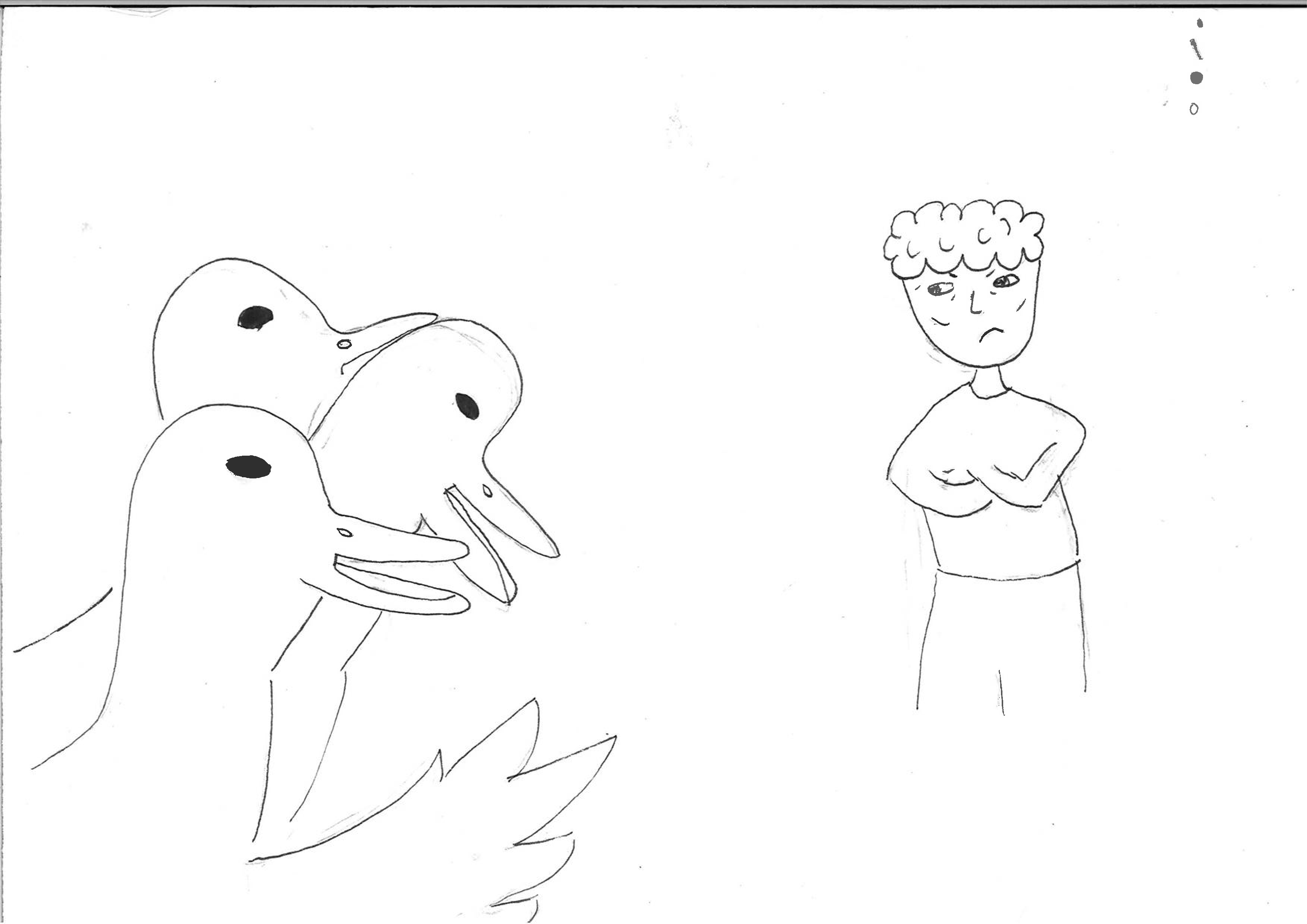
Sketch 1 received positive feedback with suggestions to emphasize the foreground of the cheese and ketchup superhero concept, potentially turning it into an ad for Comic Con. Sketch 2 faced criticism for the direction of the character’s eyes, prompting consideration for conveying different emotions. Sketch 3, featuring a tractor as a metaphor for farmers, lacked clarity, with a suggestion that making the tractor smaller might transform it into a toy for a Lego commercial. Sketch 4, inspired by a modern Frankenstein theme, was criticized for the complexity of the duck drawings and the lack of clarity in the narrative. Sketch 5, resembling a Picasso style, received mixed feedback, with some identifying a potential horror scenario involving blood but others struggling to understand the intended communication. Overall, the artist gathered valuable feedback and ideas from the group to guide further development of these concepts.
Second sketches
Eventually I chose my first sketch. This sketch was the clearest to the group, which meant I drew it good. I got the most positive feedback on this sketch and the group gave me the most and best ideas to work with this concept.
In this concept I am going to work with sriracha in different ways. I have to look how to include a superhero in this concept.

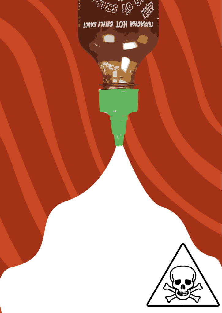
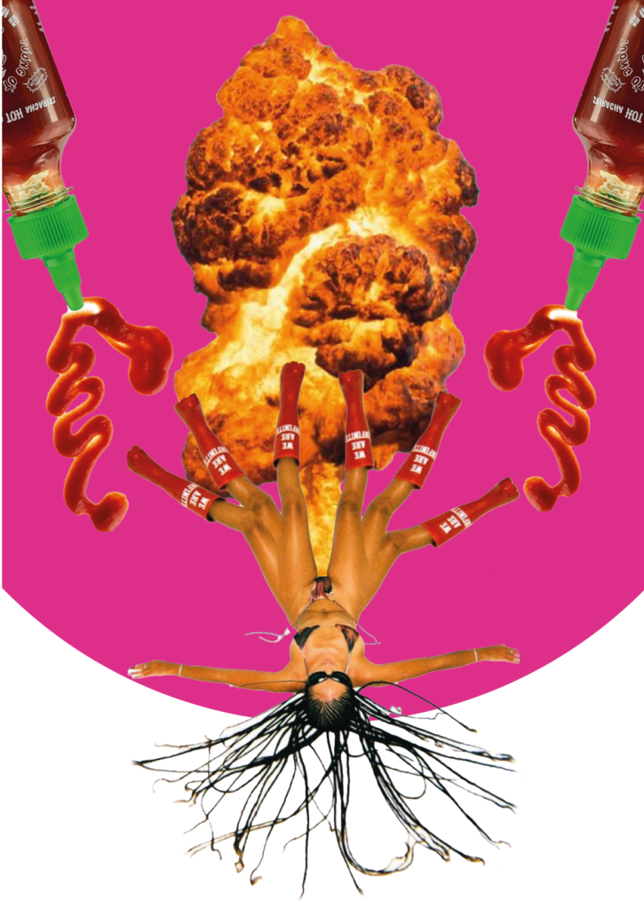
For the first concept featuring Sriracha, the goal was to demonstrate its transformative power, turning consumers into superheroes if they could handle the heat. However, feedback suggested that the series might be too narrative-driven. On a positive note, there’s potential in highlighting Sriracha’s versatility in unusual combinations, like pairing it with peanut butter, to make the concept more attention-grabbing.
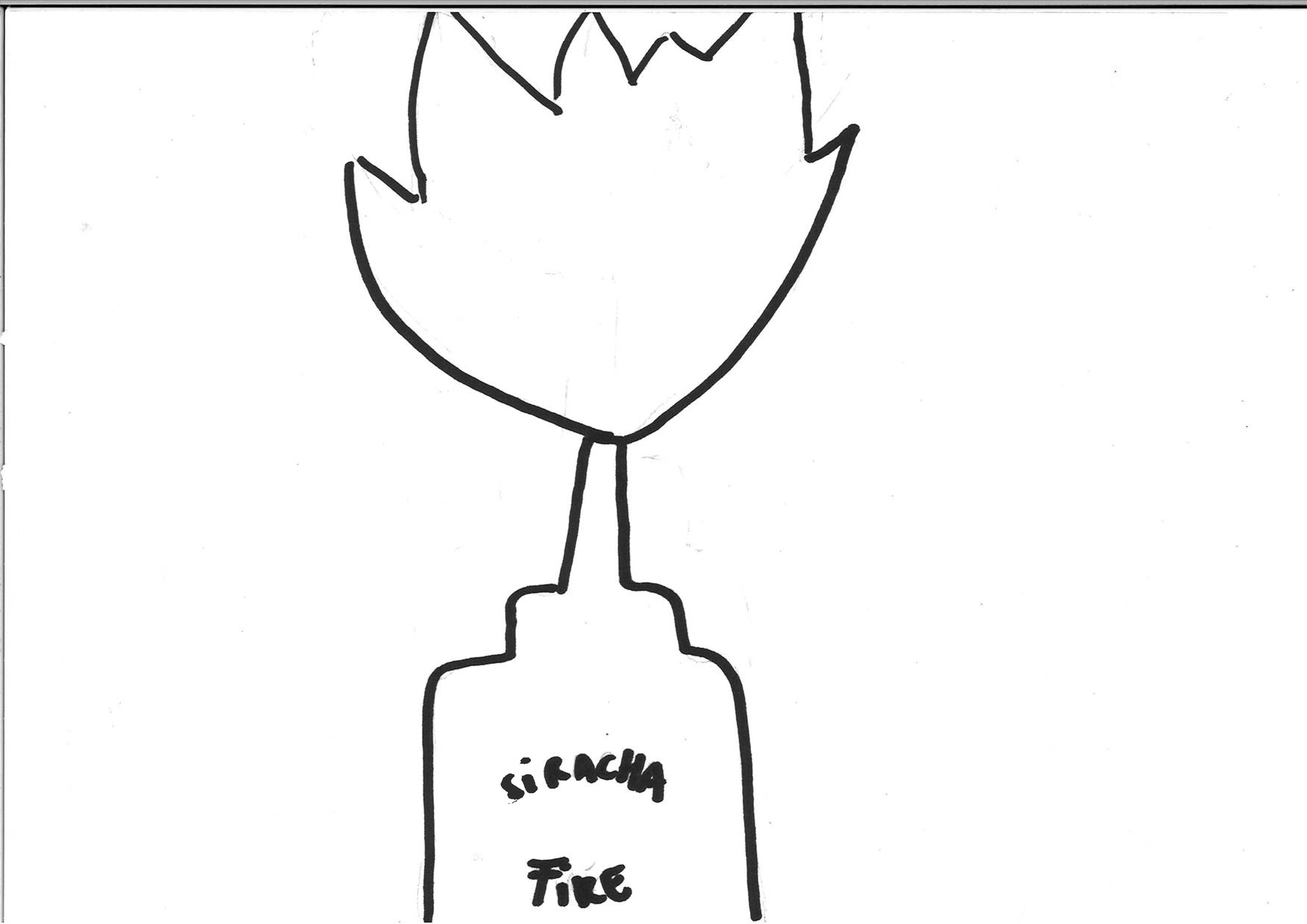
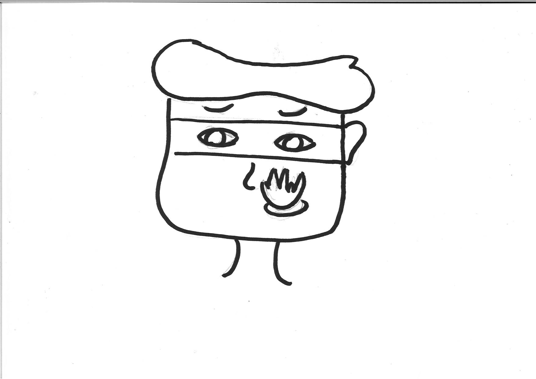
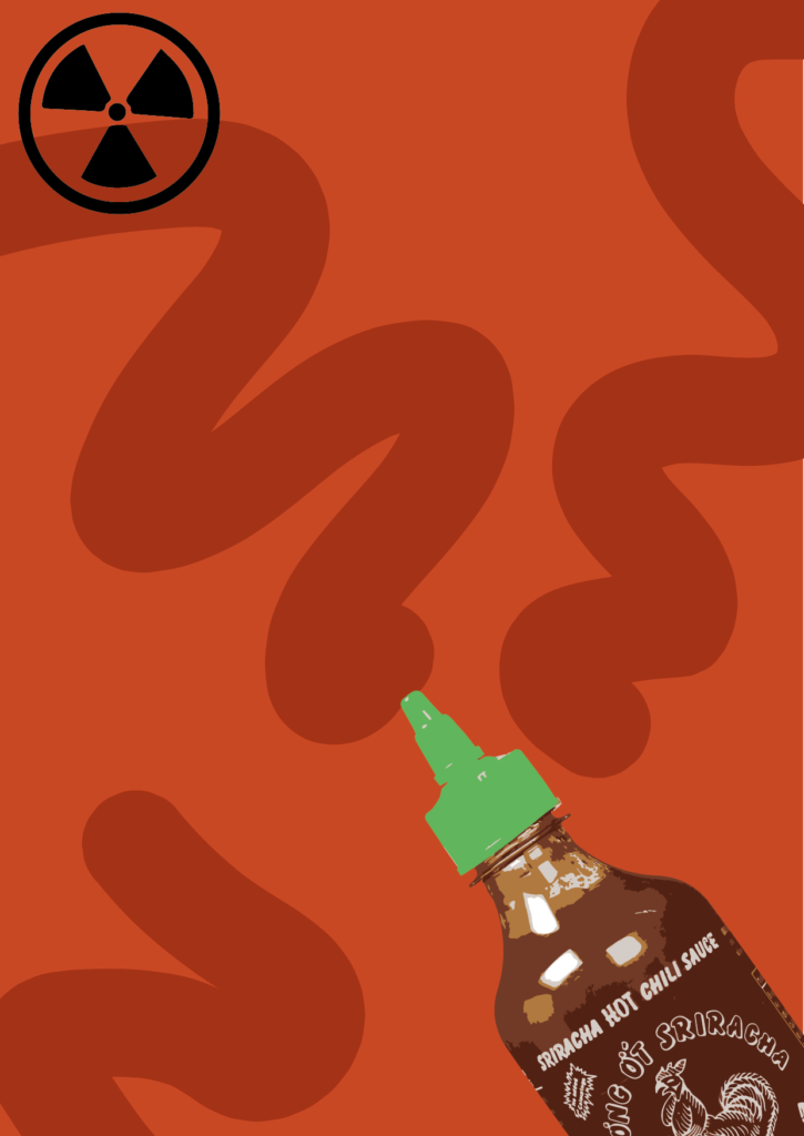
Direction two focuses on the superhero parts of the first sketch. Here I made the sriracha the superhero instead of a person. This makes you focus more on the product, and thereby the brand. The feedback I received on this direction was that the middle one is the most fun. The flying bottles works good. The best comment about this direction is that you never see the bottle of sriracha on the table, like a normal bottle. There is a lot of movement which makes for a surprising image. I got a suggestion to look at René Magritte’s work, and maybe work with that.
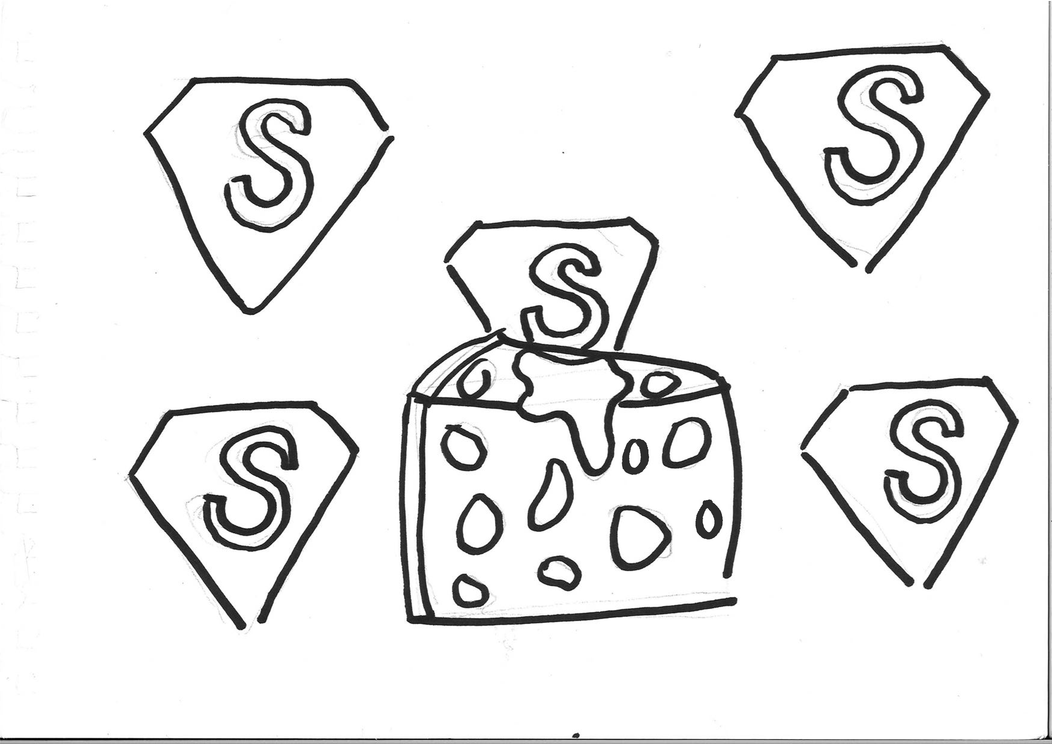

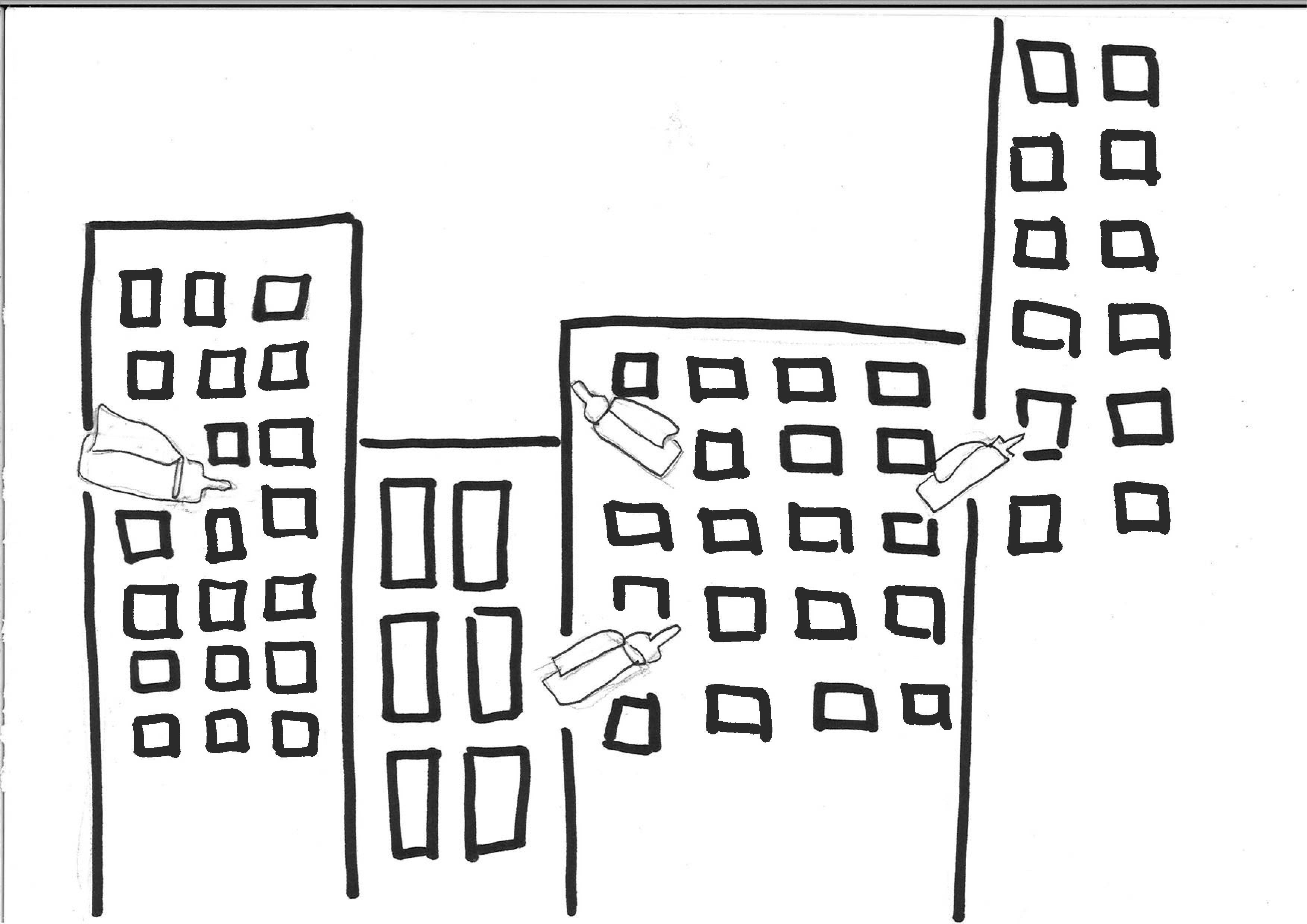
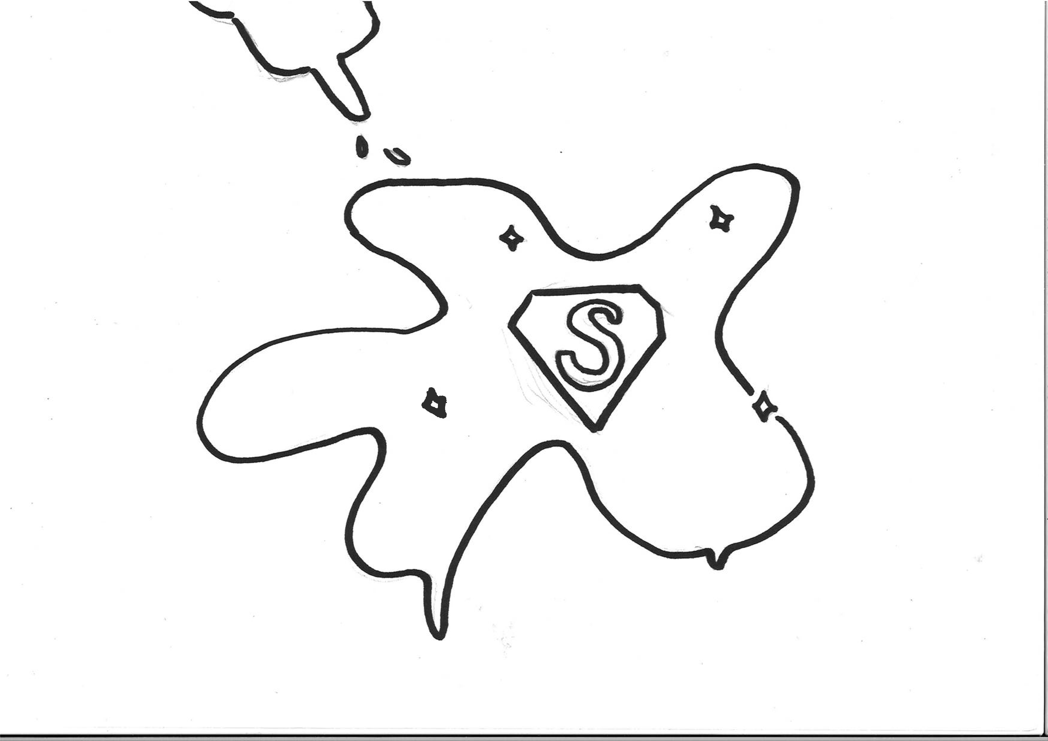
For my third direction I tried to work with patterns. I took details form every item in my first sketch and made patterns with things that are significant to them. The items from my sketch were: the cheese, the superhero and the siracha. For the pattern of the cheese I drew cheeseholes. For the superhero I used the herologo and for the sriracha I used the drips from the sauce. With these patterns I played around. Feedback: This series was had the least potential as of right now. For the serie to work, it would need strong copy or some sort of storytelling.
Third visuals
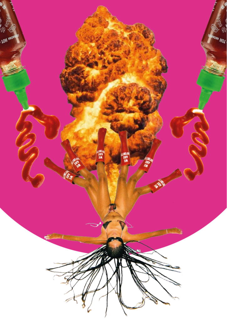
As it turned out none of my directions were good enough to be a serie, I had some trouble deciding which direction to use. Eventually I chose the second direction where the sriracha bottle is the hero of the story.
I chose this direction because I got the best feedback on this one (which I agreed with). The big idea I got with it, is that everything or everybody can be a superhero, as long as you believe in yourself. Giving this direction a sense of empowerment. Knowing that I wanted to adjust the serie, I was content with the message and the ideas I got from my classmates.
Style 1 – illustration

Style 2 – collage
Playing with copy’s
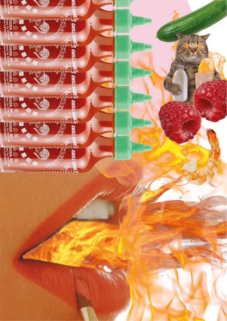
For the next assignment we had to incorporate copy’s into our current serie. I chose to continue with the collage serie. I misunderstood the assignment so I didn’t bring copy’s who were in line with my visuals. This worked surprisingly well and I made some fun combinations

Feedback
Classmates
- Easy toys is echt top! Hilarisch, orgasme zo sterk dat je bijna explodeert
- Zo random allemaal maar dat maakt het wel echt zo leuk. Vind die van Bereal het leukst
- Tering goed, echt heel grappig. Visuals zijn te gek. Klopt misschien nog niet helemaal met de tekst.
- Middle one fits copy best. I would not have text over the hair. Could be great for tinder or easy toys, spicy dates.
- The woman with the 6 legs is my fav visual. Easy toys is funny.
- Ik vind de visual en tekst goed samen passen maar de tekst van de aap zou ik weglaten
- Heel grappig omdat het totaal geen sense maakt
Rob
- Collage methosdes kijken
- Wat voor soort elementen neem je over.
- Saus heeft een goed effect
- Goed kunnen beschrijven en bewuste keuzes
- Siracha slagroom mayonaise!!
- Laat beeld zien mar wel dat copy iets anders doe.
- Leuk dat het gewaagd is maar wel een reden erachter,
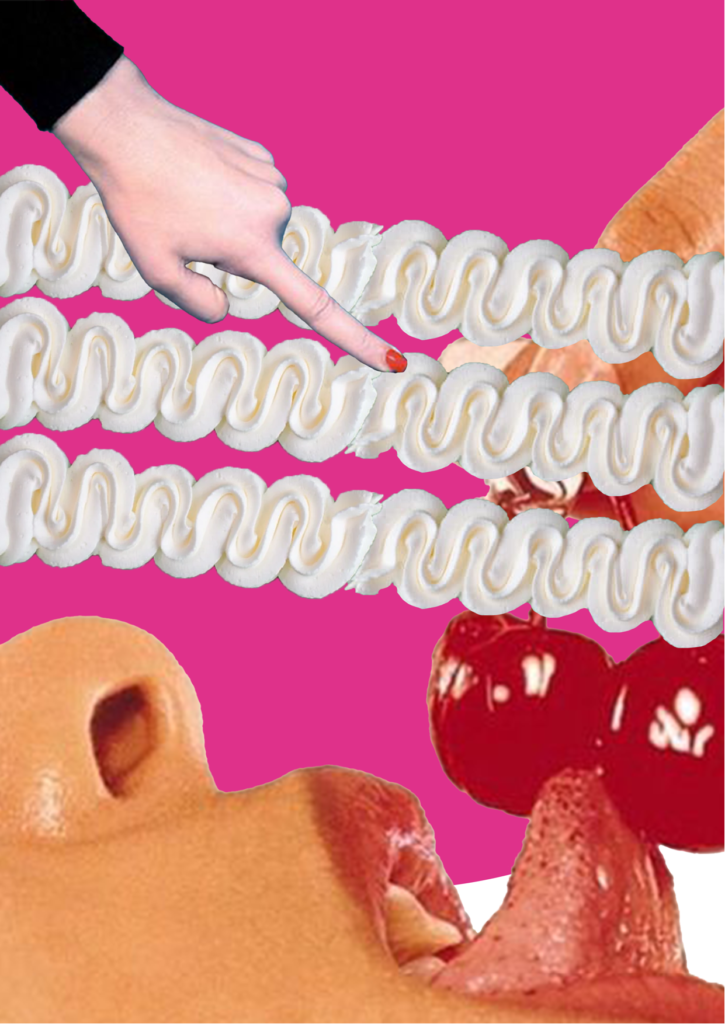
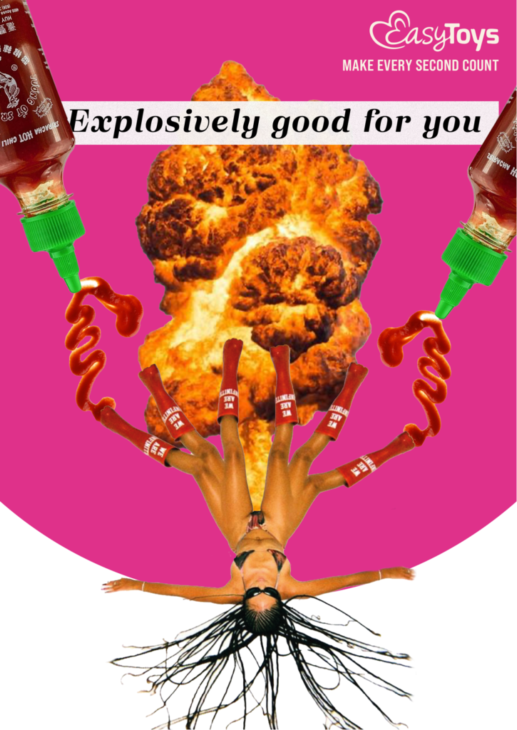
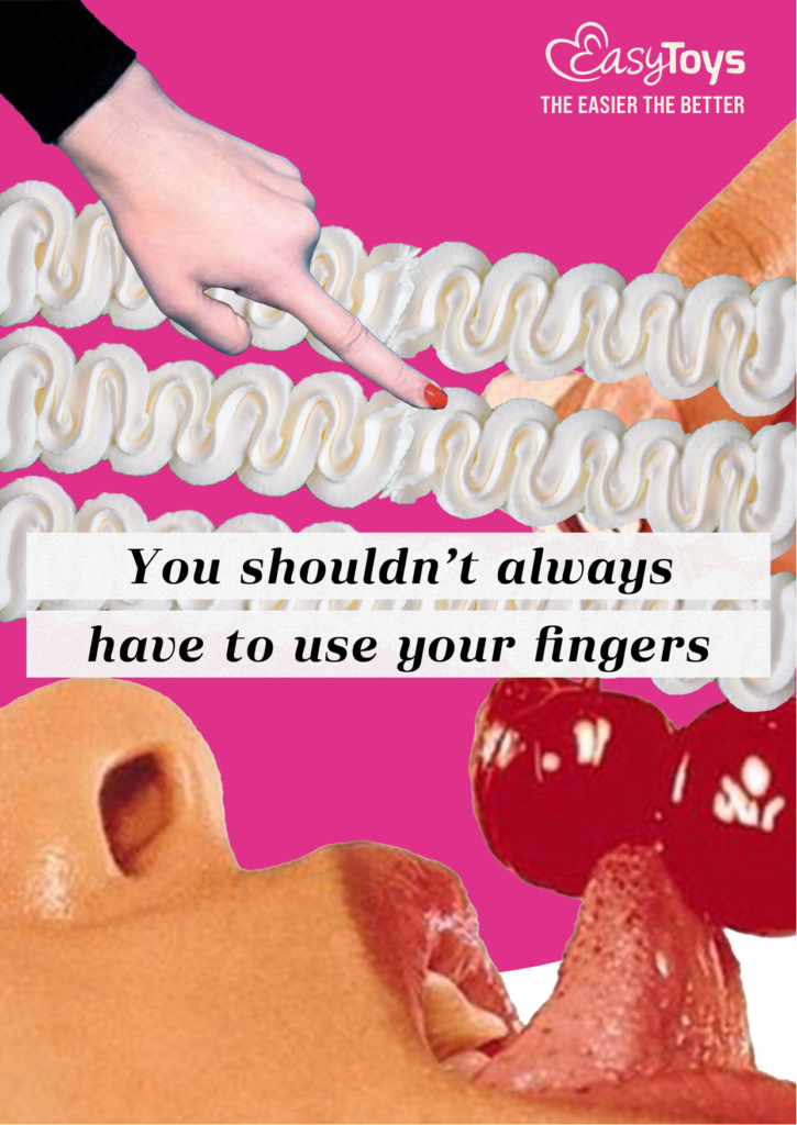
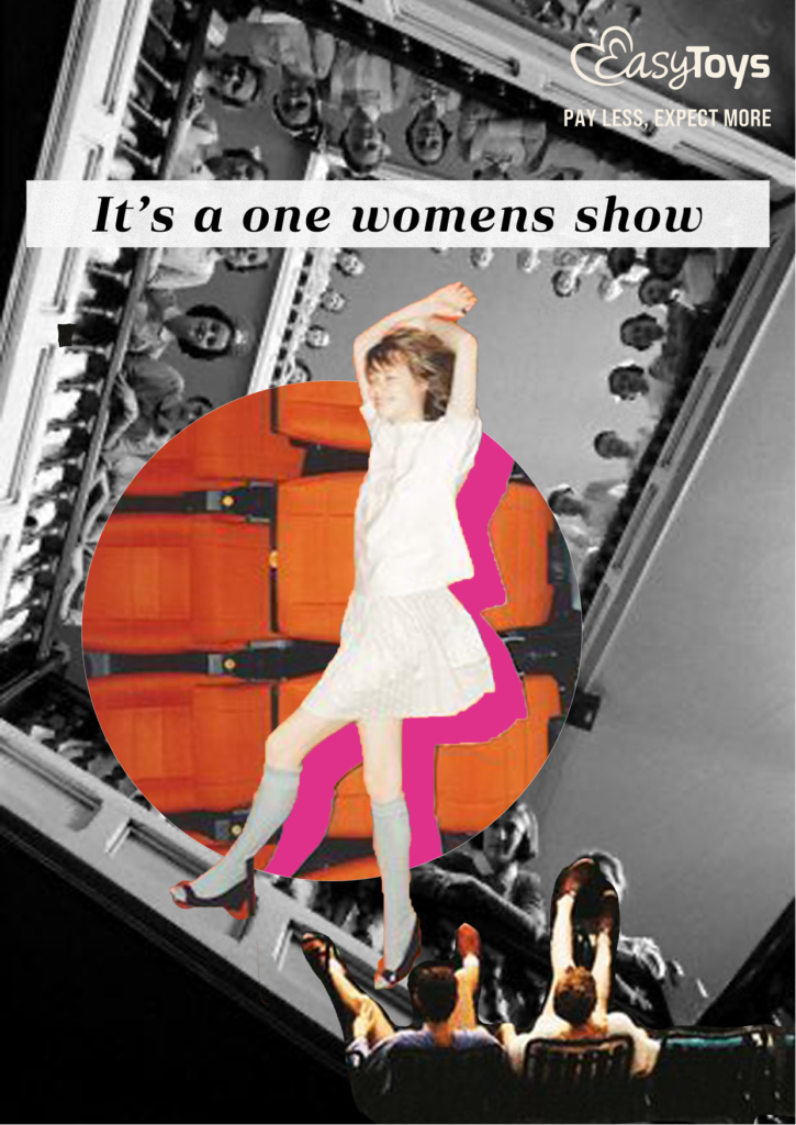
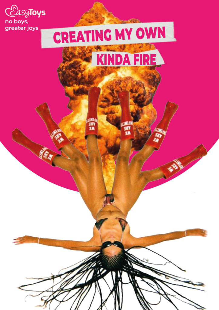
Fourth visuals
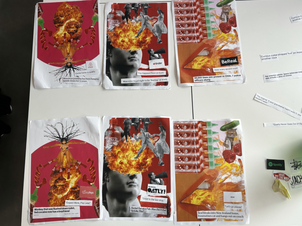
Based on the feedback, I tried adjusting my visuals as wel as the copy. I tried to stay on the ‘funny’ copy side, as my classmates liked those the best from the wordplay assignment. For my visuals I kept one collage the same and made two new collages.
I decided to go with Easytoys as my brand. This brand fits the vibe of my collage style well and I think this brand also can handle some bold copy. It’s all about breaking taboo’s, so making some risky comments is no big deal.
Updated collages without copy
Updated collages with copy
Feedback:
This feedback I received on post-its where people needed to think about what the concept, strategy, ect. could be. I didn’t get many post-its on this feedback round, unfortunately.
- Concept: visual smile? And metaphor
- Strategy: Empathy
- Proposition: Easy pleasure
- Communication goal: Female pleasure can be easy
- Concept: Dramatique collage
- Strategy: Making a question
- Proposition: make focus by extreme examples
- Communication goal: people could feel interest
- Problem: Maybe it could need a bit of consistency
- Concept: seks yourself
- Strategy: aanmoediging
- Proposition: It’s your one
Feedback Jelke: Juist veel positiever dan post its. De derde paste er minder goed bij kwa stijl (meer met roze werken). Explosive title moet anders, meer het randje opzoeken!
Presentation visuals
I made a new iteration for the presentation where you had to stand in front of the class and not say anything. Here I presented my two cases, and only wrote down my feedback without answering any questions the class may had.
The iterations I made:
The only consistence is my first visual, but that didn’t matter because people reacted really good to the visual. One point of feedback was that I had to do something with either copy or image to make the ad more clearer (on the topic) The first one is clear enough as it is. The second and third could also be for a sports brand. I don’t disagree, but also not agree. I would say that the subject could be clearer. If you read the body text I think the message is clear, but this can come more forward in the visual. I don’t agree that it looks like a sports brand.
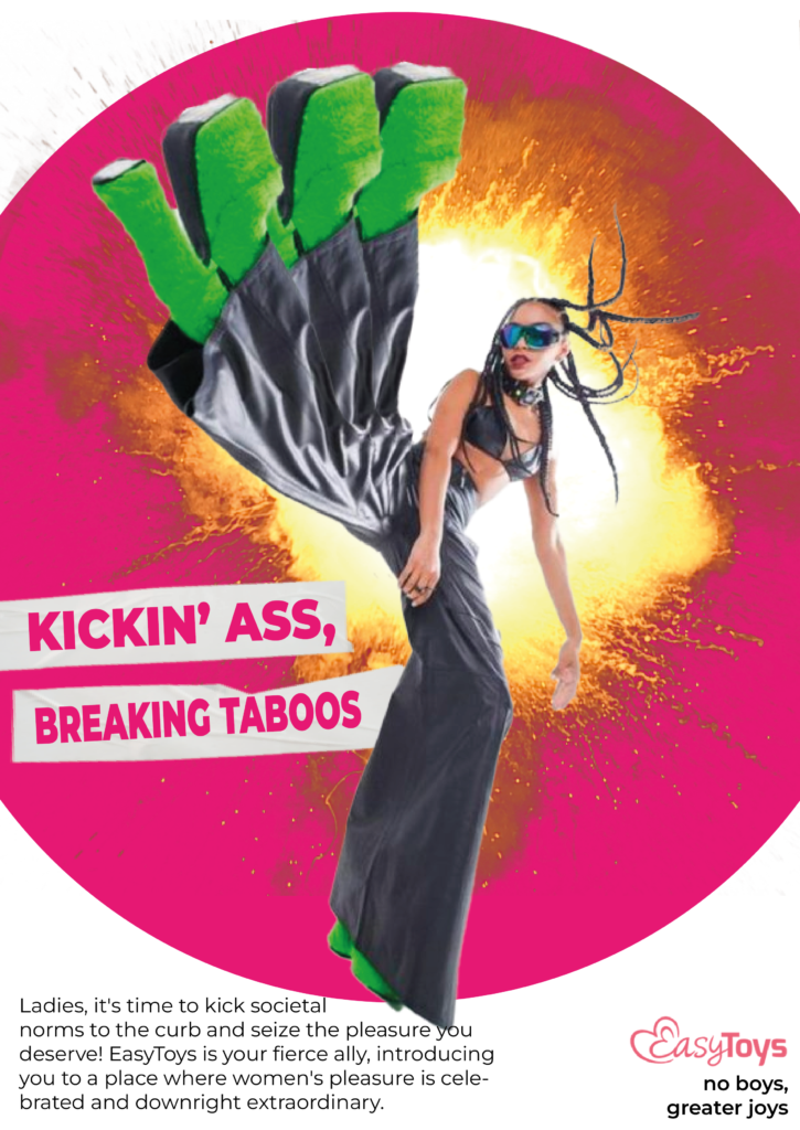
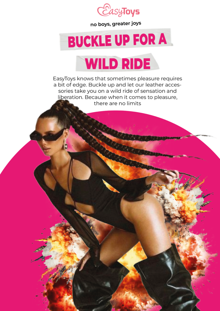
Final visuals
For my final visuals I assembled the following information:
Concept
The concept of my campaign is self love. A revolutionary concept centered around empowering women through self-love and embracing their pleasure. This feminist-driven campaign encourages a positive relationship with oneself, celebrating diversity and promoting body positivity.
Strategy
The strategy is after-only strategy. In these visuals I don’t show any product. But I do show what the product can bring the target-audience. This is much more powerful because I’m not trying to sell a product or material. I sell a experience, and it happens to be an experience a lot of women are (sometimes secretly) searching for.
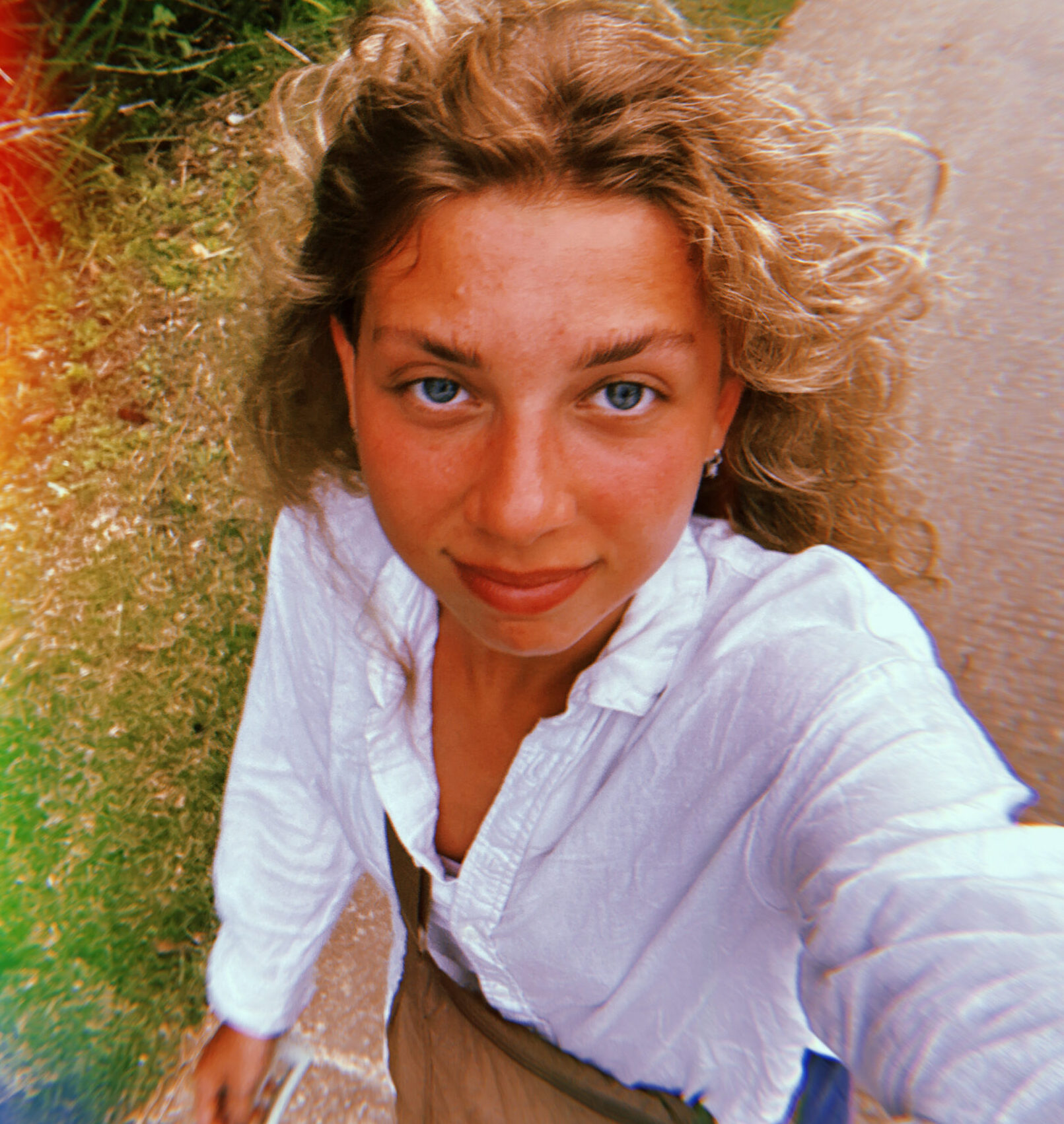
Photographer
The photographer I want to pick is Valentina Vos. She is a dutch photographer based in Amsterdam. She does a lot of work for Linda Meiden, a magazine for younger people like gen-z and millennials. Her photo’s are mostly made with hard flash and with very hard colors. I like her style because she used wide angles and her visuals feel really textured.
Art director
Ayla Spaans is an Amsterdam-based director who creates films hovering between reality and imagination. She grew up in a family of ten and always expressed her feelings through writing, filming, crafts and imagery. With a background in fashion and film, Ayla developed a distinctive style of storytelling – with a sharp eye for stylized settings, playful moments and whimsical emotion. Her work is bright, colorful, humorous and themes of family, friendship and self-love play a central role. She has worked for brands like Crisp, Bols, Pourri, Chupa Chups and wrote and directed her first children series named Rakhi & Peppe which has aired early 2023.
Budget
For this campaign I ask €30.000 euro’s.