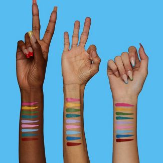
For the BIG swap, I worked on Ava’s brand: somi beauty. Her brand is a make-up line that makes eyeliners in very bright colors. Somi Beauty wants to inspire happiness and creativity with their bold, colourful eyeliner pens.
Idea’s + concept
For Somi Beauty I’m working on the concept be bold. Somi is al about the feeling you get when applying the product. The product is more eccentric then ‘normal’ make-up products. They draw attention, so with wearing the product comes a level of confidence. When slaying this product people will feel like their making a statement feeling bold. With feeling bold we match emotions like fierce, style-full, slay to empower the target group to wear this product in any place.
Target audience
The target audience I want to reach is Gen-Z. Within this generation I’m focussing on the ages 16 to 24. This age group has shown the most interest in developing make-up brands an can easily follow trends in the beauty scene. Gen Z has been instrumental in promoting diversity and inclusivity in the beauty industry. They have championed a broader range of skin tones, body types and gender expressions. This demographic also has a heightened awareness of environmental and social issues, pushing for sustainable and ethical beauty products. They prioritize transparency in ingredients and manufacturing processes. They want eco-friendly packaging and the elimination of animal testing.
When making a brand for Gen Z it’s important to have ethnical core values. It’s important that the brand lives, and not only talks to talk.
Proces
I started out with three concepts: Be Bold, Eye made you look and New grounds or familiar territory
With these concept I wanted to show Ava different possibilities for her brand, because she had said I could experiment with it. I worked with the information in the factsheet and the information in the BIG when creating concepts. I used moodboards to visualize the vibe each concept is setting.

Eye made you look
For this concept I want to use lots of pictures of eyes with the colorful eyeliners as make up. The color of the eyeliner matches te emotion of the eye. The emotion showing is connected to the copy. There will only be ‘positive’ emotions showing (no anger, sadness ect.) Think about red for fierce, orange for happy, green for kind or friendly and blue for hope.
Some other usable emotions: Hope / Pride / Amusement / Inspiration / Love
You can also use two eye together and make it a more shared emotion like love. If you want to create a more community feeling.
Be Bold
Somi is al about the feeling you get when applying the product. The thought behind Somi is that the bright colors of the eyeliners stand for brain activity. If your brain regrestrateds bright colors, hormones like serotonin and endorfines come free. They help give you better feelings. With these feelings come the statements to be bold.
Bring out the bright.
Whoever said less is more, was very boring.


New grounds or familiar territory
There is nothing more fun that exploring new make-up. With this concept I want people to experience that feeling when you first tried your mom’s make-up as a little kid. There is this one great meme about this girl who has her face full of make-up she did herself and this look of satisfaction. For this concept I want to use pictures of children using SOMI in front af a mirror on themselves and ‘the same’ person but grown up ‘still’ using the product.
Showing that you SOMI is there to experience with more than normal make-up. If you are very experienced or just starting to like make-up. Great influencers to work with would be Nikki Tutorials.
Feedback Ava
When I showed Ava my three concepts, she shared some feedback with me which I included in the further development of her brand. Her feedback:
Concept 1: The concept of eye made you look comes out best for product. The target audience is probably the biggest and there is the most storytelling for this campaign.
Concept 2: The bold concept is really nice, but not what Ava had in mind. It could work but maybe its already done, and the target audience for this concept is smaller than the others.
Concept 3: Children concept is too complicated. It seems like your promoting it to children and that won’t work because there are different laws for that. Ava’s opinion: “I don’t think you should use children because of what your processing on them. It’s not ethical.
The teachers liked the bold concept better. There are no visuals tho.
Liked the line: “whoever said less is more, was very boring”
Eventually I chose ‘Be Bold’ as my concept and continued with making visuals.
First visuals
These visuals were made for the first presentation I did on Somi. Unfortunately, Ava wasn’t there to give me feedback but I received some valuable feedback from my peers as well as my teachers.


I presented these visuals in the following presentation:
The brand
Somi is a make-up line that makes eyeliners in very bright colors. Somi Beauty wants to inspire happiness and creativity with their bold, colourful eyeliner pens
In 2022 the trend of using colorful eyeliners started. Some people call it the Euphoria effect. When this teen drama show aired on TV the colorful eye make-up trend began to rise and now-a-days this look attends every red carpet.
The concept
I’m building a campaign around the concept ‘bold feelings’. Somi is al about the feeling you get when applying the product. The product is more eccentric then ‘normal’ make-up products. They draw attention, so with wearing the product comes a level of confidence. When slaying this product people will feel like their making a statement feeling bold
That’s so fierce
That’s so bold
That’s so me
Somi
Target audience
The target audience I want to reach is Gen-Z. I think this target group is best informed by the latest trends on make-up. The have to be interested in artistic make-up. They are reachable on social media
On my presentation I received the following feedback:
From my peers:
- Hele gave posters, je ziet dat het bij elkaar hoort.
- Really nice presentation, went really well. Clear story and nice visuals
- Good analyzation on the target group, good that you mentioned Tiktok.
- Consistent idea and style
- Kan je de producten ook echt op de website kopen? (I think she meant that I needed to be clearer on my sell phase)
- Is het alleen voor vrouwen? Misschien kun je ook andere genders laten zien.
- Be even more bold
From my teachers I got the feedback that they want the posters to be even more bold. The visuals are too tame for the language I’m speaking (or want to speak) They still like the copy: ‘Whoever said less is more, was very boring’ but they want my visuals to be more in line with that message.
Research
Before I continued with working on my visuals, I wanted to do some research on the subject. I did some deskresearch on the colored eyeliner trend. I knew the trend was set by the teen drama serie Euphoria, so I searched some brands that jumped in on this trend.
Urband Decay
I really like the style Urban Decay is using for promoting their product. They have a grunge kind of style and work a lot with collage. Although I like this style, it’s definitely not the style Ava had in mind. Even though I’m already choosing to go bold with her brand, I still want to follow her brand guide and respect her wishes.


NYX make-up
The ‘young’ brand NYX also follows this colored eye pencil trend. This brand has the same target group as I want to follow with Somi. Their products sell by having nice branding, but mainly by being cheap (and sort of higher end than drugstore make-up). I will not copy this design because I think it looks cheap.


Glossier
Lastly, Glossier also produced colored eyeliners. Glossier is known for their ‘soft’ style, which also comes back in this specific product. They use Oliva Rodrigo in their ads, which is clever because she is very well known with this target group.


Deskresearch
Ava her brand is all about the feeling you get when applying the product. Bright colors have a specific connection to the brain, which makes us feel certain emotions.
Colors can have psychological and physiological effects on individuals, and researchers have explored the impact of bright colors on mood and brain function. Here are some general concepts related to this topic:
- Color Psychology:
- Red: Associated with increased arousal, excitement, and attention. It may stimulate the release of adrenaline.
- Yellow: Linked to feelings of happiness, warmth, and energy.
- Blue: Often associated with calmness, tranquility, and improved concentration.
- Green: Linked to nature and relaxation, promoting a sense of balance.
- Neurotransmitters:
- Serotonin: Often referred to as the “feel-good” neurotransmitter, serotonin plays a role in mood regulation. Exposure to bright colors, especially those in the blue spectrum, is believed to promote serotonin release and contribute to a positive mood.
- Dopamine: This neurotransmitter is associated with pleasure and reward. While the direct link between color and dopamine release is less clear, engaging and visually stimulating environments may contribute to the release of dopamine.
- Light Exposure:
- Bright colors are often associated with increased light intensity. Exposure to bright light, especially in the blue spectrum, can influence circadian rhythms and melatonin production, impacting sleep and mood regulation.
- Individual Variability:
- Responses to colors can vary among individuals due to personal preferences, cultural influences, and psychological factors.
Design process


Inspiration images


Final presentation
For my second presentation I work harder on the receiver feedback by making my visuals bolder. I did more research on the target group. It was clear for me that I wanted to use Gen-Z because they are interested in these kinds of trends and are also very aware of them. I found out that it’s not easy to make ads for Gen-Z. They don’t want to feel like they’re watching an ad, but then don’t want to be lied to. You have to be very transparent in the right way.
They are also very opinionated on certain values. It is important that the brand lives, meaning with that that the brand is aligned with their values.“If your values and ethics exist to purely align with theirs, then your business might be missing the whole point of having ethics and values.” (Young, 2023)


End result


