Premise
A projection that shifts in hue, intensity, and spatial orientation makes the impact of climate change tangible.
Synopsis
In this project I set out to explore the push and pull between technology and nature, and the uses of technology to “re-establish our connection to the earth” (Studio Drift, 2020). Frustrated at climate change denial, I dive head-first into climate theory and transformation (of space). The result is a chronological, step-by-step concept diary consisting of free-standing diary entries that alternate between technological experiments, research, feedback, and design.
Foundation
Holthaus (2020) describes climate change as long-term, irreversible shifts in the weather that are barely perceptible on the timescale of a human lifetime. Although awareness is growing, people feel disconnected from the world’s problems (Rosing & Eliasson, 2015). Surprisingly, Kellstedt et al. (2008) found that increased information about climate change has a negative effect on concern and sense of responsibility.
Research question
In contrast to abstract news, can an intuitive installation or an ‘immersive space’ make people more aware of their environment and the changing climate?
Why light?
Light can bring about a wordless experience (Turrell, 2021). Or as Mahnke (1996) explains, light is an important factor in the architectural environment; it greatly impacts our psychological reactions.
Most important insights
- Receiving feedback is valuable throughout the process;
- Researching climate change set me on the path of global warming and air pollution;
- Converting climate data into an intuitive projection is possible.
1.
Technology
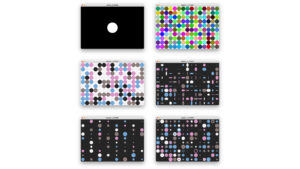
Introduction to generative art in Processing
Processing allows something as rigid as technology to be more fluent and random.
Learnings: trying the random function and waiting for the output was exciting work. However, creating randomness in visuals requires hardcore coding. I’m not sure if this way of working fits me; the process is very stiff and ‘invisible’.
2.
Technology
Flowy noise in Processing
Even more random, the noise function generates smooth, fluid movement occurring in nature like clouds, hair, and water streams.
Learnings: coding a flow field was exhilarating; I created my first generative artworks. The process is all mathematics. I’m moving on to a technology that will allow me to work more freely in 3D space.

3.
Design
Predictive / intuitive weather app
Visualising helped me realise that this idea is too readymade; it doesn’t leave room for experimentation.
4.
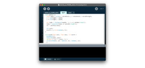
Technology
Introduction to TouchDesigner
TouchDesigner is a flexible, node-based program for visualising and prototyping.
Functionalities
- TOP: texture operators (2D)
- CHOP: channel operators (input channels from devices)
- SOP: service operators (3D)
- MAT: 3D materials
- DAT: data operators
iPhone connection
Using the ZIG SIM app, I established an input connection between my iPhone and TouchDesigner through an OCS in CHOP, enabling pressure on my iPhone display to control the moving visual in TouchDesigner.
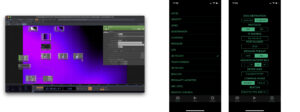
Learnings: converting different data types—data to 2D or 3D—is intriguing. TouchDesigner is the right tool for me to experiment with manipulating space, light, and data; it’s intuitive and practical in one.
5.
Research
Lecture at Het Nieuwe Instituut
After watching TNL! Design Dialogues: Solar Design, one question lingered: what do we want our landscape to look like?
6.
Research
Data
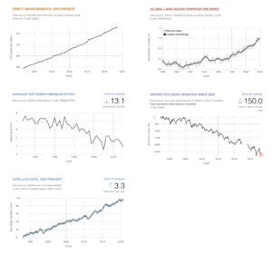
NASA’s website on global climate change offers open data about what they call the earth’s vital signs:
- Carbon dioxide
- Global temperature
- Arctic sea ice minimum
- Ice sheets
- Sea level
The graphs show a dramatic increase or decrease for each vital sign over the course of several decades; fitting data to bring to life in an immersive space?
7.
Research
Sound
It might be interesting to consider sound. Something subtle and unnerving that contributes to a feeling of ‘being on alert’, like hospital alarms or Shephard’s tones, which create the illusion of an ever-ascending scale (Shimizu et al., 2016).
8.
Research
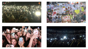
Crowds
Mass mobilisation is an inspiration: rhythm, togetherness, and flow. Can this ‘energy of crowds’ at protests, concerts, or wakes prove valuable to the installation?
9.
Design and feedback
iPad sketches
Idea: horizon
The horizon and the sky are important ‘objects’ when determining the ‘health’ of where we live. They have no beginning or end. This ‘baseline of life’ is simulated with shifting light.
Idea: inverting space
Two lit worlds, each representing a different future scenario, interact in the same space.
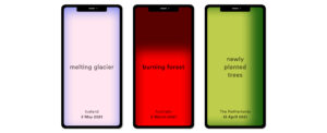
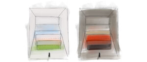
Idea: shifting data landscape
Separate glass panels represent a vital sign and are lit from the bottom up. Climate data drives the hue and intensity of each panel; every angle offers a different (view of the) landscape.
“Landscapes are in process of being shaped and reshaped. They are always temporal” (Bender, 2002).
Peer feedback: a clear sense of the changing climate is missing.
10.
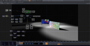
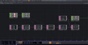
Technology
Prototyping: one
After struggling to get everything right at once, I found that experimenting with separate elements of the installation—projection, space, and data—helps my creative process and makes working with TouchDesigner manageable. I built my first 3D space with walls, noise projections, cone lights, and an animated person. No connection yet to climate change, but I’m moving forward.
Learning: recording an animation helps to get a feel of the visitors’ journey. A useful tool for idea sharing and reflection.
11.
Research
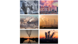
Air pollution
Air pollution is a visible and understandable consequence of climate change. It arises when we burn, build, and throw away (Bronshtein, 2021). The characteristics of flowing particles and fresh air / polluted air are inspirations.
Pollutants
- Small particles (most harmful) – PM2.5
- Large particles – PM10
- Ozone – O3
- Nitrogen Dioxide – NO2
- Sulfur Dioxide – SO2
- Carbon Monoxide – CO
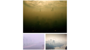
Smog
A specific form of air pollution is smog; the result of the interaction of sunlight with chemicals in the atmosphere. This ‘clicks’ with using light in the immersive space.
12.
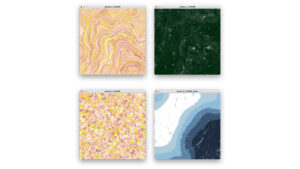
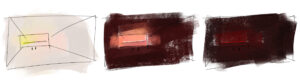
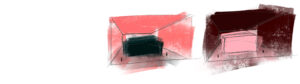
Technology
Gradient waves
An attempt to simulate smog. I started out with colours from a sunrise, but visually this didn’t make sense. Using greys and browns set a more ominous tone.
Learning: the slower the flow constant, the more oppressive the look and feel.
.
13.
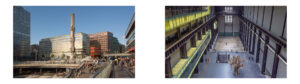
Technology
Prototyping: two
Here, I imagined the elongated Turbine Hall as my playing field—w: 23m, h: 35m, and l: 155m. The projection on a horizon-like screen looks intriguing, but precariousness is missing. Positioning the projection alongside the length of the space, as a ‘road’, would’ve been better. The flow of the projection, though too fast, works quite well.
.
14.
Technology
Pixel mapping
A sidestep into the world of pre-visualising led lighting with a digital strip of 150 leds. Instancing and different ‘universes’ in TouchDesigner are interesting, but the results feel too ‘off path’.
Learning: the arcBallCamera can be used to interactively control a camera’s position around a scene.
.
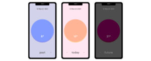
15.
Technology
Data input
Idea: rising glow
Temperature data controls the hight of the ‘glow stick’ in the field. I tested different speeds, hues, and sizes. Visually, I’m very excited about this prototype, but is there enough narrative?
Learnings: I finally succeeded in converting a DAT (data file) into a CHOP (channel operator). Plus, I managed to create a ‘glow effect’.
16.
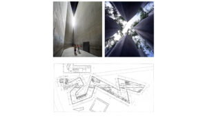
Peer feedback
Architectural inspiration
The zig-zag form of the Jewish Museum creates ‘roads’, ‘sharp spaces’, and “gives voice to a common fate” (Libeskind, 1992). This spatial sense of fate is inspiring.
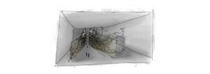
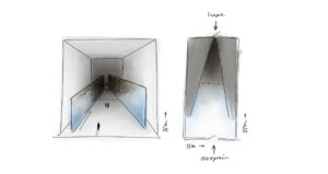
17.
Design
What if pollution (particles) would originate from one end of the space?
Idea: hope vs. despair
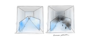
Two entrances offer two roads: from dark to light the experience is hopeful, from light to dark it’s depressing. The more pollution, the slower its speed; time seems to stand still. The road itself gets narrower and narrower nearing the polluted side, contributing to a feeling of stress.
18.
Feedback
Discussion with architect Marta Meijer
Marta pointed me in the direction of perspective and setting. What do you see when the installation is viewed from above or below? What if the experience takes place in a church?
Idea: public space
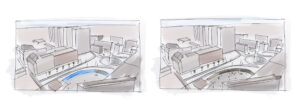
To maximise its effect, the installation could be located in a high-traffic setting like a public square.
19.
Conclusion
TouchDesigner is my top discovery this year. The link to climate change evolved slowly and only got stronger at the end of my project; exploring technology doesn’t immediately result in the big picture. Still, each step brought me closer to my final idea, the pollution mirror:
A bright blue, interactive projection starts to pollute as it gathers live data from people walking by. The more people, the denser the pollution. The experience is intriguing, alienating, and confronting.
Continuation
- Improve the projection by further investigating the formation of smog (particles);
- Experiment with live data and movement;
- Research the possibility of downscaling the installation to something more achievable and even more accessible.

20.
References
Bender, B. (2002). Time and Landscape. Current Anthropology. https://www.journals.uchicago.edu/doi/full/10.1086/339561
Bronshtein, T. (2021). The Weight of Numbers: Air Pollution and PM2.5. Undark Magazine. https://undark.org
Gordijn, L., & Nauta, R. (2020). About. Studio Drift. https://www.studiodrift.com
Holthaus, E. (2020, 25 augustus). Big disasters make headlines. But the most dangerous part of climate change is that you barely notice it’s happening. The Correspondent. https://thecorrespondent.com/658/big-disasters-make-headlines-but-the-most-dangerous-part-of-climate-change-is-that-you-barely-notice-its-happening/14933550170-e685bca1
Kellstedt, P., Zahran, S., & Vedlitz, A. (2008). Personal Efficacy, the Information Environment, and Attitudes Toward Global Warming and Climate Change in the United States. Risk Analysis, 113–126. https://doi.org/10.1111/j.1539-6924.2008.01010.x
Radwan, A. (2015). Color in Architecture is it Just an Aesthetic Value or a True Human Need? International Journal of Engineering Research & Technology. https://doi.org/10.17577/ijertv4is120587
Rosing, M., & Eliasson, O. (2015). Ice, Art, and Being Human. Studio Olafur Eliasson. http://olafureliasson.net.s3.amazonaws.com/subpages/icewatchparis/press/Ice_Watch_Essay_OE_MR.pdf
Shimizu, Y., Umeda, M., Mano, H., Aoki, I., Higuchi, T., & Tanaka, C. (2007). Neuronal response to Shepard’s tones. An auditory fMRI study using multifractal analysis. Brain Research, 113–123. https://doi.org/10.1016/j.brainres.2007.09.097
Turrell, J. (2021). Introduction. James Turrell. https://jamesturrell.com
Libeskind, D. (1992). Between the Lines: The Jewish Museum, Berlin. Research in Phenomenology, 82–87. https://doi.org/10.1163/156916492×00089
World Air Quality Index project. (2021). World’s Air Pollution. World Air Quality Index. https://waqi.info