Premise
Using AR to create a simulation of colour vision impairments to help designers make more accessible designs.
Synopsis
With the implementation of standards for inclusive web design and development like The Web Accessibility Initiative (WAI), designing inclusive is becoming the norm. Next to setting standards, the WAI helps developers and designers create a more accessible web by creating guidelines and protocols. When designing via visual indicators like webpages or folders/posters clear and accessible visual communication is important. ( Cornish et al. (2015) The Summary of the executive impact assessment (2015) states that the main problem areas of accessibility include the web and ICT services. Cornish et al. (2015) claim that the cause for not correctly implementing visual accessibility is due to the formats of the guidelines and protocol. To help make visual design more accessible, I decided to create a tool that helps to simulate colour vision impairments to test visual designs.
Project
The Approach
Through iterating on the problem statement, I concluded that to help colour vision deficient people navigate the world better I should help the designers instead of the people that suffer from colour blindness. The root cause is tackled: designers don’t always design with colour deficient people in their minds. Augmented Reality is the chosen technique for this project. Julie Carmigniani and Borko Furth (2011) define AR as a real-time direct or indirect addition/enhancement to the user’s environment. With a real-time enhancement of AR, the effects of colour deficiencies can be simulated for designers. The designer can test if their designs use the right colour combinations for people that suffer from a colour vision impairment.
Tools that already exist help with choosing the correct colour pallets. Tools that do this are Contrast Checker, Color Oracle and Colorable. These tools exist outside of programs like Figma or Adobe Creative Cloud, and therefore you need to go to a separate site and pick the colours beforehand. Other options are colourblindness simulators as plugins or tools inside programs. The downside is that there are multiple options, and each is catered to one tool or program instead of one tool that can be used in various programmes.
Color LUTs to simulate colour deficiencies

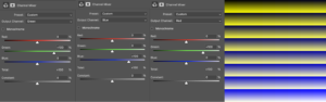
In the first technical prototype, I wanted to see if it was technically possible to make a colour changing filter that simulates the different kinds of colourblindness. After researching how colour filters are created in AR apps, I came across Color LUTs. Adobe describes a Color LUT as something that processes a colour value and outputs another colour value if done correctly. LUTs are often used for colour correction or colour filters and can be applied to photographs and videos. Figure 2 shows a neutral colour LUT. Every colour is shown in channels of red, green and blue.
To make the Color LUTs I first learned about the different types of colour vision impairments. Colour vision impairments consist of blindness for one of the colours or a weakness for one of the colours. Colour deficiency occurs when one or more colour pigment cones are non-existent, thus making it impossible to see all colour wavelengths. (Hasrod, Nabeela & Rubin, Alan. (2016) The different colour deficiencies are Monochromacy, Green-blindness (Deuteranopia), Green-Weakness (Deuteranomaly), Red-blindness (Protanopia), Red-weakness (Protanomaly), Blue-blindness (Tritanopia) and Blue-weakness (Tritanomaly). The Color LUTs were created for blindnesses because weaknesses let people see the colours in a mild version.
To make the Color LUTs simulate the different deficiencies, I played around in Adobe photoshop. Playing around with altering colours in Spark AR is relatively easy. I played around with the colour settings using the Channel mixer. With the Channel Mixer you can choose the Custom settings to create different colour outputs. You can choose from red, green and blue and change the output. Resulting in deuteranopia, protanopia and tritanopia Color LUTs. When creating Color LUT for the correct colourblindness, you have to change the channels. When designing for Deutranopia, which is Green-blindness, the green channel should be 0 to be excluded in the output, as seen in Figures 3, 4 and 5.


Iteration 1

Simultaneously I found that the Spark AR app is often used to create colour filters. This AR program is used for social media like Instagram and Facebook since it’s from Meta. Because of the colour filter options, I chose to work with Spark AR. Spark AR was a simple program to use because it uses visual coding.
My first iteration was to test if it is possible to use colour LUTs in Spark AR. I found already generated colourblind LUTs to use for my first iteration. These LUTs didn’t work; they altered the output way too much, resulting in incorrect colour changes seen in figure 6. I started making my own Color LUTs using a neutral LUT in figure 2. After fidgeting a little bit, this was successful.
Iteration 2
The next iteration was getting the Color LUTs to work in Unity because Spark AR is limited. Its primary focus is on implementing filters in Instagram and Facebook, that wasn’t what I wanted to achieve. The goal was a stand-alone app. During the process, two things happened.
First, I got the webcam to work using a little bit of programming. I got the Webcam to work as a texture projection on a canvas. (Figure 7) The next step was getting the Color LUTs to work. I had to add the Color LUT function in the render pipeline. Doing this the format of my LUTs should be changed to a height of 16 pixels instead of 32 pixels. After playing around, the only Color LUT that worked was the Deuteranopia one (Figure 7). The different LUT versions all worked in Spark AR but not in Unity. It didn’t work out after trying many different ways to create the LUTs. Next week I tried again via googling. I found a solution to flip the LUT vertically. Flipping the LUTs was the trick to getting it to work.

The last problem that occurred when opening Unity in mobile development settings; the app didn’t correctly get the phone camera, it was blank. Thus this prototype didn’t properly work. I couldn’t find the problem quickly; hence I decided to postpone the Unity part. This would be fixable if I had more time, but I wanted to do two more things. I also wanted to create an interface and test the Interface.
Iteration 3
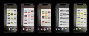
The first step of iteration three was creating the interface of the app. The interface should be easy to work with, and it should use features that designers are familiar with. Inspiration came from camera apps such as Instagram, Facebook, and the android and apple camera functions. I wanted the user to slide through or pick the options they would like. Accordingly, I started designing the interface in Figma. So I created four different prototypes for the interface.
The second step was getting input and feedback from testers of the interface. The five designers tested the Colour Filter app in Spark AR, which all worked. They didn’t have any problems using this. When trying the interfaces seen in Figure 8, the users mentioned wanting to have a visual and textual indicator of the filters in the interface. Sliding through the options worked smoothly. Two of the four designers mentioned wanting to have a tutorial notification about the use of the app. I’m not adding this function yet because I don’t want to overcomplicate the app. It’s a simple User Interface that the user will be familiar with due to phone camera apps and Instagram/Facebook. More user testing should be done to test if a bigger audience thinks the same. Since the app is a mock-up version and prototype, the development is not in this phase yet.

While testing the interface, a few things were mentioned. Four out of the four designers don’t use any tools for testing their designs on colour accessibility, but they do want to test it more if there was a tool for it. While testing, I interviewed the designers about features they would like to see added. Features discussed were opacity, on/off buttons, camera functions etc. For now, I won’t add these features because the test subjects weren’t sure about the functions and thought it would overcomplicate the app.
The last step is integrating the feedback on the interface. The testers all mentioned wanting more feedback that shows which filter is currently in use. Instead of using a text-only interface, I changed it to a text and visual interface. As seen in Figure 10, the visuals are created out of the Color LUTs themselves. The text indicates which colour vision deficiency you’re looking at. The tags only appear on the filters that are in use. I also added a size difference between the circles to show which filter is used.
Recommendation and Conclusion
For now, I’ve created an easy to use app concept that should help designers be aware of the problems users with colour vision deficiencies face. It will help them become more knowledgeable on the topic of colour vision impairments. This way, the designer can check their designs during multiple points in the design process. Because of the simple interface, the app should be uncomplicated and be easy to learn for the user.
Further research is needed to help designers make better visual design decisions for accessibility. For now, I’m only showing them where improvement can be made, not what kind of improvements they could make. The next step would be to develop a recommendation system in this app. With a recommendation, the design process would become more guided now it’s only creating awareness.
References
Cornish, K., Goodman-Deane, J., Ruggeri, K., & Clarkson, P. J. (2015). Visual accessibility in graphic design: A client–designer communication failure. Design Studies, 40, 176–195. https://doi.org/10.1016/j.destud.2015.07.003
European Comission. COMMISSION STAFF WORKING DOCUMENT EXECUTIVE SUMMARY OF THE IMPACT ASSESSMENT, Brussels, 2.12.2015 SWD(2015)
W3C Mission. (n.d.). W3C. Retrieved March 29, 2022, from https://www.w3.org/Consortium/mission
European accessibility act. (n.d.). Employment, Social Affairs & Inclusion – European Commission. Retrieved March 29, 2022, from https://ec.europa.eu/social/main.jsp?catId=1202