Synopsis
We live in a world with lots of data – a lot of it too big, opaque, and abstract for us to understand. Designers can play an important role in making this data interpretable and meaningful through various ways of encoding data in new types of visualizations, stories, and other outlets such as audio and sculpture.
In my experiments, I want to explore various tools and methods for data visualization & storytelling. The intention is to 1) get an overview of this practice and its landscape, 2) practice with common software and languages, and 3) develop a deeper understanding of data representations and the process of constructively encoding and decoding information in visual elements.
In this post, I’ll share my process, prototypes, and insights along the way.

Iteration #1: Learning TouchDesigner for generative 3D Data Visualizations
I want to explore immersive 3D data visualizations practiced by studios like Refik Anadol. By reaching out to a few studios, I learned that one of the most-used software in this space is TouchDesigner.
Week 1: Getting acquainted with TD
In the first week, I did interviews with yfx lab and Encoded studio about their process to build on my understanding. Following a handful beginners introductions to familiarize myself with the software and interface, I did these two tutorials from YouTube:
- Particle Displacement w/ Bileam Tschepe [youtube.com/watch?v=hbZjgHSCAPI]
- Generative shape w/ Matthew Ragan [youtube.com/watch?v=wubew8E4rZg]
[aesop_video src=”youtube” id=”fP0Bvj5o9Cw” width=”50″ align=”left” disable_for_mobile=”on” loop=”on” controls=”on” mute=”off” autoplay=”off” viewstart=”off” viewend=”off” show_subtitles=”off” revealfx=”off” overlay_revealfx=”off”]
[aesop_video src=”youtube” id=”wloAaB1-ipo” width=”50″ align=”left” disable_for_mobile=”on” loop=”on” controls=”on” mute=”off” autoplay=”off” viewstart=”off” viewend=”off” show_subtitles=”off” revealfx=”off” overlay_revealfx=”off”]
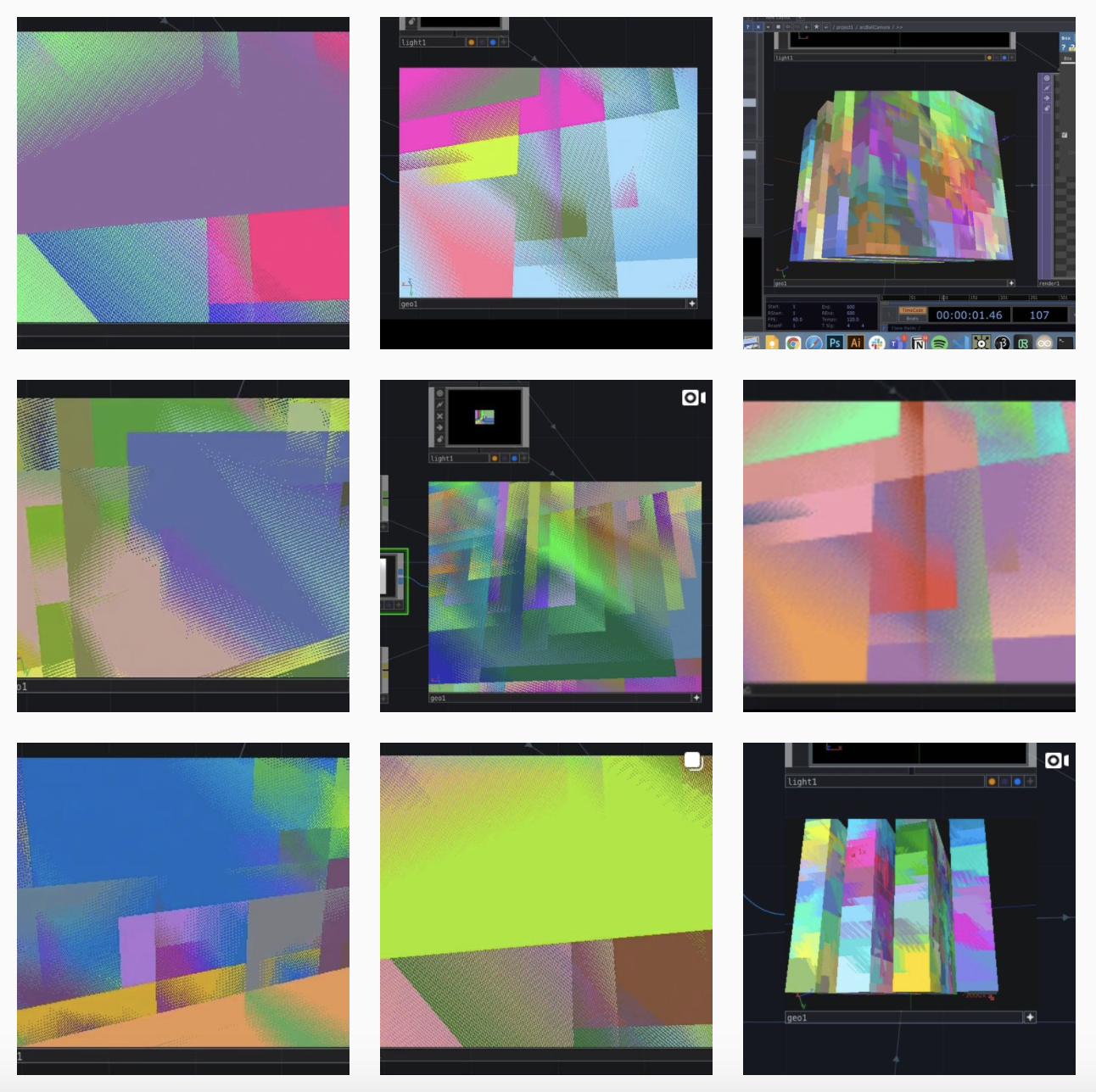
Week 2: Instancing
One of the key features that is vital to data viz in TD is instancing. I started learning about that with the following tutorial.
- Point Clouds in TouchDesigner099 Part1 – Instancing w/ Markus Heckmann [youtube.com/watch?v=WbnaW3gMmMs]
I did a call with a small TD study group we set up through yfx lab where I learned more about the Grantecan project and their approach to data viz.
I also studied the work of Edward Tufte and his theories on information design and graphical integrity.
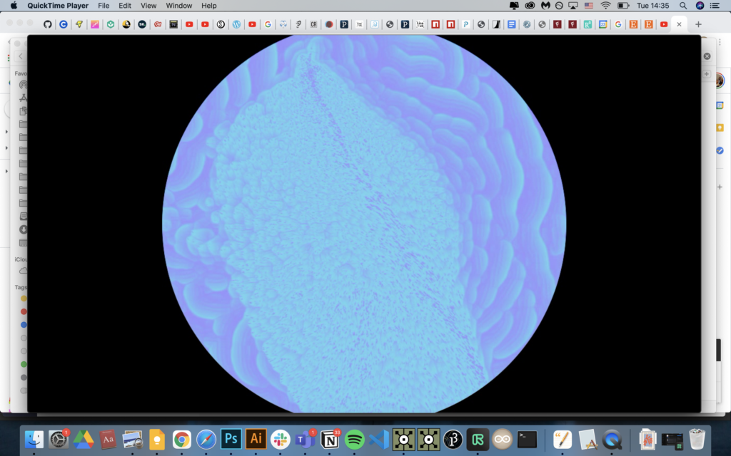
Week 3: Audioreactive Particle Cloud
This week I started working with generating the visuals based on data, in this cause the audio frequency from a song, instead of random noise. I did the following tutorial to create a particle cloud that responds to audio input.
- Audioreactive Particle Cloud – TouchDesigner Tutorial 10 with Bileam Tschepe [https://www.youtube.com/watch?v=M8X_FFB-ikQ]


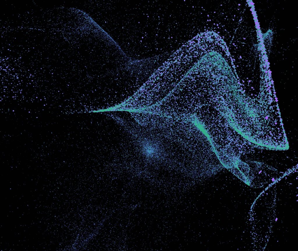

[aesop_video src=”youtube” id=”MASl85U2pYQ” align=”center” disable_for_mobile=”on” loop=”on” controls=”on” mute=”off” autoplay=”off” viewstart=”off” viewend=”off” show_subtitles=”off” revealfx=”off” overlay_revealfx=”off”]
Week 4: Letting go of TD
I found the following set of tutorials which seemed perfectly fitted for my goal:
THP 494/598 | Make it with Data Part 3/4 | TouchDesigner
I still wanted to create one full data visualization in TD using a real dataset and loading it through CSV and Python and worked my way through the first part of this series.
At the same time, realizing TouchDesigner is a very complex software (I had been warned! lol), and 3D data viz a nascent field, and me being an expert in neither, I had to adjust my expectations. Upon asking the guys from the studio for input they all said what I had hoped to make would be very challenging, even for them. Shortly after, I decided to let go of my TD aspirations and switch to more accessible tools.
Reflections on TD & 3D data visualization
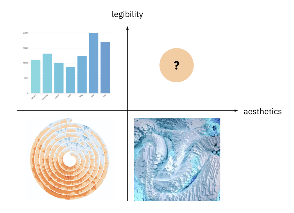
I started this wondering how 3D data visualizations can be legible storytellers. My conclusion is they can, but it’s very difficult and not practiced much in a meaningful way. There are situations in which it makes sense, for example where texture and color can be used in an intuitive way. But for most use cases this is not (yet) a feasible direction.
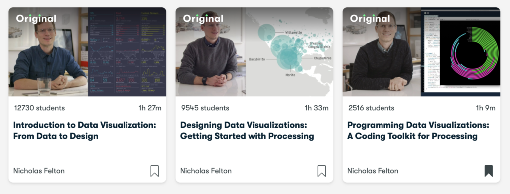
Iteration #2: Data Visualization with Nicholas Felton on Skillshare
The focus remained with data visualization but exploring other, more accessible tools of which there are many. I spent a bit of time researching and found FLARE, D3.js, vegalite, protovis, R, Processing, Python, Plotly, as well as no-code tools such as Illustrator, RAWgraphs, built-in graphing features in Excel and Sheets, and many more.
On Skillshare I found a 3-part series from information designer Nicholas Felton that I decided to use to structure my learning.
The first class is an introduction to Data Visualization, focussing on the creative process and way of thinking about embedding information in visuals. The second class is an example project loading in data and creating a map visualization with Processing. The third class is Nicholas sharing and explaining a lot of code snippets for the whole end-to-end process.
Step 1: Find a story/question
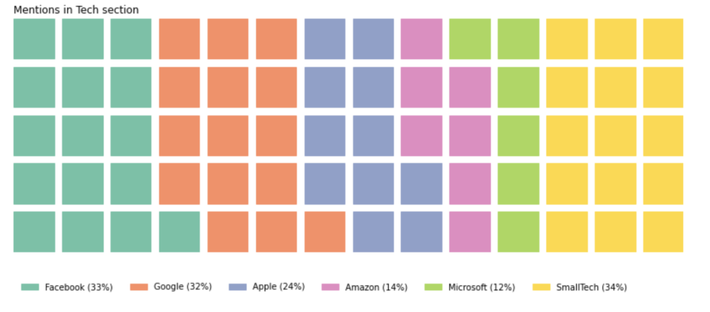
I choose to work with a big and general news publication and zoom in on the Technology section. Scrolling through it, it stood out to me how many of the articles are about one of the five big tech companies. It made me wonder: “how much of the technology section is taken up by the big five?” to explore how much of the conversation they dominate. Posed as a data question: how many articles from the tech section do not mention Google, FB, Apple, Amazon, or Microsoft?
Step 2: Collect and explore the data
I tried working with the New York Times APIs and figuring how to provide the proper query to return the results I was going for, and how to store the results in a manageable way.

I also tried scraping the Technology section using Beautiful Soup and Selenium. Because the page works with infinite scroll, I also had to use a Chrome driver to simulate scrolling down on the page for it to show more results.
I decided to follow a class on Datacamp that offers an introduction to scraping with Python using the scrapy library to get a better grasp of the HTML and CSS selector methods.

Neither of these worked out eventually because there’s a limit to the amount of articles. While it would be quality data, ±500 rows would be too small of a dataset to say anything meaningful about.
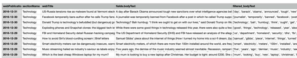
As an alternative, I found this dataset from The Guardian on Kaggle where a filter on the Technology section returned 5050 rows. I used Pandas and Python to process the dataset. I was able to create a boolean whether the article includes a mention of the company name, sentiment polarity and subjectivity score between -1 and +1 using TextBlob, and the sentiment class whether positive, negative, or neutral based on the average.


Step 3: Sketching
The third step is sketching out some ideas for your visualization. Here are my sketches:

Step 4: Creating images
As the data processing was done in Python, I started with some simple plotting using Plotly and Matplotlib to get a first sight of the data. In my sketch I had made a waffle chart so I created one with Python using a specific library for it.

Using the Skillshare classes and videos from The Coding Train on how to deal with Tabular Data in Processing, I was able to create some very simple visualizations in Processing.
The next step was to bring the output of these graphing libraries into Illustrator so I could create more custom illustrations. I hadn’t worked with Illustrator much more (mostly Photoshop) so this was good practice.

This is what I ended up creating as the final visual for now. I created a basic waffle-like chart through Processing, then exported that to Illustrator to add the rest.

Iteration #3: The Data Storytelling Process
To learn more about the data storytelling process and how to arrive at interesting visuals, I decided to book the workshop Shape of Data by Tiziana Alocci, an award-winning data designer.


We worked with the Our World in Data data about plastic pollution. I came up with 7+ stories and was struggling to pick a story, to which I was advised to scale down in terms of audience (e.g. client or demographic or intended purpose) or format (e.g. social post, animation, editorial).

I picked one and I created a few sketches exploring different types of visualizations while using the Data Viz Project catalogue as a reference. I drew out sankey and sorted stream graphs, topographic maps, and proportional area charts but using half-circles, in combination with plotting them roughly on a world map to indicate which region it’s about.
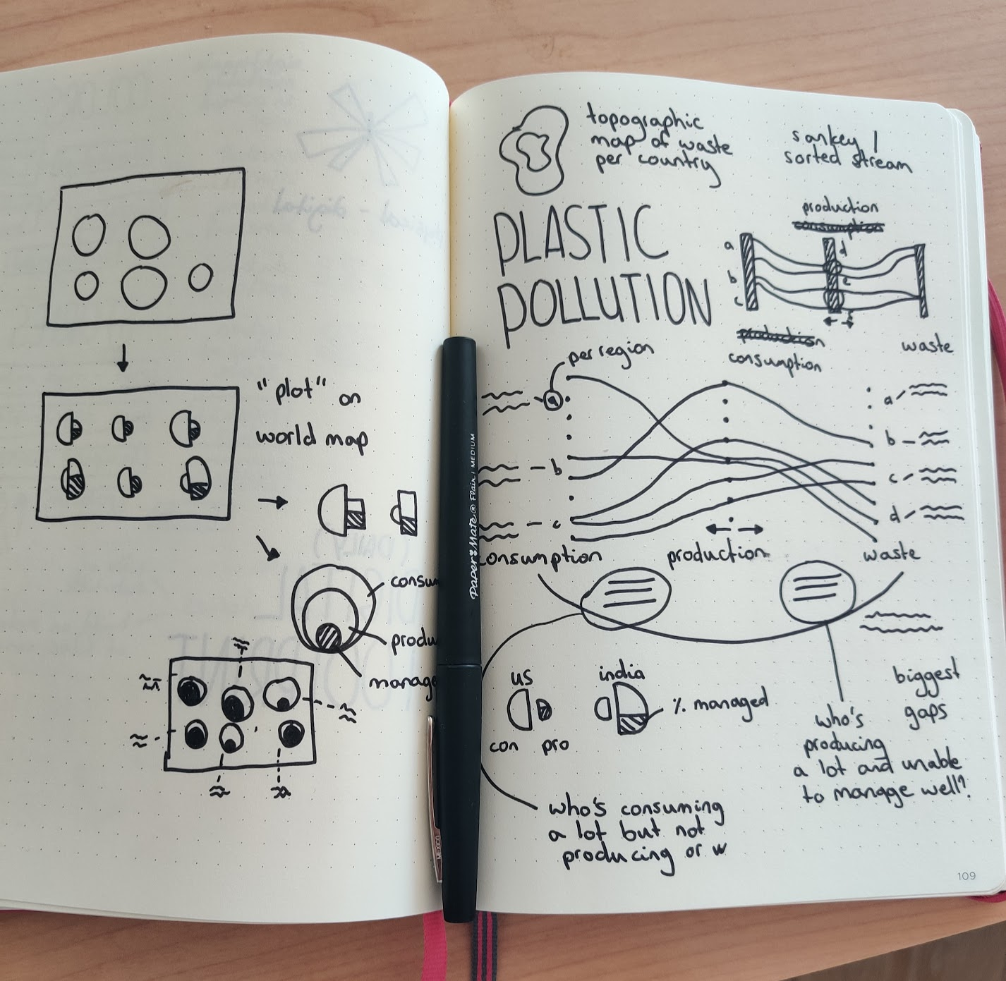
To create visualizations that are more interesting than the default graphs, there are a few strategies such as using pictograms (e.g. shape of bottle), split your visualization in two, or pick one type of visualization, then plot it onto a different shape (e.g. bar chart in radial shape).
This is where the workshop ended and Tiz encouraged us to create our visualizations afterward.
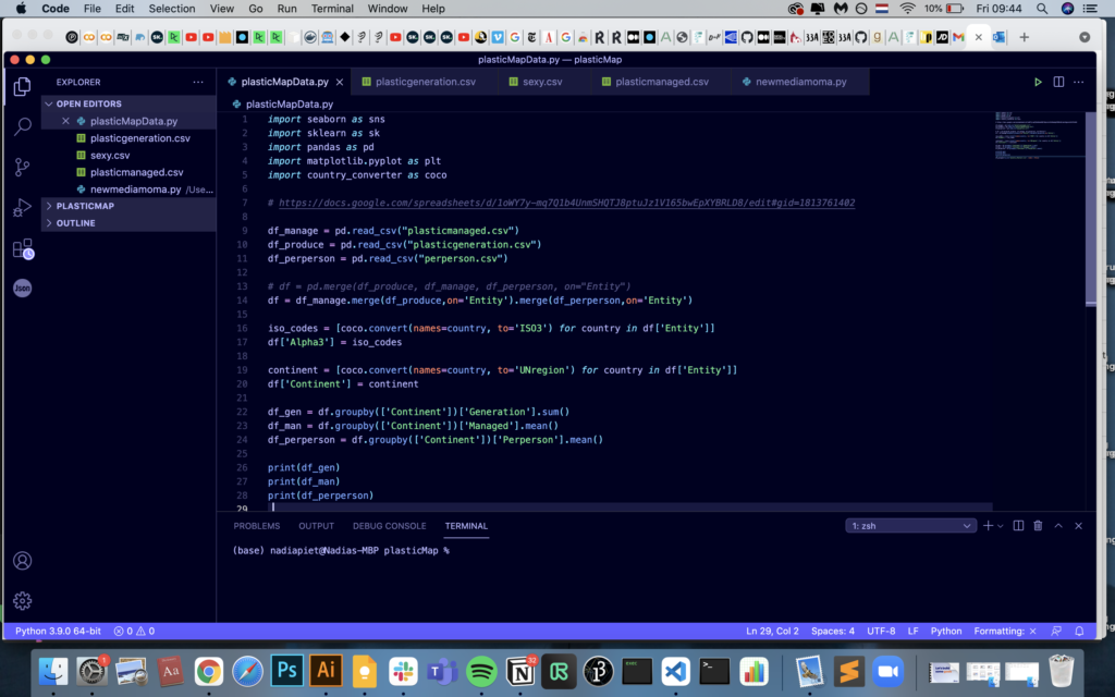
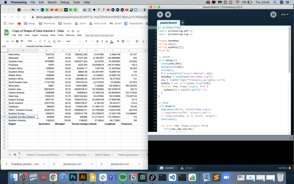
I ended up creating the following visual using Python and pandas to edit the data, and Processing and Illustrator for the image. With more time, I would’ve liked to add a way to represent waste per person and annotations.

Reflections
The journey has been rocky with plenty of detours and forks in the road. While I didn’t reach the output I hoped for when I started, I learned much more than I expected. I realized that my passion for data is much more about creative research, meaningful embedding of information, and storytelling, rather than generating impressive visuals.
Next steps
I definitely want to keep practising each step of this process and look forward to bring this into other projects I’m doing. More specifically, I want to look into Figma tools to do data viz, this vimeo series on Processing for Data Viz, and finish my scraping course on DataCamp.